Updates since 1.0.3
New components
Calcite has added new components to enhance and support your UI, which include:
Navigation and Menu
Navigation and related components Navigation User and Navigation Logo provide a consistent structure and behavior for users to reliably and consistently navigation your application. Using Navigation with Navigation Logo, and where applicable, Navigation User, can ensure your experiences are consistent and understandable. Navigation can also be useful for containing a Menu and Menu Items.
The Menu and Menu Item components provide a consistent menu structure allowing your users to access and navigate pages, routes, or functionality within your application and experience. They are most often slotted into a Navigation component, but can also be placed in other layout components, such as Shell Panel, Panel, and Flow.
<calcite-navigation>
<calcite-navigation-logo slot="logo" heading="Walt's Chips"></calcite-navigation-logo>
<calcite-menu slot="content-start" layout="horizontal">
<calcite-menu-item icon-end="information" text="About" active></calcite-menu-item>
<calcite-menu-item icon-end="gallery" text="Gallery"></calcite-menu-item>
<calcite-menu-item icon-end="map" text="Map"></calcite-menu-item>
</calcite-menu>
<calcite-menu slot="content-end" layout="horizontal">
<calcite-menu-item icon-start="phone" text="Contact"></calcite-menu-item>
</calcite-menu>
<calcite-navigation-user slot="user" full-name="John Muir"></calcite-navigation-user>
</calcite-navigation>Text Area
Text Area is a multiple line text input control, which allows users to enter a sizable amount of content in free form text. The component can collect user inputs, such as comments or reviews in forms.
Text Area also supports a specified maximum number of characters with the max property, includes a default (unamed) slot and two footer slots, footer-start and footer-end.
<calcite-text-area name="feedback-calcite" max-length="50" placeholder="Provide your feedback">
<calcite-button slot="footer-start">Spell check</calcite-button>
</calcite-text-area>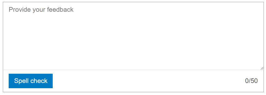
maxLength and footer-start slot.Chip Group
Chip Group provides consistent spacing, accessible keyboard navigation, and selection modes with the selection property to multiple Chips. Use includes selection workflows, filtering patterns, and toggling of categorical data.
<calcite-chip-group label="Park regions" selection-mode="multiple">
<calcite-chip value="national">National</calcite-chip>
<calcite-chip value="state">State</calcite-chip>
<calcite-chip value="regional">Regional</calcite-chip>
<calcite-chip value="county">County</calcite-chip>
<calcite-chip value="local">Local</calcite-chip>
</calcite-chip-group>Theming
Calcite includes new workflows to support your UI and brand, which include:
Focus color and offset variables
Support your workflow using two global CSS variables, also available on individual components, --calcite-ui-focus-color and --calcite-ui-focus-offset-invert. You can alter the focus color from the --calcite-ui-brand color and offset the focus outline inset to 1 (default is 0).
#transportation-chip-group {
--calcite-ui-focus-offset-invert: 1;
}
#plane-chip {
--calcite-ui-focus-color: #C66A4A;
}
Component sample themes
Sample themes are now available for light and dark modes in each sample's "Theming" section, such as List.
Component functionality
Enhancements to support component functionality are now available, which include:
- Color Picker transparency
- List single persist selection
- List change event
- List Items close button
- Tab Title close button
- Modal sticky slots
- Input files support
Color Picker transparency
Color Picker can be configured to include an alpha channel to handle transparency. The alpha channel can be enabled using the alpha property.
<calcite-color-picker alpha-channel></calcite-color-picker>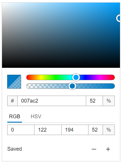
alphaChannel property.List single persist selection
List includes a selection of "single-persist", which allows one selected item and prevents de-selection.
<calcite-list selection-mode="single-persist">
<calcite-list-item label="Hiking trails" description="Designated routes for hikers to use." value="hiking-trails">
</calcite-list-item>
<calcite-list-item label="Waterfalls" description="Vertical drops from a river." value="waterfalls">
</calcite-list-item>
<calcite-list-item label="Rivers" description="Large naturally flowing watercourses." value="rivers">
</calcite-list-item>
</calcite-list>List change event
List has a calcite event, which listens for selection changes to the component to access the selected property.
const listElem = document.querySelector("calcite-list");
listElem.addEventListener("calciteListChange", () => {
listElem.selectedItems.forEach(selectedItem => {
console.log(selectedItem.value);
})
});List Items close button
List Items support close buttons with the closable property, similar to the deprecated Pick List Item removable property.
<calcite-list filter-enabled>
<calcite-list-item label="Hiking trails" description="Designated routes for hikers to use." value="hiking-trails" closable>
</calcite-list-item>
<calcite-list-item label="Waterfalls" description="Vertical drops from a river." closable value="waterfalls">
</calcite-list-item>
<calcite-list-item label="Rivers" description="Large naturally flowing watercourses." closable value="rivers">
</calcite-list-item>
<calcite-list-item label="Estuaries" description="Where the river meets the sea." closable value="estuaries">
</calcite-list-item>
</calcite-list>closable List Items.Tab Title close button
Tab Title supports close buttons with the closable property, and individual items can be closed with the closed property.
A new event, calcite, fires when a Tab is closed.
<calcite-tabs>
<calcite-tab-nav slot="title-group">
<calcite-tab-title selected closable tab="watercraft">Watercraft</calcite-tab-title>
<calcite-tab-title closable tab="automobiles">Automobiles</calcite-tab-title>
<calcite-tab-title closable tab="aircraft">Aircraft</calcite-tab-title>
</calcite-tab-nav>
<calcite-tab selected>
<calcite-notice icon="embark" open>
<div slot="message">Recommended for coastal use</div>
</calcite-notice>
</calcite-tab>
<calcite-tab>
<calcite-notice icon="car" open>
<div slot="message">A good choice for inland adventure</div>
</calcite-notice>
</calcite-tab>
<calcite-tab>
<calcite-notice icon="plane" open>
<div slot="message">Cross continents quickly</div>
</calcite-notice>
</calcite-tab>
</calcite-tabs>
<script>
const tabNav = document.querySelector("calcite-tab-nav");
tabNav.addEventListener("calciteTabsClose", (evt) => {
console.log(evt.target.tab);
});
</script>Modal sticky slots
Modal includes two slots, content-top and content-bottom, which will retain, or stick, content to the component's header or footer when scrolling up and down.
<calcite-modal aria-labelledby="modal-title" id="example-modal">
<div slot="header" id="modal-title">
Read the terms
</div>
<div slot="content-top">Scroll to accept the terms</div>
<calcite-label slot="content-bottom" layout="inline-space-between">
<calcite-checkbox></calcite-checkbox>I agree to the terms
</calcite-label>
<div slot="content">
<p>Add a large amount of content for scrolling here.</p>
</div>
<calcite-button slot="primary" width="full">
I'm done
</calcite-button>
</calcite-modal>content-top and content-bottom.Input files support
When Input's type is "file", the files property specifies the component's selected files.
const fileInput = document.querySelector("calcite-input");
const submitBtn = document.querySelector(".submit-button");
submitBtn.addEventListener("click", () => {
for (const file of fileInput.files) {
console.log(`${file.name}`);
}
});files property.Layout improvements
Layout improvements have been added to Panel, Shell, and Shell Panel to support your UI and apps, which include:
- Action Group layout inheritance
- Flow Item and Panel action bar
- Flow Item and Panel footer
- Shell slots
- Resize Shell Panel and CSS variables
- Shell Panel display mode
Action Group layout inheritance
Action Group inherits layout from its parent Action Bar or Action Pad. The inheritance change deprecates the Action Group's layout property.
<calcite-action-bar layout="horizontal">
<calcite-action-group>
<calcite-action text="Add" icon="plus"></calcite-action>
<calcite-action text="Layers" icon="layers"></calcite-action>
</calcite-action-group>
<calcite-action-group>
<calcite-action text="Undo" icon="undo"></calcite-action>
<calcite-action text="Redo" icon="redo"></calcite-action>
<calcite-action text="Save" icon="save"></calcite-action>
</calcite-action-group>
</calcite-action-bar>Flow Item and Panel action bar
Add an Action Bar to Panel with the action-bar slot.
<!-- Flow Item action-bar slot -->
<calcite-shell>
<calcite-shell-panel slot="panel-start" width-scale="l">
<calcite-flow id="example-flow">
<calcite-flow-item heading="Map Layers">
<calcite-action-bar slot="action-bar" expand-disabled>
<calcite-action-group>
<calcite-action text="Save" icon="save"></calcite-action>
</calcite-action-group>
<calcite-action-group>
<calcite-action text="Undo" icon="undo"></calcite-action>
<calcite-action text="Redo" icon="redo"></calcite-action>
</calcite-action-group>
</calcite-action-bar>
</calcite-flow-item>
</calcite-flow>
</calcite-shell-panel>
</calcite-shell>
<!-- Panel action-bar slot -->
<calcite-shell>
<calcite-shell-panel slot="panel-start">
<calcite-panel heading="Map Options">
<calcite-action-bar slot="action-bar" expand-disabled>
<calcite-action-group>
<calcite-action text="Save" icon="save"></calcite-action>
</calcite-action-group>
<calcite-action-group>
<calcite-action text="Undo" icon="undo"></calcite-action>
<calcite-action text="Redo" icon="redo"></calcite-action>
</calcite-action-group>
</calcite-action-bar>
</calcite-panel>
</calcite-shell-panel>
</calcite-shell>Flow Item and Panel footer
A CSS variable is available to specify the padding of the Flow Item and Panel components with --calcite-flow-item-footer-padding and --calcite-panel-footer-padding. The update deprecates the footer-actions slot for both components; use the footer slot instead.
/* Flow Item footer padding */
calcite-flow-item {
--calcite-flow-item-footer-padding: 0;
}
/* Panel footer padding */
calcite-panel {
--calcite-panel-footer-padding: 0;
}Shell slots
Shell supports alerts, modals, panel-top and panel-bottom slots. Deprecates the center-row slot, use panel-bottom instead.
"alerts" slot positions an Alert over the Shell.Resize Shell Panel and CSS variables
Shell Panel's "top" and "bottom" slots now support resizing with the resizable property. There are also CSS variables to support your UI, including:
--calcite-shell-panel-detached-max-height,--calcite-shell-panel-height,--calcite-shell-panel-max-height,--calcite-shell-panel-max-width,--calcite-shell-panel-min-height,--calcite-shell-panel-min-width,--calcite-shell-panel-width, and--calcite-shell-panel-z-index
"bottom" slot now supports resizing.Shell Panel display mode
Shell Panel now offers a display property, which specifies the component's display in your UI, where:
"dock"(default): Displays at full height, adjacent to center content."float": Displays without full height and content is seperate and detached from the Action Bar. Content is positioned on top of center content."overlay": Displays at full height, content is positioned on top of center content.
The new offering deprecates the detached and detached properties; use the respective display and height properties instead. Additionally, deprecates the --calcite-shell-panel-detached-max-height CSS variable.
<calcite-shell>
<calcite-shell-panel slot="panel-start" position="start" display-mode="overlay">
<calcite-action-bar slot="action-bar">
<calcite-action-group>
<calcite-action active text="Add" icon="plus"></calcite-action>
<calcite-action text="Undo" icon="undo"></calcite-action>
<calcite-action text="Redo" icon="redo"></calcite-action>
<calcite-action text="Save" disabled icon="save"></calcite-action>
</calcite-action-group>
<calcite-action-group slot="bottom-actions">
<calcite-action text="Settings" indicator icon="gear"></calcite-action>
</calcite-action-group>
</calcite-action-bar>
<calcite-panel heading="Layer effects">
</calcite-panel>
</calcite-shell-panel>
<calcite-panel heading="Map">
<div id="viewDiv"></div>
</calcite-panel>
</calcite-shell>Accessibility
Calcite continues to ensure the applications and experiences you create are usable by a wide range of audiences leveraging the W3C Accessibility Standards. Since January Calcite has added additional accessibility enhancements and resources to support you in developing web applications, which include:
Conformance report
Calcite's conformance report is now available and includes support on the US Access Board (Section 508), Web Content Accessibility Guidelines (WCAG), and current format of the Voluntary Product Accessibility Template (VPAT®).
Picker functionality and focus trap support
Input Date Picker and Input Time Picker support focus trapping and allow toggling the Date Picker and Time Picker component respectivelly when clicking the input or selecting the " key to open, or " key to close the component dialog.
Avatar assistive technology support
Avatar specifies context to assistive technologies (AT) where the component will be provided additional context to AT with the label property. For non-images, the full value will provide context to AT, unless a label value is specified.
<calcite-avatar label="A bear" full-name="A bear" thumbnail="https://placebear.com/40/40"></calcite-avatar>set method
The set method, which sets focus on the component's first focusable element, is now supported in the Action Group, Date Picker, Dropdown, Pagination, and Split Button components.
customElements.whenDefined("calcite-split-button").then(() => document.querySelector("calcite-split-button").setFocus());setFocus method is called.Localization
Calcite continues to support localization, meaning the UI content can be adapted to a specific language and culuture. Since January Calcite's localization support includes:
German - Austria language
German - Austria (de-AT) is a new Calcite supported language, which includes locale support to the Date Picker component. For instance, January displays as "Jänner" when specifying the locale.
<calcite-date-picker lang="de-at"></calcite-date-picker>Block handle
Block's movable handle now includes string translations for Calcite's supported languages.
Changes since January 2023
A full list of changes since January, include:
Features
-
tailwind to use calcite-design-tokens instead of calcite-colors (#6884) (28d6e92)
-
add global CSS props for focus offset and color (#6782) (fbe7b20), closes #3392
-
allow disabled elements to emit pointer events without triggering activation (#6732) (c151025), closes #5318
-
make getAssetPath available in output targets (#6755) (f915aa1), closes #6696
-
support setting form ID on form components (#6682) (1a4041d), closes #5164
-
action-bar, action-pad: Set layout property on child action-group elements. (#6739) (8eefa12), closes #6390
-
action-group, date-picker, dropdown, pagination, split-button: add
setmethod (#6438) (a93a85f), closes #5147Focus -
list, list-item: Adds the ability to close a list-item (#6775) (66171ab), closes #6555
- navigation, navigation-logo, navigation-user: Add navigation, navigation-logo & navigation-user components. (#6873) (167f9f8), closes #6531
-
panel, flow-item: Add CSS custom property to define footer padding and deprecate "footer-actions" slot. (#6906) (cfa5689), closes #6892
-
action-bar: Improve border display in horizontal layout (#6888) (62e4665), closes #6758
-
avatar: add label prop for alternative text & aria-label (#6910) (e8d78e7), closes #5564
-
block: add built-in localization (#6503) (5e5a7ab), closes #6248
-
chip-group: Add Chip Group component (#6075) (77dec87), closes #1933
-
color-picker: add support for alpha channel (deprecates
hide,Channels hide,Hex hide) (#2841) (83c5808), closes #749Saved -
date-picker: add support for de-AT locale (#6788) (be3a8b2), closes #6737
-
flow-item: Add action bar slot (#6887) (aa8b46c), closes #6886
-
input-date-picker:
-
input-time-picker:
-
list:
-
modal: adds
content-topandcontent-bottomslots (#6490) (4a511ba), closes #4800 -
panel: Add slot for an action-bar component. (#6738) (b57733b), closes #6448
-
shell: Add panel-top slot (#6730) (62fb8a2), closes #6389 #6449
-
shell-panel:
-
stack: Adds new
Stackcomponent to arrange content and actions (#6903) (bbced3a), closes #6743 #5664 -
tab-nav: adds optional closable functionality to individual
tab-titles(#6740) (d30792d), closes #2620 -
text-area: adds new calcite-text-area component (#5644) (1a1528b), closes #863
Bug fixes
-
deps: move
composed-offset-positionto dependencies (#6895) (747e471), closes #6875 -
restore form control validation in Safari (#6623) (b293077), closes #6626
-
vite: getting the dist build to work correctly with vite again (#6452) (cc44984), closes #6419
-
accordion, accordion-item: now wraps long words in header (title & description) (#6608) (46575ff), closes #5683
-
alert, combobox, dropdown, input-date-picker, popover, tooltip: prefers-reduced-motion no longer prevents open/close components from emitting before + open/close events (#6605) (dfcaa22), closes #6582
-
combobox, dropdown, input-date-picker, popover, tooltip: fix misplaced floating-ui elements when associated-components are closed (#6709) (e220686), closes #6404
-
combobox, select, slider: display label in screen reader instructions. (#6500) (3a7f112), closes #5627
-
filter, list: filter properly on initialization (#6551) (b7782aa), closes #6523
-
inline-editable, input-message, input-number, input-text, input: prevent components from unintentionally picking up a different scale/status value from an ancestor (#6506) (e27f4b3), closes #6494
-
input, input-number: increment/decrement unsafe numbers without loss of precision (#6580) (40c0f0f), closes #5920
-
input, input-number, input-text: emit change value when clearing programmatically-set value (#6431) (1802dc3), closes #4232
-
input-time-picker, time-picker: render when input-time-picker or time-picker's step property changes (#6731) (2118349), closes #6039
-
modal, popover: fix focus-trap from preventing first click (#6769) (be4a63a), closes #6581
-
tooltip, popover: Support transparent backgrounds #6803 (#6847) (7eec6fb), closes #6798 floating-ui/floating-ui#2195
-
accordion: supports selection mode updates (#6356) (8278d3e), closes #5143
-
action: ensure consistent width to accommodate indicator when displaying text (#6562) (2b0d704), closes #5375
-
alert: ensure
border-radiusis consistent for prescribedslots(#6368) (cfe5699), closes #6348 -
avatar: passes color contrast after adjusting text color (#6592) (e7a4971), closes #6203
-
block:
-
button: truncate long button text (#6664) (5857e76), closes #5660
-
card: provide more meaningful screen reader label for selectable cards (deprecates
deselectmessage override) (#6657) (8ee37d2), closes #5585 -
combobox: Visually nest group items properly (#6749) (8d0d0e5), closes #6384
-
chip:
-
date-picker:
-
dropdown: trigger should break words when overflowing container. (#6747) (496ce7e), closes #5903
-
flow-item: Close back button tooltip on click (#6978) (224b695)
-
input-date-picker:
-
correctly position open component when scrolling (#6815) (d22f4f5), closes #6463
-
implement dialog behavior to improve a11y (#6669) (a013819), closes #5582 #6668
-
input renders numbers in the specified numbering system (#6360) (b74c37f)
-
update input-date-picker to properly handle Buddhist calendar changes (#6970) (1d8ad68), closes #6636
-
-
input-time-picker:
-
modal:
-
panel:
-
popover: fix heading padding for m and l scales (#6341) (6153db9), closes #5803
-
segmented-control: handle segmented-control-items with duplicate values (#6963) (3a5ad87), closes #6283
-
shell-center-row: Correctly do not set Action Bar layout (#6891) (7e96dd0), closes #6890
-
slider:
-
split-button: no longer displays divider for transparent with inverse kind (#6350) (11bc2e8), closes #6332
- stepper: rerender stepper items when parent numbering system changes (#6563) (e817b03), closes #5979
-
stepper-item: no longer refer numberingSystem from neighbor stepper component (#6380) (c647fe3), closes #6331
-
tab-nav: ensure selected title is set when tab change event is emitted (#6986) (1fd5b9b), closes #6299
-
tabs: fix error when tabs is resized before initial render (#6342) (a2ba64e), closes #6310
-
tile: adds styling where
linkis present for additional distinction (#6628) (093ae47), closes #5608 -
tile-select: fix click not firing in custom-elements build (#6665) (71aa826), closes #6185
-
tip-manager: Set padding for tips and tip-groups consistently (#6959) (fbd2f3f), closes #6464
-
tooltip:
-
prevent closing of Esc-key-closing parent components when dismissing a tooltip with Esc (#6343) (b4cbf54), closes #6292
-
fix focusing tooltip when a referenceElement is within a shadowDOM (#6915) (453d527), closes #6893
-
close tooltip when pointer is moving (#6922) (dd2c98c), closes #6785
-
Open hovered tooltip while pointer is moving (#6868) (76b02f6), closes #6278 #6615 #6785
-
-
tree:
-
prevent lines from expanded item from bleeding out of container (#6372) (d2fa8a6), closes #6367
-
prevent
tree-itemcontent from being clipped (#6519) (8501b23), closes #6514 -
restore wrapping in tree-item text content (#6518) (7b95194), closes #6512
-
allow selection of parent category w/out selecting children (#6926) (601ec67), closes #6912 #6444 #6509 #6444 #6912 #6509
-
-
tree-item:
-
value-list:
Compatibility
The 4.27 release of the ArcGIS Maps SDK for JavaScript supports Calcite version 1.4.2. If you are using version 4.26 it is recommended to use Calcite's 1.0.7 release.