The Column widget is a layout container that you can use to position and organize content vertically as a single column on a page. A column can consist of multiple widgets.
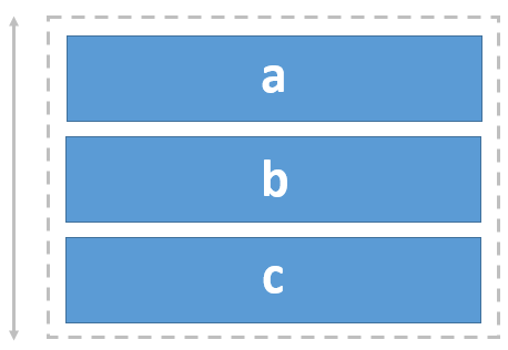
Example
Use this widget to support app design requirements such as the following:
- You want page elements, such as images with captions, to be aligned vertically in a column.
Usage notes
To add widgets to the Column widget, click the Add widget button on the widget toolbar and select from the widget gallery or drag widgets from the Insert widget panel.
To increase the size of a nested widget, adjust its height manually or resize the column that contains it. You can specify how the widgets align with the column and how much space to use for gaps between widgets and padding around the inner edge of the column. The gap and padding spaces are only evident on the canvas when you select widgets or for widgets with borders, such as images.
You can add other layout widgets to a column (such as a Row widget) for additional control when designing your pages.
Settings
The Column widget includes the following settings:
-
Vertical align—Change the way nested widgets align vertically in the column.
-
Start—Align nested widgets starting at the top of the column. This is the default.
-
End—Align nested widgets starting at the bottom of the column.
-
Center—Align nested widgets centered between the top and bottom of the column.
-
Space around—Position nested widgets in the column with equal space around each.
-
Space between—Position nested widgets in the column from top to bottom, with the same space between them. Widgets at the top and bottom of the column align with the column's edge based on the specified padding.
-
Space evenly—Position nested widgets in the column with the same space above and below them. (The space between widgets includes the specified gap.)
-
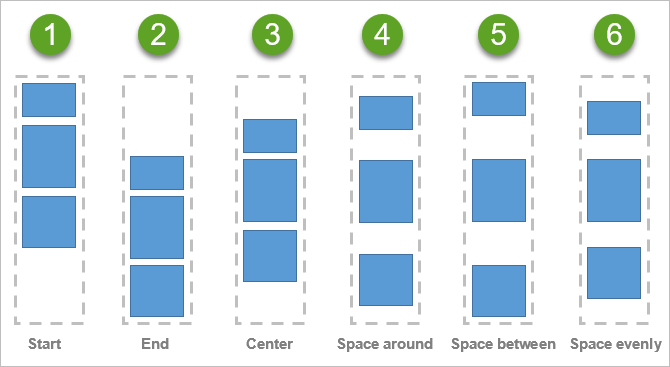
Each of the vertical alignment settings has a corresponding numbered diagram that illustrates how nested widgets are distributed in a column. 1. Start 2. End 3. Center 4. Space around 5. Space between 6. Space evenly.
-
Scrollable—Provide a scrollbar when content exceeds the size of the column.
-
Gap—Specify the space between nested widgets (in pixels). For example, if you want the edge of widgets to touch, change the Gap value to 0.
-
Padding—Change the default of no padding space around the inner edge of the Column widget to add space between the column’s boundary and the boundary of its nested widgets. You can adjust the padding on any side (top, right, bottom, and left) by pixels or percent. You can lock independent padding to synchronize the padding for all sides; type a value for one side and they all update to match. The padding is automatically applied to the group of widgets nested in the column.