import Daylight from "@arcgis/core/widgets/Daylight.js";const Daylight = await $arcgis.import("@arcgis/core/widgets/Daylight.js");- Inheritance:
- Daylight→
Widget<DaylightProperties>→ Accessor
- Since
- ArcGIS Maps SDK for JavaScript 4.14
The Daylight widget can be used to manipulate the lighting conditions
of a SceneView. For this, the widget modifies the lighting property of
SceneView.environment. To illuminate the
scene, one can either use a configuration of date and time to position the sun or switch to the
virtual mode, where the light source is relative to the camera.
When lighting the scene with the sun and adjusting the time and date, the position of the sun
and the stars get updated accordingly, changing the light and the shadows in the scene. This sets the date and directShadowsEnabled properties of
SceneView.environment.lighting.
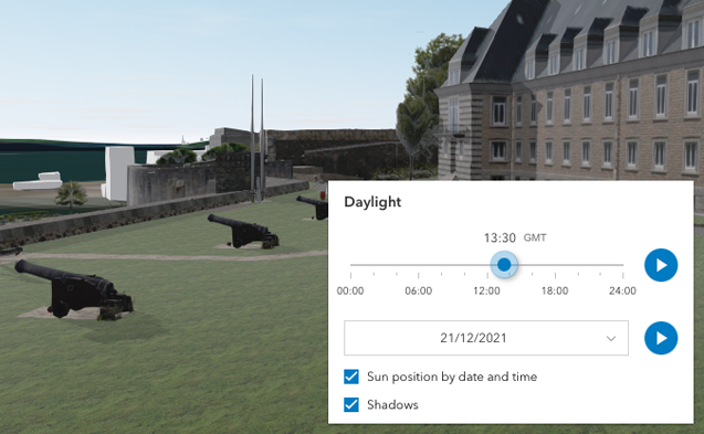
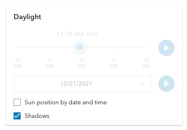
The daytime slider has an option to select the timezone. When the user makes any adjustments here, a new time
in the chosen timezone is calculated and displayed in the slider. The timezone selector can be disabled
by setting timezone to false in the visibleElements property.
By default a calendar is displayed where the user can select the day, month and year. With the dateOrSeason property, the calendar can be replaced with a dropdown menu where a season can be selected instead:
const daylight = new Daylight({ view: view, dateOrSeason: "season"});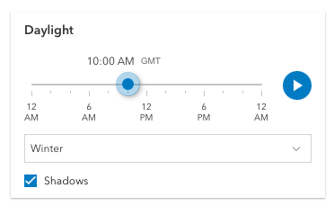
There are two play buttons, one corresponds to the daytime slider and it animates the time as it cycles through the minutes of the day. The second button corresponds to the date picker and it animates the time as it cycles through the months of the year. The speed of the animation can be set using the playSpeedMultiplier property.
const daylight = new Daylight({ view: view, playSpeedMultiplier: 2});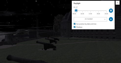
Except for the daytime slider, all the elements in the daylight widget can be hidden by using the visibleElements property:
const daylight = new Daylight({ view: view, visibleElements: { timezone: false, datePicker: false, playButtons: false, sunLightingToggle: false, shadowsToggle: false }});With these settings, the widget looks like this:
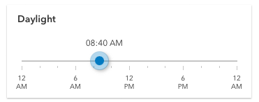
Whenever the sun position option is unchecked, the scene applies the virtual light source relative to the camera. With this, the widget's time slider and date picker get automatically disabled:
Known limitations:
The Daylight widget uses UTC time and does not account for the daylight savings times in different countries and regions of the world.
When the SceneView.environment.lighting is of the type virtual, setting the time and date does not have an influence on the lighting conditions of the scene.
Example
// basic usage of the daylight widget using the default settingsconst daylight = new Daylight({ view: view});view.ui.add(daylight, "top-right");Constructors
Constructor
Parameters
| Parameter | Type | Description | Required |
|---|---|---|---|
| properties | | |
Example
// Typical usageconst daylightWidget = new Daylight({  view: view});
view.ui.add(daylightWidget, "top-right");
Properties
| Property | Type | Class |
|---|---|---|
container inherited | HTMLElement | null | undefined | |
| | ||
declaredClass readonly inherited | ||
destroyed readonly inherited | ||
| | ||
Icon["icon"] | | |
id inherited | ||
| | ||
| | ||
| | ||
| | ||
| | ||
visible inherited | ||
| |
container
- Type
- HTMLElement | null | undefined
The ID or node representing the DOM element containing the widget. This property can only be set once. The following examples are all valid use case when working with widgets.
Examples
// Create the HTML div element programmatically at runtime and set to the widget's containerconst basemapGallery = new BasemapGallery({  view: view,  container: document.createElement("div")});
// Add the widget to the top-right corner of the viewview.ui.add(basemapGallery, {  position: "top-right"});
// Specify an already-defined HTML div element in the widget's container
const basemapGallery = new BasemapGallery({ view: view, container: basemapGalleryDiv});
// Add the widget to the top-right corner of the viewview.ui.add(basemapGallery, { position: "top-right"});
// HTML markup<body> <div id="viewDiv"></div> <div id="basemapGalleryDiv"></div></body>// Specify the widget while adding to the view's UIconst basemapGallery = new BasemapGallery({ view: view});
// Add the widget to the top-right corner of the viewview.ui.add(basemapGallery, { position: "top-right"}); dateOrSeason
- Type
- DateOrSeason
Controls whether the widget displays a date or a season picker. When the date picker is set, the user selects the date from a calendar. The season picker allows the user to choose a season from a drop-down list. Each season uses a fixed date corresponding to the equinoxes and solstices of 2014.
- Default value
- "date"
Example
// set the season pickerdaylightWidget.dateOrSeason = "season"; headingLevel
- Type
- HeadingLevel
- Since
- ArcGIS Maps SDK for JavaScript 4.20
Indicates the heading level to use for the widget title. By default, the title is rendered
as a level 3 heading (e.g. <h3>Daylight</h3>). Depending on the widget's placement
in your app, you may need to adjust this heading for proper semantics. This is
important for meeting accessibility standards.
- See also
- Default value
- 3
Example
daylight.headingLevel = 2; icon
- Type
- Icon["icon"]
- Since
- ArcGIS Maps SDK for JavaScript 4.27
Icon which represents the widget. It is typically used when the widget is controlled by another one (e.g. in the Expand widget).
- Default value
- "brightness"
playSpeedMultiplier
- Type
- number
Controls the speed of the daytime animation.
- Default value
- 1.0
Example
// Plays the daylight animation at half of the default speeddaylightWidget.playSpeedMultiplier = 0.5; timeSliderSteps
- Since
- ArcGIS Maps SDK for JavaScript 4.16
Sets steps, or intervals, on the time slider to restrict the times
of the day that can be selected when dragging the thumb. All values are in
minutes, where 0 is midnight and 23 * 60 + 59 is just before midnight
the following day.
If an array of numbers is passed to this property, the slider thumbs may only be moved to the times specified in the array.
If a single number is set, then steps are set for the entire day at an
interval of timeSliderSteps minutes. For example, if a value of 60 is
set here, dragging the slider will allow selecting each of 24 hours of the day.
- Default value
- 5
Examples
// set steps at an interval of 60. So the// slider thumb snaps at each hour of the day.daylightWidget.timeSliderSteps = 60;// Set steps at specific times.daylightWidget.timeSliderSteps = [60, 100, 120, 160]; viewModel
- Type
- DaylightViewModel
The view model for the Daylight widget. This is a class that contains all the logic (properties and methods) that controls this widget's behavior. See the DaylightViewModel class.
visible
- Type
- boolean
Indicates whether the widget is visible.
If false, the widget will no longer be rendered in the web document. This may affect the layout of other elements or widgets in the document. For example, if this widget is
the first of three widgets associated to the upper right hand corner of the DefaultUI, then the other widgets will reposition when this widget is made invisible.
For more information, refer to the css display value of "none".
- Default value
- true
Example
// Hides the widget in the viewwidget.visible = false; visibleElements
- Type
- VisibleElements
This property provides the ability to display or hide the individual elements of the widget.
Play buttons, sun lighting toggle, shadow toggle button, date picker, and timezone selector can be displayed or hidden by setting their
corresponding properties to true or false. By default, all the elements are displayed.
Example
// display all elements, except the shadow toggle buttondaylightWidget.visibleElements.shadowsToggle = false;
// disable all elementsdaylightWidget.visibleElements = {  header: false,  playButtons: false,  datePicker: false,  timezone: false,  sunLightingToggle: false,  shadowsToggle: false};
Methods
| Method | Signature | Class |
|---|---|---|
classes inherited | classes(...classNames: ((string | null | undefined) | ((string[] | Record<string, boolean>) | null | undefined) | false | null | undefined)[]): string | |
destroy inherited | destroy(): void | |
emit inherited | emit<Type extends EventNames<this>>(type: Type, event?: this["@eventTypes"][Type]): boolean | |
hasEventListener inherited | hasEventListener<Type extends EventNames<this>>(type: Type): boolean | |
isFulfilled inherited | isFulfilled(): boolean | |
isRejected inherited | isRejected(): boolean | |
isResolved inherited | isResolved(): boolean | |
on inherited | on<Type extends EventNames<this>>(type: Type, listener: EventedCallback<this["@eventTypes"][Type]>): ResourceHandle | |
postInitialize inherited | postInitialize(): void | |
render inherited | render(): any | null | |
renderNow inherited | renderNow(): void | |
scheduleRender inherited | scheduleRender(): void | |
when inherited | when<TResult1 = this, TResult2 = never>(onFulfilled?: OnFulfilledCallback<this, TResult1> | null | undefined, onRejected?: OnRejectedCallback<TResult2> | null | undefined): Promise<TResult1 | TResult2> |
classes
- Signature
-
classes (...classNames: ((string | null | undefined) | ((string[] | Record<string, boolean>) | null | undefined) | false | null | undefined)[]): string
A utility method used for building the value for a widget's class property.
This aids in simplifying css class setup.
Parameters
- Returns
- string
The computed class name.
Example
// .tsx syntax showing how to set css classes while rendering the widget
render() {  const dynamicClasses = {    [css.flip]: this.flip,    [css.primary]: this.primary  };
return ( <div class={classes(css.root, css.mixin, dynamicClasses)} /> );} emit
- Signature
-
emit <Type extends EventNames<this>>(type: Type, event?: this["@eventTypes"][Type]): boolean
- Type parameters
- <Type extends EventNames<this>>
Emits an event on the instance. This method should only be used when creating subclasses of this class.
hasEventListener
- Signature
-
hasEventListener <Type extends EventNames<this>>(type: Type): boolean
- Type parameters
- <Type extends EventNames<this>>
Indicates whether there is an event listener on the instance that matches the provided event name.
Parameters
| Parameter | Type | Description | Required |
|---|---|---|---|
| type | Type | The name of the event. | |
- Returns
- boolean
Returns true if the class supports the input event.
isFulfilled
- Signature
-
isFulfilled (): boolean
isFulfilled() may be used to verify if creating an instance of the class is fulfilled (either resolved or rejected).
If it is fulfilled, true will be returned.
- Returns
- boolean
Indicates whether creating an instance of the class has been fulfilled (either resolved or rejected).
isRejected
- Signature
-
isRejected (): boolean
isRejected() may be used to verify if creating an instance of the class is rejected.
If it is rejected, true will be returned.
- Returns
- boolean
Indicates whether creating an instance of the class has been rejected.
isResolved
- Signature
-
isResolved (): boolean
isResolved() may be used to verify if creating an instance of the class is resolved.
If it is resolved, true will be returned.
- Returns
- boolean
Indicates whether creating an instance of the class has been resolved.
on
- Signature
-
on <Type extends EventNames<this>>(type: Type, listener: EventedCallback<this["@eventTypes"][Type]>): ResourceHandle
- Type parameters
- <Type extends EventNames<this>>
Registers an event handler on the instance. Call this method to hook an event with a listener.
Parameters
| Parameter | Type | Description | Required |
|---|---|---|---|
| type | Type | An event or an array of events to listen for. | |
| listener | EventedCallback<this["@eventTypes"][Type]> | The function to call when the event fires. | |
- Returns
- ResourceHandle
Returns an event handler with a
remove()method that should be called to stop listening for the event(s).Property Type Description remove Function When called, removes the listener from the event.
Example
view.on("click", function(event){ // event is the event handle returned after the event fires. console.log(event.mapPoint);}); when
- Signature
-
when <TResult1 = this, TResult2 = never>(onFulfilled?: OnFulfilledCallback<this, TResult1> | null | undefined, onRejected?: OnRejectedCallback<TResult2> | null | undefined): Promise<TResult1 | TResult2>
when() may be leveraged once an instance of the class is created. This method takes two input parameters: an onFulfilled function and an onRejected function.
The onFulfilled executes when the instance of the class loads. The
onRejected executes if the instance of the class fails to load.
Parameters
| Parameter | Type | Description | Required |
|---|---|---|---|
| onFulfilled | OnFulfilledCallback<this, TResult1> | null | undefined | The function to call when the promise resolves. | |
| onRejected | The function to execute when the promise fails. | |
- Returns
- Promise<TResult1 | TResult2>
Returns a new promise for the result of
onFulfilledthat may be used to chain additional functions.
Example
// Although this example uses MapView, any class instance that is a promise may use when() in the same waylet view = new MapView();view.when(function(){ // This function will execute once the promise is resolved}, function(error){ // This function will execute if the promise is rejected due to an error});Events
| Name | Type |
|---|---|
user-date-time-change inherited |
user-date-time-change
user-date-time-change: CustomEvent<Record<never, never>> - Since
- ArcGIS Maps SDK for JavaScript 4.33
Fires when the user changes the date or time in the widget by interacting with the slider, the date picker, the season selector or the play buttons.