import RelationshipColumn from "@arcgis/core/widgets/FeatureTable/RelationshipColumn.js";const RelationshipColumn = await $arcgis.import("@arcgis/core/widgets/FeatureTable/RelationshipColumn.js");- Since
- ArcGIS Maps SDK for JavaScript 4.30
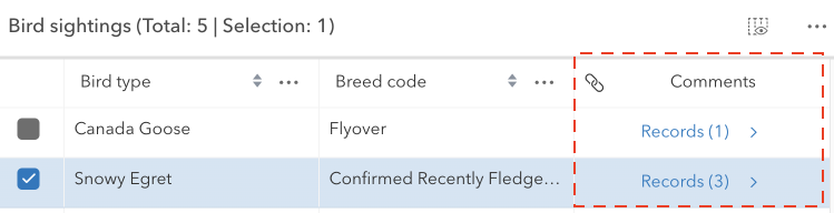
The RelationshipColumn class works with the FeatureTable to display any associated related records for each feature in the table. This column will only be displayed if the related layer or table is also added to the map. If a feature has related records and the table is configured to enable related records, the count of related records is displayed in the cell. Whereas the cell is empty if the feature does not have related records. This column is always appended to the end of the table.
This class should be used for observing potential changes. It is designed primarily to read and not interact directly with the relationship columns.
Constructors
Constructor
Parameters
| Parameter | Type | Description | Required |
|---|---|---|---|
| properties | | |
Properties
| Property | Type | Class |
|---|---|---|
autoWidth inherited | ||
| | ||
declaredClass readonly inherited | ||
description inherited | ||
direction inherited | ||
effectiveDescription readonly inherited | ||
effectiveLabel readonly | | |
fieldName readonly inherited | ||
flexGrow inherited | ||
formatFunction readonly inherited | ||
frozen readonly inherited | ||
frozenToEnd readonly inherited | ||
hidden inherited | ||
Icon["icon"] | | |
iconText inherited | ||
initialSortPriority readonly inherited | ||
invalid inherited | ||
label inherited | ||
labelTooltipText inherited | ||
layer readonly | | |
menu readonly inherited | ||
menuConfig readonly inherited | ||
menuIsOpen readonly inherited | ||
menuIsVisible readonly inherited | ||
originRelationship readonly | | |
relatedLayer readonly | | |
relationship readonly | | |
relationshipId readonly | | |
resizable readonly | | |
sortable inherited | ||
tableTimeZone readonly inherited | ||
textAlign readonly | | |
textWrap inherited | ||
timeZone inherited | ||
visibleElements inherited | ||
| |
collapsed
- Type
- boolean
Indicates whether the column displays collapsed. If collapsed, the header will always display as empty.
- Default value
- false
direction
- Type
- Direction
Controls the sort order of the column. This property will only be honored on one column in the FeatureTable widget. If direction is specified on more than one column in the same FeatureTable, it will only be honored on the column with the highest index.
This is used in combination with the initialSortPriority and FeatureTable.multiSortEnabled properties to set sorting functionality for multiple columns.
| Possible Value | Description |
|---|---|
| asc | Sorts the column in ascending order. |
| desc | Sorts the column in descending order. |
| null | No sort is applied to the column. |
effectiveDescription
- Since
- ArcGIS Maps SDK for JavaScript 4.31
The sanitized description string, describing the purpose of each column.
effectiveLabel
- Type
- string
The sanitized label displayed within the FeatureTable header for the relationship column. If the label is not provided, the name of the relationship is used. If the relationship name is not provided, the title of the related layer is used.
formatFunction
- Type
- FormatFunction | null | undefined
Custom function for rendering cell content that is called when the column is rendered in the table. The function should return the formatted content to display within a table's cell. This can be a string, number, an HTML element, or equivalent node type (e.g. a Calcite component). If the content is an HTML element, it is appended to the root element. If the content is a string or number, it is set as the innerHTML of the root element. If the content is null, the root element is cleared. If the content is undefined, the root element is not modified. This property is useful when you want to customize the cell content. For example, you can use this property to create a custom cell renderer that displays a progress bar in the cell. The progress bar can be used to show the progress of a task.
Example
// The following example demonstrates how to use the formatFunction property to create a custom cell renderer that displays a progress bar in the cell. The progress bar can be used to show the progress of a task.column.formatFunction = ({ column, feature, index, value })=> { const progress = document.createElement("progress"); progress.max = 100; progress.value = value; return progress;}; icon
- Type
- Icon["icon"]
The Calcite Icon displayed within the FeatureTable header for the attachments column.
- Default value
- "link"
iconText
- Since
- ArcGIS Maps SDK for JavaScript 4.32
The string value displayed when hovering over the associated icon displayed in the header cell of the column. When a value is not provied, the column label is displayed instead. A value for 'icon' must also be set on the column.
- See also
layer
- Type
- FeatureLayer | SceneLayer
The layer that contains the features being displayed in the table.
menu
- Type
- HTMLElement
The element representing the field column's menu.
menuConfig
- Type
- ColumnTableMenuConfig | null | undefined
Configuration options for the column's menu.
originRelationship
- Type
- Relationship | null | undefined
Returns the Relationship of the relatedLayer to find a relationship that has the same id as the relationshipId.
relatedLayer
- Type
- FeatureLayer | SceneLayer
The layer that contains the related features being displayed in the table.
relationship
- Type
- Relationship | null | undefined
Returns the first relationship from layer's relationships that matches the relationshipId.
resizable
- Type
- boolean
Indicates whether the relationship column can be resized. This is always set to true.
- Default value
- true
tableTimeZone
- Since
- ArcGIS Maps SDK for JavaScript 4.31
The FeatureTable.timeZone of the parent table widget.
textAlign
- Type
- TextAlign
The text alignment of the relationship column.
- Default value
- "center"
textWrap
- Type
- boolean
Indicates cell content should be wrapped and displayed on multiple lines within the cell. Warning: this causes rows to expand when tall content is visible in the viewport. Scrolling tall cells into the viewport may cause the table to visually jump depending on the height of the expanding rows.
- Default value
- false
visibleElements
- Type
- VisibleElements | null | undefined
The visible elements of the column's associated FeatureTable.