import Features from "@arcgis/core/widgets/Features.js";const Features = await $arcgis.import("@arcgis/core/widgets/Features.js");- Since
- ArcGIS Maps SDK for JavaScript 4.27
The Features widget allows users to view a feature's popupTemplate content such as attributes, actions, related records, etc., without having to be tied to the View. This widget looks and behaves similarly to the Popup widget, however unlike Popup, the Features widget can be placed outside of the view. For example, when features are selected in the View, the Popup widget opens within the View whether it is docked or anchored to the selected feature. With the Features widget, the same information that popup provides is shown in a separate container from the view, such as a HTML div within a Calcite Design System Shell Panel.
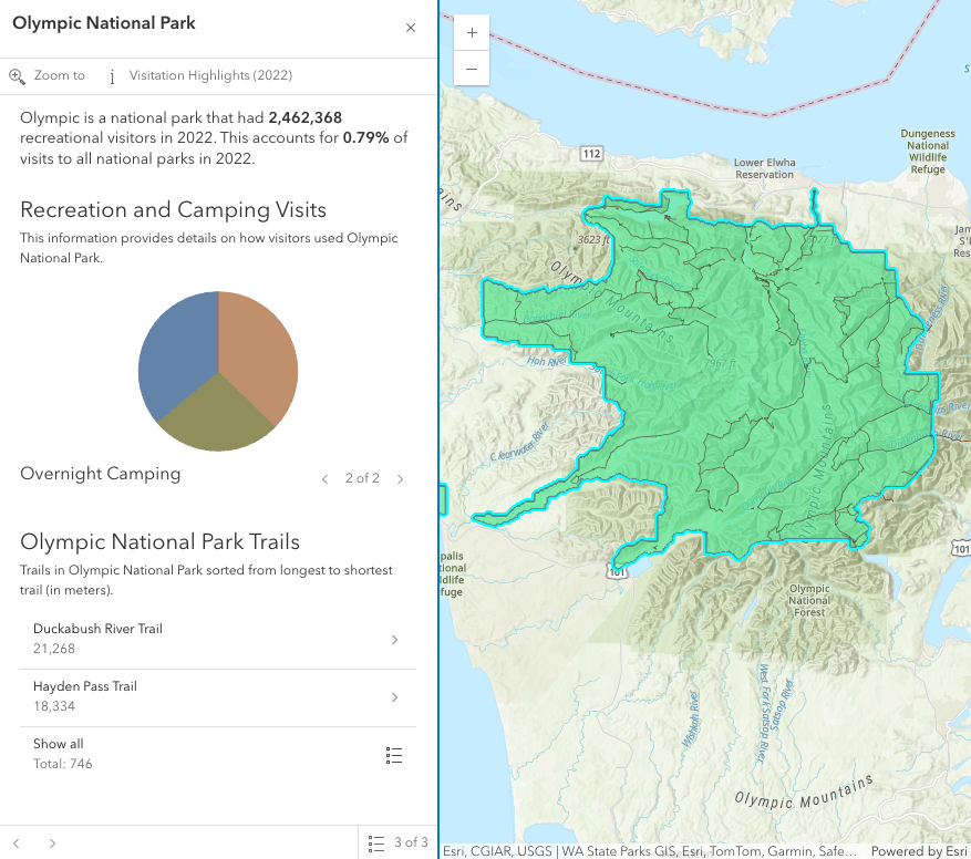
In the image above, a Calcite shell panel displays the Features widget along with a MapView in a separate div.
A generic title and content property can be set directly on the Features widget or
each individual layer's PopupTemplate can be displayed (e.g.
the Olympic National Park feature's PopupTemplate that contains text, media, and relationship elements).
The action bar, shown below the title in the image above, displays actions that can be defined either on the widget level within the open() method,
with the FeaturesViewModel.actions property, or in the PopupTemplate of the layer.
If multiple features are passed into the Features widget, the widget provides buttons to page though the features and a feature menu that allows the
list of features to be displayed so the user can choose which feature content to display in the widget. The widget also respects
feature reduction PopupTemplates for binning and clustering.
The Features widget should be used if needing to use the Popup functionality outside of the View. If wanting to show a single feature's content without actions, related records, clustering configuration, etc., then use the Feature widget.
Examples
// Create a new instance of Features and set this on the View's// popup. When features are selected in the map, the Features widget// will automatically open in its respective container.const view = new MapView({ container: "viewDiv", map: map, popup: new Features({ container: "features-widget" })});// Create a new instance of Features and set the view property// to the View along with the container that holds the widget// such as a Calcite Shell Panel.const featuresWidget = new Features({ view: view, container: "features-widget"});
// Use reactiveUtils to watch for when the view has a click event// then open the Features widget in its respective container.reactiveUtils.on(()=> view, "click",(event)=>{ featuresWidget.open({ location: event.mapPoint, fetchFeatures: true })});Constructors
Constructor
Parameters
| Parameter | Type | Description | Required |
|---|---|---|---|
| properties | | |
Properties
| Property | Type | Class |
|---|---|---|
active readonly | | |
| | ||
container inherited | HTMLElement | null | undefined | |
FeaturesViewModel["content"] | | |
declaredClass readonly inherited | ||
destroyed readonly inherited | ||
| | ||
Graphic[] | | |
| | ||
| | ||
| | ||
icon inherited | ||
id inherited | ||
| | ||
| | ||
| | ||
| | ||
selectedDrillInFeature readonly | | |
selectedFeature readonly | | |
| | ||
selectedFeatureWidget readonly | | |
| | ||
| | ||
| | ||
| | ||
| | ||
| | ||
| |
active
- Type
- boolean
- Since
- ArcGIS Maps SDK for JavaScript 4.30
Indicates if the widget is active when it is visible and is not waiting for results.
- Default value
- false
collapsed
- Type
- boolean
Indicates whether the popup displays its content. If true, only the header displays.
- Default value
- false
container
- Type
- HTMLElement | null | undefined
The ID or node representing the DOM element containing the widget. This property can only be set once. The following examples are all valid use case when working with widgets.
Examples
// Create the HTML div element programmatically at runtime and set to the widget's containerconst basemapGallery = new BasemapGallery({  view: view,  container: document.createElement("div")});
// Add the widget to the top-right corner of the viewview.ui.add(basemapGallery, {  position: "top-right"});
// Specify an already-defined HTML div element in the widget's container
const basemapGallery = new BasemapGallery({ view: view, container: basemapGalleryDiv});
// Add the widget to the top-right corner of the viewview.ui.add(basemapGallery, { position: "top-right"});
// HTML markup<body> <div id="viewDiv"></div> <div id="basemapGalleryDiv"></div></body>// Specify the widget while adding to the view's UIconst basemapGallery = new BasemapGallery({ view: view});
// Add the widget to the top-right corner of the viewview.ui.add(basemapGallery, { position: "top-right"}); content
- Type
- FeaturesViewModel["content"]
The content of the Features widget. When set directly on the Popup, this content is static and cannot use fields to set content templates. To set a template for the content based on field or attribute names, see PopupTemplate.content.
Example
// This sets generic instructions in the widget that will always be displayed// unless it is overridden by a PopupTemplatefeaturesWidget.content = "Click a feature on the map to view its attributes"; featureNavigationTop
- Type
- boolean
- Since
- ArcGIS Maps SDK for JavaScript 4.32
Indicates whether the feature navigation arrows are displayed at the top of the widget. By default, the navigation arrows are displayed at the bottom of the widget.
- Default value
- false
features
- Type
- Graphic[]
An array of features associated with the Features widget. Each graphic in this array must
have a valid PopupTemplate set. They may share the same
PopupTemplate or have unique
PopupTemplates depending on their attributes.
The content and title
of the widget is set based on the content and title properties of each graphic's respective
PopupTemplate.
When more than one graphic exists in this array, the current content of the Features widget is set based on the value of the selected feature.
This value is null if no features are associated with the widget.
Example
// When setting the features property, the graphics pushed to this property// must have a PopupTemplate set.let g1 = new Graphic();g1.popupTemplate = new PopupTemplate({ title: "Results title", content: "Results: {ATTRIBUTE_NAME}"});// Set the graphics as an array to the Features widget instance. The content and title of// the widget will be set depending on the PopupTemplate of the graphics.// Each graphic may share the same PopupTemplate or have a unique PopupTemplatelet graphics = [g1, g2, g3, g4, g5];const featuresWidget = new Features({ container: "features-widget", features: graphics visible: true}); goToOverride
- Type
- GoToOverride | null | undefined
This function provides the ability to override either the MapView goTo() or SceneView goTo() methods.
- See also
Example
// The following snippet uses Search but can be applied to any// widgets that support the goToOverride property.search.goToOverride = function(view, goToParams) { goToParams.options = { duration: updatedDuration }; return view.goTo(goToParams.target, goToParams.options);}; headerActions
- Type
- Collection<ActionBase>
- Since
- ArcGIS Maps SDK for JavaScript 4.32
The actions that are displayed in the header of the widget.
headingLevel
- Type
- HeadingLevel
Indicates the heading level to use for the title of the widget.
By default, the title is rendered
as a level 2 heading (e.g. <h2>Popup title</h2>). Depending on the widget's placement
in your app, you may need to adjust this heading for proper semantics. This is
important for meeting accessibility standards.
- Default value
- 2
icon
Icon which represents the widget. It is typically used when the widget is controlled by another one (e.g. in the Expand widget).
- See also
map
- Since
- ArcGIS Maps SDK for JavaScript 4.30
A map is required when the input features have a popupTemplate that contains Arcade expressions in ExpressionInfo or ExpressionContent that may use the $map profile variable to access data from layers within a map. Without a map, expressions that use $map will throw an error.
Alternatively, the view property can be used to provide the map instance for this property.
Example
// The building footprints represent the buildings that intersect a clicked parcellet buildingFootprints = Intersects($feature, FeatureSetByName($map, "Building Footprints")); selectedDrillInFeature
- Since
- ArcGIS Maps SDK for JavaScript 4.32
The feature that the widget has drilled into. This feature is either associated with the selected feature in a relationship element or utility network association element.
selectedFeature
The selected feature accessed by the Features widget. The content displayed in the widget is determined based on the PopupTemplate assigned to this feature.
spatialReference
- Type
- SpatialReference | null | undefined
- Since
- ArcGIS Maps SDK for JavaScript 4.30
The spatial reference used for Arcade operations. This property should be set if the Features widget executes Arcade expressions that contain geometry functions.
Alternatively, the view property can be used to provide the spatial reference instance for this property.
timeZone
- Type
- TimeZone
- Since
- ArcGIS Maps SDK for JavaScript 4.30
Dates and times displayed in the widget will be displayed in this time zone. By default this time zone is
inherited from MapView.timeZone if the view property is set. When a MapView is not associated with the widget
then the property will fallback to the system time zone.
Possible Values
| Value | Description |
|---|---|
| system | Dates and times will be displayed in the timezone of the device or browser. |
| unknown | Dates and time are not adjusted for any timezone. |
| Specified IANA timezone | Dates and times will be displayed in the specified IANA time zone. See wikipedia - List of tz database time zones. |
title
The title of the Features widget. This can be set to any string value no matter the features that are selected. If the selected feature has a PopupTemplate, then the title set in the corresponding template is used here.
- See also
Example
// This title will display in the widget unless a selected feature's// PopupTemplate overrides it.featuresWidget.title = "Population by zip codes in Southern California"; view
- Type
- MapViewOrSceneView | null | undefined
A reference to the MapView or SceneView. Set this to link the widget to a specific view.
The Features widget requires a view if:
- The features have a popupTemplate containing Arcade expressions in ExpressionInfo or ExpressionContent that may use geometry functions or reference the
$mapprofile variable (i.e. access data from layers within a map). Alternatively, set the map property. - Content is displayed from the popup template of an aggregate feature (i.e. a cluster or bin).
- Values from
dateandtimestamp-offsetfields should respect the view's time zone. Alternatively, set the timeZone property. - Using the fetchFeatures() method or the
fetchFeaturesoption in the open() method. - Using the
Zoom todefault action. If theviewis not specified, set the FeaturesViewModel.includeDefaultActions property tofalseto remove this default action.
viewModel
- Type
- FeaturesViewModel
This is a class that contains all the logic (properties and methods) that controls this widget's behavior. See the FeaturesViewModel class to access all properties and methods on the widget.
visible
- Type
- boolean
Indicates whether the widget is visible.
Example
// Hides the widget in the viewwidget.visible = false; visibleElements
The visible elements that are displayed within the widget. This provides the ability to turn individual elements of the widget's display on/off.
Methods
| Method | Signature | Class |
|---|---|---|
blur(): void | | |
classes inherited | classes(...classNames: ((string | null | undefined) | ((string[] | Record<string, boolean>) | null | undefined) | false | null | undefined)[]): string | |
clear(): void | | |
close(): void | | |
destroy inherited | destroy(): void | |
emit inherited | emit<Type extends EventNames<this>>(type: Type, event?: this["@eventTypes"][Type]): boolean | |
fetchFeatures(screenPoint: ScreenPoint, options?: FetchFeaturesOptions): Promise<FetchPopupFeaturesResult> | | |
focus(): void | | |
hasEventListener inherited | hasEventListener<Type extends EventNames<this>>(type: Type): boolean | |
isFulfilled inherited | isFulfilled(): boolean | |
isRejected inherited | isRejected(): boolean | |
isResolved inherited | isResolved(): boolean | |
next(): FeaturesViewModel | | |
on inherited | on<Type extends EventNames<this>>(type: Type, listener: EventedCallback<this["@eventTypes"][Type]>): ResourceHandle | |
open(options?: FeaturesOpenOptions): void | | |
postInitialize inherited | postInitialize(): void | |
previous(): FeaturesViewModel | | |
render inherited | render(): any | null | |
renderNow inherited | renderNow(): void | |
scheduleRender inherited | scheduleRender(): void | |
triggerAction(actionIndex: number): void | | |
when inherited | when<TResult1 = this, TResult2 = never>(onFulfilled?: OnFulfilledCallback<this, TResult1> | null | undefined, onRejected?: OnRejectedCallback<TResult2> | null | undefined): Promise<TResult1 | TResult2> |
classes
- Signature
-
classes (...classNames: ((string | null | undefined) | ((string[] | Record<string, boolean>) | null | undefined) | false | null | undefined)[]): string
A utility method used for building the value for a widget's class property.
This aids in simplifying css class setup.
Parameters
- Returns
- string
The computed class name.
Example
// .tsx syntax showing how to set css classes while rendering the widget
render() {  const dynamicClasses = {    [css.flip]: this.flip,    [css.primary]: this.primary  };
return ( <div class={classes(css.root, css.mixin, dynamicClasses)} /> );} emit
- Signature
-
emit <Type extends EventNames<this>>(type: Type, event?: this["@eventTypes"][Type]): boolean
- Type parameters
- <Type extends EventNames<this>>
Emits an event on the instance. This method should only be used when creating subclasses of this class.
fetchFeatures
- Signature
-
fetchFeatures (screenPoint: ScreenPoint, options?: FetchFeaturesOptions): Promise<FetchPopupFeaturesResult>
Use this method to return feature(s) at a given screen location. These features are fetched from all of the layer views in the View. In order to use this, a layer must already have an associated PopupTemplate. This method allows a developer to control how the input location is handled.
Parameters
| Parameter | Type | Description | Required |
|---|---|---|---|
| screenPoint | An object representing a point on the screen. This point can be in either the ScreenPoint or ScreenPoint. | | |
| options | The options
to pass into the | |
- Returns
- Promise<FetchPopupFeaturesResult>
Resolves with the selected
hitTestlocation. In addition, it also returns an array of graphics if thehitTestis performed directly on the View, a single Promise containing an array of all resulting graphics, or an array of objects containing this array of resulting graphics in addition to its associated LayerView.Most commonly if accessing all features, use the single promise returned in the result's allGraphicsPromise and call
.then()as seen in the example snippet.
Example
// Use reactiveUtils to watch the view's click event.reactiveUtils.on(() => view, "click",(event) => { // Call fetchFeatures and pass in the click event screenPoint featuresWidget.fetchFeatures(event.screenPoint).then((response) => { // Access the response from fetchFeatures response.allGraphicsPromise.then((graphics) => { // If there are no graphics in the click event, then make sure // the Features widget is not showing. if(graphics.length === 0){ featuresWidget.visible = false; } // If graphics do exist, set the Features widget features property to the returned // graphics from fetchFeatures and set the visible property to true. else{ featuresWidget.features = graphics; featuresWidget.visible = true; } }); }); focus
- Signature
-
focus (): void
Use this method to give focus to the Widget if the widget is able to be focused.
- Returns
- void
hasEventListener
- Signature
-
hasEventListener <Type extends EventNames<this>>(type: Type): boolean
- Type parameters
- <Type extends EventNames<this>>
Indicates whether there is an event listener on the instance that matches the provided event name.
Parameters
| Parameter | Type | Description | Required |
|---|---|---|---|
| type | Type | The name of the event. | |
- Returns
- boolean
Returns true if the class supports the input event.
isFulfilled
- Signature
-
isFulfilled (): boolean
isFulfilled() may be used to verify if creating an instance of the class is fulfilled (either resolved or rejected).
If it is fulfilled, true will be returned.
- Returns
- boolean
Indicates whether creating an instance of the class has been fulfilled (either resolved or rejected).
isRejected
- Signature
-
isRejected (): boolean
isRejected() may be used to verify if creating an instance of the class is rejected.
If it is rejected, true will be returned.
- Returns
- boolean
Indicates whether creating an instance of the class has been rejected.
isResolved
- Signature
-
isResolved (): boolean
isResolved() may be used to verify if creating an instance of the class is resolved.
If it is resolved, true will be returned.
- Returns
- boolean
Indicates whether creating an instance of the class has been resolved.
next
- Signature
-
next (): FeaturesViewModel
Selects the feature at the next index in relation to the selected feature.
- See also
- Returns
- FeaturesViewModel
Returns an instance of the popup's view model.
on
- Signature
-
on <Type extends EventNames<this>>(type: Type, listener: EventedCallback<this["@eventTypes"][Type]>): ResourceHandle
- Type parameters
- <Type extends EventNames<this>>
Registers an event handler on the instance. Call this method to hook an event with a listener.
Parameters
| Parameter | Type | Description | Required |
|---|---|---|---|
| type | Type | An event or an array of events to listen for. | |
| listener | EventedCallback<this["@eventTypes"][Type]> | The function to call when the event fires. | |
- Returns
- ResourceHandle
Returns an event handler with a
remove()method that should be called to stop listening for the event(s).Property Type Description remove Function When called, removes the listener from the event.
Example
view.on("click", function(event){ // event is the event handle returned after the event fires. console.log(event.mapPoint);}); open
- Signature
-
open (options?: FeaturesOpenOptions): void
Opens the Features widget in its container with content defined either explicitly with content
or driven from the PopupTemplate of input features. This method sets
the Feature widget's visible property to true. Users can alternatively show the Features widget
by directly setting the visible property to true.
- See also
Parameters
| Parameter | Type | Description | Required |
|---|---|---|---|
| options | Defines the content of the Feature's widget when opened. | |
- Returns
- void
Examples
// Use reactiveUtils to watch the view's click event.reactiveUtils.on(() => view, "click",(event) => { featuresWidget.open({ // Title and content displayed in the widget title: `Click location: (${event.mapPoint.x},${event.mapPoint.y})`, content: "This is the default content displayed on click." });});// The Features widget must have a view set on the widget along with the// location property to fetch features.// Use reactiveUtils to watch the view's click event.reactiveUtils.on(() => view, "click",(event) => { featuresWidget.open({ location: event.mapPoint, // Display the content for the selected feature(s) if a popupTemplate is defined. fetchFeatures: true });});// Open the Features widget with a specified array of graphics that already// have a PopupTemplate set and display the feature menu when it opens.featuresWidget.open({ // array of graphics features: graphics, // selected features initially display in a list featureMenuOpen: true}); previous
- Signature
-
previous (): FeaturesViewModel
Selects the feature at the previous index in relation to the selected feature.
- See also
- Returns
- FeaturesViewModel
Returns an instance of the Features widget view model.
triggerAction
- Signature
-
triggerAction (actionIndex: number): void
Triggers the @trigger-action event and executes the action at the specified index in the FeaturesViewModel.actions array.
when
- Signature
-
when <TResult1 = this, TResult2 = never>(onFulfilled?: OnFulfilledCallback<this, TResult1> | null | undefined, onRejected?: OnRejectedCallback<TResult2> | null | undefined): Promise<TResult1 | TResult2>
when() may be leveraged once an instance of the class is created. This method takes two input parameters: an onFulfilled function and an onRejected function.
The onFulfilled executes when the instance of the class loads. The
onRejected executes if the instance of the class fails to load.
Parameters
| Parameter | Type | Description | Required |
|---|---|---|---|
| onFulfilled | OnFulfilledCallback<this, TResult1> | null | undefined | The function to call when the promise resolves. | |
| onRejected | The function to execute when the promise fails. | |
- Returns
- Promise<TResult1 | TResult2>
Returns a new promise for the result of
onFulfilledthat may be used to chain additional functions.
Example
// Although this example uses MapView, any class instance that is a promise may use when() in the same waylet view = new MapView();view.when(function(){ // This function will execute once the promise is resolved}, function(error){ // This function will execute if the promise is rejected due to an error});Events
| Name | Type |
|---|---|
trigger-action inherited |
trigger-action
trigger-action: CustomEvent<ActionEvent> Fires after the user clicks on an action or action toggle in the action bar. This event may be used to define a custom function to execute when particular actions are clicked. See the example below for details of how this works.
Examples
featuresWidget.open({  location: event.mapPoint,  fetchFeatures: true,  featureMenuOpen: true,  actions: [{    // This text is displayed as a tooltip    title: "Zoom out",    // The ID used to reference this action in the event handler    id: "zoom-out",    // Sets the icon font used to style the action button    className: "esri-icon-zoom-out-magnifying-glass"  },  {    title: "Delete Feature",    id: "delete-feature-action",    icon: "trash"  }]});
// Fires each time an action is clickedreactiveUtils.on(()=> featuresWidget, "trigger-action", (event)=>{  // If the zoom-out action is clicked, execute the following code  if(event.action.id === "zoom-out"){    // Zoom out two levels (LODs)    view.goTo({      center: view.center,      zoom: view.zoom - 2    });  }});
// Defines an action button to zoom out from the selected featureconst zoomOutAction = { type: "button", // This text is displayed as a tooltip title: "Zoom out", // The ID by which to reference the action in the event handler id: "zoom-out", // Sets the icon used to style the action button icon: "magnifying-glass-minus"};// Adds the custom action to the popup.view.popup.actions.push(zoomOutAction);
// This event fires for each click on any actionreactiveUtils.on(()=>view.popup?.viewModel, "trigger-action", (event)=>{ // If the zoom-out action is clicked, fire the zoomOut() function if(event.action.id === "zoom-out"){ // in this case the view zooms out two LODs on each click view.goTo({ center: view.center, zoom: view.zoom - 2 }); }});// Defines an action button to zoom out from the selected featureconst zoomOutAction = { type: "button", // This text is displayed as a tooltip title: "Zoom out", // The ID by which to reference the action in the event handler id: "zoom-out", // Sets the icon used to style the action button icon: "magnifying-glass-minus"};// Adds the custom action to the popup.view.popup.actions.push(zoomOutAction);
// This event fires for each click on any actionreactiveUtils.on(()=>view.popup?.popupViewModel, "trigger-action", (event)=>{ // If the zoom-out action is clicked, fire the zoomOut() function if(event.action.id === "zoom-out"){ // in this case the view zooms out two LODs on each click view.goTo({ center: view.center, zoom: view.zoom - 2 }); }});Type definitions
FeaturesOpenOptions
- Supertypes
- Partial<Pick<PopupOpenOptions, "actions" | "collapsed" | "content" | "features" | "fetchFeatures" | "featureMenuOpen" | "featureMenuTitle" | "location" | "promises" | "title" | "updateLocationEnabled">>