import TimeSlider from "@arcgis/core/widgets/TimeSlider.js";const TimeSlider = await $arcgis.import("@arcgis/core/widgets/TimeSlider.js");- Since
- ArcGIS Maps SDK for JavaScript 4.12
The TimeSlider widget simplifies visualization of temporal data in your application. Before adding the TimeSlider to your application, you first should understand how it can be configured to correctly display your temporal data.
The fullTimeExtent property defines the entire time period within which you can visualize your time aware data using the TimeSlider widget. You can visualize temporal data up to a point in time, from a point in time, at an instant of time, or from data that falls within a time range by setting the mode property. The stops property defines specific locations on the TimeSlider where thumbs will snap to when manipulated. You can set this property to be either an array of dates, a number of evenly spaced stops or a specific time interval (e.g. days). The timeExtent property defines the current location of the thumbs.
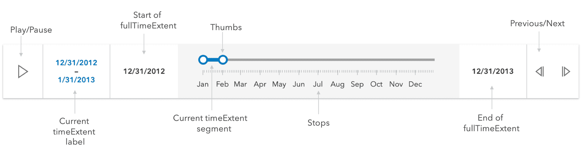
If the time slider widget settings are invalid, the current time segment and thumbs will be drawn in a red color with a message indicating the issue.

Configuring your time aware data
The TimeSlider widget can be configured to manipulate your time aware data in two different ways as outlined below:
Update the view's timeExtent
The TimeSlider widget can be configured to update the view's View.timeExtent
when the view property is set on the widget. Use this approach if your service has been published with timeInfo information.
This approach requires less code.
Read More
With this approach, whenever a TimeSlider's timeExtent is updated, the assigned view's View.timeExtent will also be updated. All time-aware layers will automatically update to conform to the view's timeExtent. Check out the Set time properties on data (ArcGIS Pro) and Configure time settings on a layer (ArcGIS Online) documents to learn how to enable time on your service.
// Create a TimeSlider for the first decade of the 21st century.// set the TimeSlider's view property.// Only show content for the 1st year of the decade for all// time aware layers in the view.const timeSlider = new TimeSlider({ container: "timeSliderDiv", view: view, // show data within a given time range // in this case data within one year mode: "time-window", fullTimeExtent: { // entire extent of the timeSlider start: new Date(2000, 0, 1), end: new Date(2010, 0, 1) }, timeExtent: { // location of timeSlider thumbs start: new Date(2000, 0, 1), end: new Date(2001, 1, 1) }});view.ui.add(timeSlider, "manual");Watch TimeSlider's timeExtent
The TimeSlider widget can also be configured to apply a custom logic whenever the TimeSlider's timeExtent property changes. This approach can be used if your service has a date field but does not have time enabled. You can also use this approach if you want to have a complete control over the logic whenever the timeSlider's timeExtent updates.
Read More
For example, when the TimeSlider's timeExtent is updated, you may want to update the timeExtent property of client-side filters and feature effects on a FeatureLayerView, CSVLayerView, GeoJSONLayerView or OGCFeatureLayerView as well as other layer views that support filters and feature effects. A FeatureFilter can be used to filter out data that is not included in the current timeExtent, and a FeatureEffect can be used to apply a visual effect to features that are included in or excluded from the current timeExtent. The FeatureEffect can only be used in a 2D MapView.
Warning: When watching the timeExtent property, the view should not be set on the TimeSlider widget instance. Setting both the TimeSlider's view property (explained above) and applying a timeExtent to a client-side feature effect may result in excluded features not being rendered to the view. This is because excluded features have been filtered out by the view's timeExtent, so the effect will not show.
// Create a time slider to update layerView filterconst timeSlider = new TimeSlider({  container: "timeSliderDiv",  mode: "cumulative-from-start",});view.ui.add(timeSlider, "manual");
// wait until the layer view is loadedlet timeLayerView;view.whenLayerView(layer).then((layerView) => {  timeLayerView = layerView;  const fullTimeExtent = layer.timeInfo.fullTimeExtent;  const end = fullTimeExtent.start;
  // set up time slider properties based on layer timeInfo  timeSlider.fullTimeExtent = fullTimeExtent;  timeSlider.timeExtent = {    start: null,    end: end  };  timeSlider.stops = {    interval: layer.timeInfo.interval  };});
reactiveUtils.watch(  () => timeSlider.timeExtent,  (value) => {    // update layer view filter to reflect current timeExtent    timeLayerView.filter = {      timeExtent: value    };  });
Set TimeSlider widget from a WebMap
The TimeSlider settings can be imported from a WebMap and applied to the TimeSlider widget by calling the getTimeSliderSettingsFromWebDocument() utility method.
Read More
For example, the following snippet shows how a WebMap with TimeSlider settings can be loaded into a view.
// this webmap is saved with TimeSlider settingsconst webmap = new WebMap({  portalItem: {    id: "your-webmap-id"  }});
// set the TimeSlider widget to honor the TimeSlider settings from the webmap.timeUtils.getTimeSliderSettingsFromWebDocument(webmap).then((timeSliderSettings) => {  const timeSlider = new TimeSlider({    ...timeSliderSettings,    view  });
  const { unit, value } = timeSlider.stops.interval;  console.log(`The stop interval is every ${value} ${unit}.`); // output: "This stop interval is every 3 weeks."});
In the example above, the timeSlider definition in the
webmap has a play rate (or thumbMovingRate) of 2 seconds. The following snippet overrides this setting.
const timeSlider = new TimeSlider({ ...timeSliderSettings, view, playRate: 1000});console.log(`The playback rate is ${timeSlider.playRate} ms.`); // output: "The playback rate is 1000 ms."It may be necessary to examine or adjust settings after they have been imported from a webmap. To determine when the
import has completed you can watch for the ready TimeSliderViewModel.state
of the viewModel. The snippet expands or snaps the fullTimeExtent after the property
has been computed from an associated webmap.
await reactiveUtils.whenOnce(() => timeSlider.viewModel.state === "ready");timeSlider.fullTimeExtent = timeSlider.fullTimeExtent.expandTo("years");- See also
Constructors
Constructor
Parameters
| Parameter | Type | Description | Required |
|---|---|---|---|
| properties | | |
Properties
| Property | Type | Class |
|---|---|---|
| | ||
container inherited | HTMLElement | null | undefined | |
declaredClass readonly inherited | ||
destroyed readonly inherited | ||
| | ||
effectiveStops readonly | | |
TimeExtent | null | undefined | | |
Icon["icon"] | | |
id inherited | ||
| | ||
| | ||
| | ||
| | ||
| | ||
| | ||
| | ||
TickConfig[] | null | undefined | | |
TimeExtent | null | undefined | | |
| | ||
| | ||
| | ||
| | ||
visible inherited |
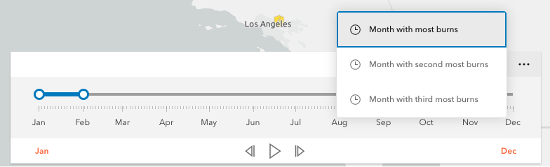
actions
- Type
- Collection
- Since
- ArcGIS Maps SDK for JavaScript 4.21
Defines actions that will appear in a menu when the user clicks the ellipsis button
 in the widget. The
ellipsis button will not display if this property is
in the widget. The
ellipsis button will not display if this property is null or if the collection is empty.
Each Action is defined with a unique id, a title,
and an icon.
The @trigger-action event fires each time an action in the menu is clicked. This event can be used to execute custom code such as setting the timeExtent to a specific date or copying the timeExtent to the browser's clipboard.
- See also
Example
// Create a TimeSlider with two actions to snap the thumb to// two specific time extents.const timeSlider = new TimeSlider({  container: "timeSliderDiv",  fullTimeExtent: {    start: new Date(2011, 0, 1),    end: new Date(2012, 0, 1)  },  mode: "instant",  actions: [    {      id: "quake",      icon: "exclamation-mark-triangle",      title: "Jump to Earthquake"    },    {      id: "quake-plus-one-month",      icon: "organization",      title: "One month later"    }  ]});
// listen to timeSlider's trigger-action event// check what action user clicked on and respond accordingly.timeSlider.on("trigger-action", (event) => {  const quake = new Date(Date.UTC(2011, 3, 11, 8, 16, 12));  const oneMonthLater = new Date(quake.getTime()).setMonth(quake.getMonth() + 1);  switch(event.action.id) {    case "quake":      timeSlider.timeExtent = {        start: quake,        end: quake      };      break;    case "quake-plus-one-month":      timeSlider.timeExtent = {        start: oneMonthLater,        end: oneMonthLater      };      break;  }});
container
- Type
- HTMLElement | null | undefined
The ID or node representing the DOM element containing the widget. This property can only be set once. The following examples are all valid use case when working with widgets.
Examples
// Create the HTML div element programmatically at runtime and set to the widget's containerconst basemapGallery = new BasemapGallery({  view: view,  container: document.createElement("div")});
// Add the widget to the top-right corner of the viewview.ui.add(basemapGallery, {  position: "top-right"});
// Specify an already-defined HTML div element in the widget's container
const basemapGallery = new BasemapGallery({ view: view, container: basemapGalleryDiv});
// Add the widget to the top-right corner of the viewview.ui.add(basemapGallery, { position: "top-right"});
// HTML markup<body> <div id="viewDiv"></div> <div id="basemapGalleryDiv"></div></body>// Specify the widget while adding to the view's UIconst basemapGallery = new BasemapGallery({ view: view});
// Add the widget to the top-right corner of the viewview.ui.add(basemapGallery, { position: "top-right"}); disabled
- Type
- boolean
- Since
- ArcGIS Maps SDK for JavaScript 4.16
When true, sets the widget to a disabled state so the user cannot interact with it.
- Default value
- false
Example
// Create a timeslider widget that is initially disabled.const timeSlider = new TimeSlider({ container: "timeSliderDiv", fullTimeExtent: { start: new Date(2000, 5, 1), end: new Date(2010, 0, 1) }, disabled: true}); fullTimeExtent
- Type
- TimeExtent | null | undefined
The temporal extent of the entire slider. It defines the entire time period within which you can visualize your time aware data using the time slider widget.
Example
// Create a new TimeSlider with set datesconst timeSlider = new TimeSlider({  container: "timeSliderDiv",  view: view});
// wait for the time-aware layer to loadlayer.when(() => {  // set up time slider properties based on layer timeInfo  timeSlider.fullTimeExtent = layer.timeInfo.fullTimeExtent;  timeSlider.stops = {   interval: layer.timeInfo.interval  };});
icon
- Type
- Icon["icon"]
- Since
- ArcGIS Maps SDK for JavaScript 4.27
Icon which represents the widget. It is typically used when the widget is controlled by another one (e.g. in the Expand widget).
- Default value
- "clock"
labelFormatFunction
- Type
- DateLabelFormatter | null | undefined
- Since
- ArcGIS Maps SDK for JavaScript 4.17
A function used to specify custom formatting and styling of the min, max, and extent labels of the TimeSlider. Please refer to DateLabelFormatter for more detailed information on how to configure the style and format of the labels.
The image below demonstrates how the date format, color, size, and font family of the label can be customized. The code for this specific configuration is shown in the following example.

Example
// The following example customizes the text and styling of the min, max and extent labels.// Specifically:// 1) min/max labels//    - short date format with en-us locale (e.g. "9/1/2020", "9/2/2020", "9/3/2020" etc)//    - use 'Orbitron' font, magenta color and 16pt size// 2) extent label//    - display accumulated days (e.g. "Day 0", "Day 1", "Day 2" etc)//    - use 'Orbitron' font, red color and 22pt size// The labelFormatFunction must wait until the time slider's properties are set.// In this case, the function must wait until the time slider's fullTimeExtent is set.const timeSlider = new TimeSlider({  container: "timeSlider",  view,  timeVisible: true,  loop: true,  labelFormatFunction: (value, type, element, layout) => {    if (!timeSlider.fullTimeExtent) {      element.setAttribute(        "style",        "font-family: 'Orbitron', sans-serif; font-size: 11px; color: black;"      );      element.innerText = "loading..."      return;
    const normal = new Intl.DateTimeFormat("en-us");    switch (type) {      case "min":      case "max":        element.setAttribute(          "style",          "font-family: 'Orbitron', sans-serif; font-size: 16px; color: magenta;"        );        element.innerText = normal.format(value);        break;      case "extent":        const start = timeSlider.fullTimeExtent.start;        const days = (value[0].getTime() - start.getTime()) / 1000 / 3600 / 24;        element.setAttribute(          "style",          "font-family: 'Orbitron', sans-serif; font-size: 18px; color: red;"        );        element.innerText = `Day ${days}`;        break;    }  }});
layout
- Type
- TimeSliderLayout
- Since
- ArcGIS Maps SDK for JavaScript 4.16
Determines the layout used by the TimeSlider widget.
Possible values are listed below:
| Value | Description |
|---|---|
| auto | Automatically uses the "compact" layout when the widget width is less than 858 pixels. Otherwise the "wide" layout it used. |
| compact | Widget elements are oriented vertically. This layout is better suited to narrower widths. |
| wide | Widget elements are oriented laterally. This thinner design is better suited to wide applications. |
- Default value
- "auto"
Example
timeSlider.layout = "compact"; loop
- Type
- boolean
When true, the time slider will play its animation in a loop.
- Default value
- false
Example
// Start a time slider animation that advances every second// and restarts when it reaches the end.timeSlider.set({ loop: true, playRate: 1000});timeSlider.play(); mode
- Type
- TimeSliderMode
The time slider mode. This property is used for defining if the temporal data will be displayed cumulatively up to a point in time, a single instant in time, or within a time range. See the following table for possible values.
| Possible Values | Description | Example |
|---|---|---|
| instant | The slider will show temporal data that falls on a single instance in time. Set the timeExtent property's start and end dates to same date: {start: sameDate, end: sameDate} |  |
| time-window | The slider will show temporal data that falls within a given time range. This is the default. Set timeExtent property's start and date properties to desired dates. |  |
| cumulative-from-start | Similar to time-window with the start time is always pinned to the start of the slider. Set the timeExtent property's start date to null and set end date to a desired date: {start: null, end: date} | 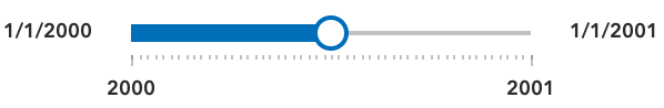 |
| cumulative-from-end | Also, similar to the time-window with the end time pinned to the end of the slider. Set the timeExtent property's start date to a desired date and set end date to null: {start: date, end: null} | 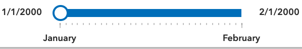 |
- See also
- Default value
- "time-window"
Example
// Create a single thumbed time slider that includes all historic content.const timeSlider = new TimeSlider({ container: "timeSliderDiv", view: view, mode: "cumulative-from-start", fullTimeExtent: { start: new Date(2000, 0, 1), end: new Date(2010, 0, 1) }, timeExtent: { start: null, end: new Date(2001, 0, 1) //end date }}); playRate
- Type
- number
The time (in milliseconds) between animation steps.
When a View is associated with a TimeSlider and the TimeSlider is playing, the playback will pause before advancing if the View is still updating.
For example, if the playRate is set to 1,000 (one second) and the View takes 1.5 seconds to render then the TimeSlider thumb(s) will advance every
1.5 seconds rather than every second.
- Default value
- 1000
Example
// Start a time slider animation that advances// ten times a second and stops when it reaches the end.timeSlider.set({ loop: false, playRate: 100});timeSlider.play(); stops
Defines specific locations on the time slider where thumbs will snap to when manipulated. If unspecified, ten evenly spaced stops will be added.
For continuous sliding, set stops to null:
timeSlider.stops = null;To define regularly spaced stops, parse an object with interval and timeExtent properties
with types TimeInterval and TimeExtent respectively.
The timeExtent property is optional and used to confine stops to a certain date range.
This property is useful to commence stops on a specific day of the week or month.
If a stop definition by interval results in excess of 10,000 stops, then the view model
will default to ten evenly spaced stops.
// Add yearly intervals starting from the beginning of the TimeSlider.timeSlider.stops = { interval: { value: 1, unit: "years" }};Rather than setting the stops as time intervals, the TimeSlider can be divided into evenly spaced
stops using the count property. Similar to the previous method, divisions can be confined to a specific date range
using the optional timeExtent property.
// Add stops at 15 evenly spaced intervals.timeSlider.stops = { count: 15};For irregularly spaced stops, simply assign an array of dates as demonstrated below.
// Add nine irregular stops.timeSlider.stops = { dates: [ new Date(2000, 0, 1), new Date(2001, 3, 8), new Date(2002, 0, 10), new Date(2003, 12, 8), new Date(2004, 2, 19), new Date(2005, 7, 5), new Date(2006, 9, 11), new Date(2007, 11, 21), new Date(2008, 1, 10) ]};Lastly, to constrain or offset division by count or interval use the optional timeExtent property.
// Add yearly stops from Christmas 2019 to Christmas 2029 onlytimeSlider.stops = {  interval: {    value: 1,    unit: "years"  },  timeExtent: {    start: new Date(2019, 11, 25),    end: new Date(2029, 11, 25)  }};
// Likewise, add stops that represent quarters of 2019 only.timeSlider.stops = { count: 4, timeExtent: { start: new Date(2019, 0, 1), end: new Date(2020, 0, 1) }};- Default value
- { count : 10 }
tickConfigs
- Type
- TickConfig[] | null | undefined
- Since
- ArcGIS Maps SDK for JavaScript 4.16
When set, overrides the default TimeSlider ticks labelling system. Please refer to TickConfig for detailed documentation on how to configure tick placement, style, and behavior.
Examples
// By default in "en-US" the TimeSlider will display ticks with "2010, 2011, 2012, etc".// Overwrite TimeSlider tick configuration so that labels display "'10, '12, '14, etc" in red.const timeSlider = new TimeSlider({ container: "timeSliderDiv", fullTimeExtent: { start: new Date(2010, 0, 1), end: new Date(2020, 0, 1) }, tickConfigs: [{ mode: "position", values: [ new Date(2010, 0, 1), new Date(2012, 0, 1), new Date(2014, 0, 1), new Date(2016, 0, 1), new Date(2018, 0, 1), new Date(2020, 0, 1) ].map((date) => date.getTime()), labelsVisible: true, labelFormatFunction: (value) => { const date = new Date(value); return `'${date.getUTCFullYear() - 2000}`; }, tickCreatedFunction: (value, tickElement, labelElement) => { tickElement.classList.add("custom-ticks"); labelElement.classList.add("custom-labels"); } }]};// this CSS goes with the snippet above.#timeSlider .custom-ticks { background-color: red; width: 1px; height: 8px;}#timeSlider .custom-labels { font-family: Georgia, 'Times New Roman', Times, serif; font-size: 15px; color: red;} timeExtent
- Type
- TimeExtent | null | undefined
The current time extent of the time slider. This property can be watched for
updates and used to update the time extent property in queries and/or the layer filters and effects.
The following table shows the timeExtent values returned for each mode.
| Mode | The timeExtent value |
|---|---|
time-window | {start: startDate, end: endDate} |
instant | {start: sameDate, end: sameDate} |
cumulative-from-start | {start: null, end: endDate} |
cumulative-from-end | {start: startDate, end: null} |
Example
// Display the time extent to the console whenever it changes.const timeSlider = new TimeSlider({  container: "timeSliderDiv",  mode: "time-window",  fullTimeExtent: {    start: new Date(2019, 2, 3),    end: new Date(2019, 2, 5)  },  timeExtent: {    start: new Date(2019, 2, 1),    end: new Date(2019, 2, 28)  }});
reactiveUtils.watch(  () => timeSlider.timeExtent,  (timeExtent) => {    console.log("Time extent now starts at", timeExtent.start, "and finishes at:", timeExtent.end);  });
timeVisible
- Type
- boolean
Shows/hides time in the display.
- Default value
- false
Example
// For time sliders with a small time extent it may be useful to display times as shown below.const timeSlider = new TimeSlider({ container: "timeSliderDiv", mode: "time-window", timeVisible: true, fullTimeExtent: { start: new Date(2019, 2, 3), end: new Date(2019, 2, 5) }, timeExtent: { start: new Date(2019, 2, 1), end: new Date(2019, 2, 28) }}); timeZone
- Type
- TimeZone
- Since
- ArcGIS Maps SDK for JavaScript 4.28
Dates and times displayed in the widget will be displayed in this time zone. By default this time zone is
inherited from MapView.timeZone. When a MapView is not associated with the widget
then the property will fallback to the system time zone.
Possible Values
| Value | Description |
|---|---|
| system | Dates and times will be displayed in the timezone of the device or browser. |
| unknown | Dates and time are not adjusted for any timezone. TimeSlider will be disabled. |
| Specified IANA timezone | Dates and times will be displayed in the specified IANA time zone. See wikipedia - List of tz database time zones. |
view
- Type
- MapViewOrSceneView | null | undefined
A reference to the MapView or SceneView. If this property is set, the TimeSlider widget will update the view's MapView.timeExtent property whenever the time slider is manipulated or updated programmatically. This property will affect any time-aware layer in the view.
Example
// Create and then add a TimeSlider widget and then listen to changes in the View's time extent.const timeSlider = new TimeSlider({  container: "timeSliderDiv",  view: view,  mode: "instant",  fullTimeExtent: {    start: new Date(2000, 0, 1),    end: new Date(2010, 0, 1)  },  timeExtent: {    start: new Date(2000, 0, 1),    end: new Date(2000, 0, 1)  }});view.ui.add(timeSlider, "top-left");
reactiveUtils.watch(  () => view.timeExtent,  (timeExtent) => {    console.log("New view time is: ", timeExtent.start);  });
viewModel
- Type
- TimeSliderViewModel
The view model for this widget. This is a class that contains all the logic (properties and methods) that controls this widget's behavior. See the TimeSliderViewModel class to access all properties and methods on the widget.
Example
// Below is an example of initializing a TimeSlider widget using properties// on the viewModel instead of the widget.const timeSlider = new TimeSlider({ container: "timeSliderDiv", viewModel: { view: view, mode: "instant", fullTimeExtent: { start: new Date(2000, 0, 1), end: new Date(2010, 0, 1) }, timeExtent: { start: new Date(2000, 0, 1), end: new Date(2000, 0, 1) }}); visible
- Type
- boolean
Indicates whether the widget is visible.
If false, the widget will no longer be rendered in the web document. This may affect the layout of other elements or widgets in the document. For example, if this widget is
the first of three widgets associated to the upper right hand corner of the DefaultUI, then the other widgets will reposition when this widget is made invisible.
For more information, refer to the css display value of "none".
- Default value
- true
Example
// Hides the widget in the viewwidget.visible = false;Methods
| Method | Signature | Class |
|---|---|---|
classes inherited | classes(...classNames: ((string | null | undefined) | ((string[] | Record<string, boolean>) | null | undefined) | false | null | undefined)[]): string | |
destroy inherited | destroy(): void | |
emit inherited | emit<Type extends EventNames<this>>(type: Type, event?: this["@eventTypes"][Type]): boolean | |
hasEventListener inherited | hasEventListener<Type extends EventNames<this>>(type: Type): boolean | |
isFulfilled inherited | isFulfilled(): boolean | |
isRejected inherited | isRejected(): boolean | |
isResolved inherited | isResolved(): boolean | |
next(): void | | |
on inherited | on<Type extends EventNames<this>>(type: Type, listener: EventedCallback<this["@eventTypes"][Type]>): ResourceHandle | |
play(): void | | |
postInitialize inherited | postInitialize(): void | |
previous(): void | | |
render inherited | render(): any | null | |
renderNow inherited | renderNow(): void | |
scheduleRender inherited | scheduleRender(): void | |
stop(): void | | |
updateWebDocument(document: WebMap | WebScene): void | | |
when inherited | when<TResult1 = this, TResult2 = never>(onFulfilled?: OnFulfilledCallback<this, TResult1> | null | undefined, onRejected?: OnRejectedCallback<TResult2> | null | undefined): Promise<TResult1 | TResult2> |
classes
- Signature
-
classes (...classNames: ((string | null | undefined) | ((string[] | Record<string, boolean>) | null | undefined) | false | null | undefined)[]): string
A utility method used for building the value for a widget's class property.
This aids in simplifying css class setup.
Parameters
- Returns
- string
The computed class name.
Example
// .tsx syntax showing how to set css classes while rendering the widget
render() {  const dynamicClasses = {    [css.flip]: this.flip,    [css.primary]: this.primary  };
return ( <div class={classes(css.root, css.mixin, dynamicClasses)} /> );} emit
- Signature
-
emit <Type extends EventNames<this>>(type: Type, event?: this["@eventTypes"][Type]): boolean
- Type parameters
- <Type extends EventNames<this>>
Emits an event on the instance. This method should only be used when creating subclasses of this class.
hasEventListener
- Signature
-
hasEventListener <Type extends EventNames<this>>(type: Type): boolean
- Type parameters
- <Type extends EventNames<this>>
Indicates whether there is an event listener on the instance that matches the provided event name.
Parameters
| Parameter | Type | Description | Required |
|---|---|---|---|
| type | Type | The name of the event. | |
- Returns
- boolean
Returns true if the class supports the input event.
isFulfilled
- Signature
-
isFulfilled (): boolean
isFulfilled() may be used to verify if creating an instance of the class is fulfilled (either resolved or rejected).
If it is fulfilled, true will be returned.
- Returns
- boolean
Indicates whether creating an instance of the class has been fulfilled (either resolved or rejected).
isRejected
- Signature
-
isRejected (): boolean
isRejected() may be used to verify if creating an instance of the class is rejected.
If it is rejected, true will be returned.
- Returns
- boolean
Indicates whether creating an instance of the class has been rejected.
isResolved
- Signature
-
isResolved (): boolean
isResolved() may be used to verify if creating an instance of the class is resolved.
If it is resolved, true will be returned.
- Returns
- boolean
Indicates whether creating an instance of the class has been resolved.
next
- Signature
-
next (): void
Incrementally moves the time extent forward one stop.
- Returns
- void
Example
// Advance the slider's time extent.const timeSlider = new TimeSlider({ container: "timeSliderDiv", mode: "instant", fullTimeExtent: { start: new Date(2000, 0, 1), end: new Date(2010, 0, 1) }, timeExtent: { start: new Date(2000, 0, 1), end: new Date(2000, 0, 1) }});timeSlider.next(); on
- Signature
-
on <Type extends EventNames<this>>(type: Type, listener: EventedCallback<this["@eventTypes"][Type]>): ResourceHandle
- Type parameters
- <Type extends EventNames<this>>
Registers an event handler on the instance. Call this method to hook an event with a listener.
Parameters
| Parameter | Type | Description | Required |
|---|---|---|---|
| type | Type | An event or an array of events to listen for. | |
| listener | EventedCallback<this["@eventTypes"][Type]> | The function to call when the event fires. | |
- Returns
- ResourceHandle
Returns an event handler with a
remove()method that should be called to stop listening for the event(s).Property Type Description remove Function When called, removes the listener from the event.
Example
view.on("click", function(event){ // event is the event handle returned after the event fires. console.log(event.mapPoint);}); play
- Signature
-
play (): void
Initiates the time slider's temporal playback.
- Returns
- void
Example
// Start a TimeSlider animation if not already playing.if (timeSlider.state === "ready") { timeSlider.play();} previous
- Signature
-
previous (): void
Incrementally moves the time extent back one stop.
- Returns
- void
Example
timeSlider.previous(); stop
- Signature
-
stop (): void
Stops the time slider's temporal playback.
- Returns
- void
Example
// Stop the current TimeSlider animation.if (timeSlider.viewModel.state === "playing") { timeSlider.stop();} updateWebDocument
- Signature
-
updateWebDocument (document: WebMap | WebScene): void
- Since
- ArcGIS Maps SDK for JavaScript 4.18
Updates the time slider widget definition in the provided WebMap or WebScene.
Parameters
- Returns
- void
Example
// Load a webmap containing a timeslider widget into a MapView. Once loaded, advance the current time// extent by one stop and then update the original webmap.
const webmap = new WebMap({  portalItem: {    id: "acea555a4b6f412dae98994bcfdbc002"  }});
const view = new MapView({  container: "viewDiv",  map: webmap});await view.when();
const timeSlider = new TimeSlider({  view});// Advance to thumb to next time extenttimeSlider.next();timeSlider.updateWebDocument(webmap);webmap.save();
when
- Signature
-
when <TResult1 = this, TResult2 = never>(onFulfilled?: OnFulfilledCallback<this, TResult1> | null | undefined, onRejected?: OnRejectedCallback<TResult2> | null | undefined): Promise<TResult1 | TResult2>
when() may be leveraged once an instance of the class is created. This method takes two input parameters: an onFulfilled function and an onRejected function.
The onFulfilled executes when the instance of the class loads. The
onRejected executes if the instance of the class fails to load.
Parameters
| Parameter | Type | Description | Required |
|---|---|---|---|
| onFulfilled | OnFulfilledCallback<this, TResult1> | null | undefined | The function to call when the promise resolves. | |
| onRejected | The function to execute when the promise fails. | |
- Returns
- Promise<TResult1 | TResult2>
Returns a new promise for the result of
onFulfilledthat may be used to chain additional functions.
Example
// Although this example uses MapView, any class instance that is a promise may use when() in the same waylet view = new MapView();view.when(function(){ // This function will execute once the promise is resolved}, function(error){ // This function will execute if the promise is rejected due to an error});Events
| Name | Type |
|---|---|
trigger-action inherited |
trigger-action
trigger-action: CustomEvent<TimeSliderViewModelTriggerActionEvent> - Since
- ArcGIS Maps SDK for JavaScript 4.21
Fires when a user clicks on an action in the actions menu.
- See also
Example
// Add an action to reset the time extent to the full time extent.timeSlider.actions.add({ id: "full-extent", icon: "content-full", title: "Full Extent"});timeSlider.on("trigger-action", (event) => { if (event.action.id === "full-extent") { timeSlider.timeExtent = timeSlider.fullTimeExtent; }});Type definitions
LabelType
The label type that you want to format.
- See also
- Type
- "min" | "max" | "extent"
DateLabelFormatter
This function is used by the labelFormatFunction property to specify custom formatting and styling of the min, max and extent labels of the time slider widget.
Parameters
| Parameter | Type | Description | Required |
|---|---|---|---|
| value | Date | [
Date,
Date
] | The date(s) that correspond to labels. When the label
type is | |
| type | The label type that you want to format. | | |
| element | The HTML element corresponding to the label type. You can add or modify the default style of individual labels by adding CSS classes to this element. You can also add custom behavior to labels by attaching event listeners to individual elements. | | |
| layout | Exclude<TimeSliderLayout, "auto"> | The TimeSlider layout. | |
- Returns
- void