import SnappingControlsVisibleElements from "@arcgis/core/widgets/support/SnappingControls/VisibleElements.js";const SnappingControlsVisibleElements = await $arcgis.import("@arcgis/core/widgets/support/SnappingControls/VisibleElements.js");- Inheritance:
- SnappingControlsVisibleElements→
Accessor
- Since
- ArcGIS Maps SDK for JavaScript 5.0
The visible elements that are displayed within the widget. This provides the ability to toggle visibility for individual elements within the widget.
Example
// Setting visibleElements on SnappingControlsconst snappingControls = new SnappingControls({ view, visibleElements: { selfEnabledToggle: false, gridControlsElements: { colorSelection: false, gridEnabledToggle: false } }});Constructors
Constructor
Parameters
| Parameter | Type | Description | Required |
|---|---|---|---|
| properties | | |
Properties
| Property | Type | Class |
|---|---|---|
declaredClass readonly inherited | ||
| | ||
| | ||
| | ||
| | ||
| | ||
| | ||
| | ||
| | ||
| |
enabledToggle
- Type
- boolean
Indicates whether to display the enabledToggle (Enable snapping). Default is true. This toggles
the SnappingOptions.enabled property.
Note
It is recommended to set SnappingControls.snappingOptions.enabled = true if enabledToggle is set to false.
This is because selfEnabledToggle and featureEnabledToggle require snapping globally to be enabled in order to be interactive. Otherwise, these toggles will not be responsive.
- Default value
- true
featureEnabledToggle
- Type
- boolean
Indicates whether to display the featureEnabledToggle (Feature to feature). Default is true. This toggles
the SnappingOptions.featureEnabled property.
- Default value
- true
gridControls
- Type
- boolean
Indicates whether to display the grid controls widget embedded in snapping controls. Default is true.
- Default value
- true
gridControlsElements
The available GridControls elements within the widget.
gridEnabledToggle
- Type
- boolean
Indicates whether to display the grid display toggle embedded in grid controls. Default is true.
- Default value
- true
header
- Type
- boolean
Indicates whether to display the header. Default is false.
- Default value
- false
layerList
- Type
- boolean
Indicates whether to display the FeatureSnappingLayerSource layerList. Default is true. The layerlist provides the available layer sources supported for snapping.
- Default value
- true
layerListToggleLayersButton
- Type
- boolean
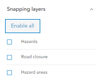
Indicates whether to display the “Enable all” or “Disable all” button to enable / disable snapping for all the layers in the list.
- Default value
- true
selfEnabledToggle
- Type
- boolean
Indicates whether to display the selfEnabledToggle (Geometry guides). Default is true. This toggles
the SnappingOptions.selfEnabled property.
- Default value
- true