import BuildingExplorer from "@arcgis/core/widgets/BuildingExplorer.js";const BuildingExplorer = await $arcgis.import("@arcgis/core/widgets/BuildingExplorer.js");- Since
- ArcGIS Maps SDK for JavaScript 4.16
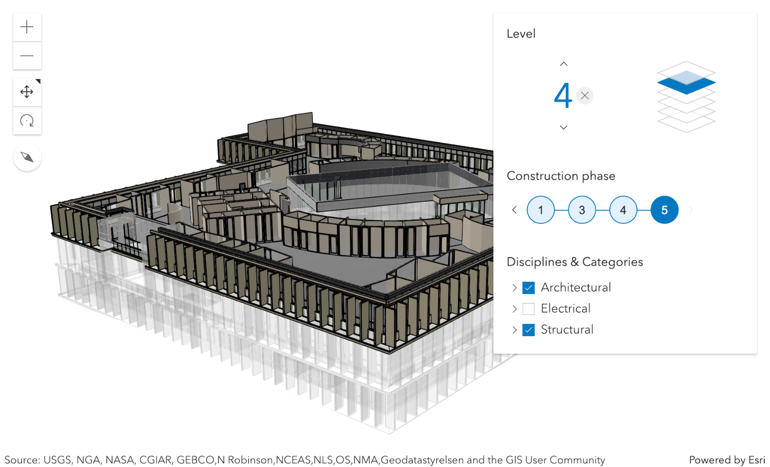
The BuildingExplorer widget is used to filter and explore the various components of BuildingSceneLayers. BuildingSceneLayers are complex digital models of buildings and interiors and can contain thousands of components grouped in sublayers. Using this widget, buildings can be filtered by level, construction phase or by disciplines and categories. Three elements are used to filter BuildingSceneLayers: the Level element, the Construction phases element and the Disciplines are Categories list. The visibility of these elements can be configured using the widget's visibleElements.
The BuildingSceneLayers to be explored have to be set on the layers property of the widget. When setting multiple layers, the filters set by the widget will be applied on all layers. The widget doesn't allow the user to select between multiple BuildingSceneLayers in a SceneView.
Often, BuildingSceneLayers contain an overview BuildingComponentSublayer that serves as an exterior shell and views the building model as a single feature. When a layer is added to the BuildingExplorer widget, the visibility of the overview layer is turned off, so that the user can interact with the individual features in the full model BuildingGroupSublayer.
The Level element of the BuildingExplorer widget allows to select a single level in one or several buildings. When selecting a level, the levels above it are hidden and the levels below it become semi-transparent for added visual context.
Some BuildingSceneLayers include information indicating the phase when the components were created, and optionally, when they were demolished. If a layer has multiple construction phases, these will be displayed in the Construction phases element. When selecting a construction phase, all the components created during or before the phase are selected. Demolished components aren't displayed.
Discipline layers are group layers that organize the BuildingSceneLayer content into architectural, structural, mechanical, or electrical groups. These layers contain a number of Category layers such as walls, windows, furniture, and lighting fixtures. These layers can be turned on and off in the Disciplines and Categories list.
The widget can only display filters set by the widget itself. Filters set by other applications will be ignored.
- See also
BuildingExplorerViewModel - Deprecated since 5.0. Use the Building Explorer component instead.
Example
const buildingExplorer = new BuildingExplorer({ view: view, layers: [buildingSceneLayer]});// adds the BuildingExplorer to the top right corner of the SceneViewview.ui.add(buildingExplorer, "top-right");Constructors
Constructor
Parameters
| Parameter | Type | Description | Required |
|---|---|---|---|
| properties | | |
Properties
| Property | Type | Class |
|---|---|---|
container inherited | HTMLElement | null | undefined | |
declaredClass readonly inherited | ||
destroyed readonly inherited | ||
| | ||
Icon["icon"] | | |
id inherited | ||
| | ||
| | ||
| | ||
| | ||
visible inherited | ||
| |
container
- Type
- HTMLElement | null | undefined
The ID or node representing the DOM element containing the widget. This property can only be set once. The following examples are all valid use case when working with widgets.
Examples
// Create the HTML div element programmatically at runtime and set to the widget's containerconst basemapGallery = new BasemapGallery({  view: view,  container: document.createElement("div")});
// Add the widget to the top-right corner of the viewview.ui.add(basemapGallery, {  position: "top-right"});
// Specify an already-defined HTML div element in the widget's container
const basemapGallery = new BasemapGallery({ view: view, container: basemapGalleryDiv});
// Add the widget to the top-right corner of the viewview.ui.add(basemapGallery, { position: "top-right"});
// HTML markup<body> <div id="viewDiv"></div> <div id="basemapGalleryDiv"></div></body>// Specify the widget while adding to the view's UIconst basemapGallery = new BasemapGallery({ view: view});
// Add the widget to the top-right corner of the viewview.ui.add(basemapGallery, { position: "top-right"}); headingLevel
- Type
- HeadingLevel
- Since
- ArcGIS Maps SDK for JavaScript 4.20
Indicates the heading level to use for the headings in the widget. By default, they are rendered
as level 3 headings (e.g. <h3>Disciplines & categories</h3>). Depending on the widget's placement
in your app, you may need to adjust this heading for proper semantics. This is
important for meeting accessibility standards.
- See also
- Default value
- 3
Example
buildingExplorer.headingLevel = 4; icon
- Type
- Icon["icon"]
- Since
- ArcGIS Maps SDK for JavaScript 4.27
Icon which represents the widget. It is typically used when the widget is controlled by another one (e.g. in the Expand widget).
- Default value
- "organization"
layers
- Type
- Collection<BuildingSceneLayer>
A Collection of layers of type BuildingSceneLayer that are added to the widget for exploration. The widget is only displayed when this property is set. In case of multiple layers, the widget will display and apply the filters on all layers.
viewModel
The view model for this widget. This is a class that contains all the logic (properties and methods) that controls this widget's behavior. See the BuildingExplorerViewModel class to access all properties and methods on the widget.
visible
- Type
- boolean
Indicates whether the widget is visible.
If false, the widget will no longer be rendered in the web document. This may affect the layout of other elements or widgets in the document. For example, if this widget is
the first of three widgets associated to the upper right hand corner of the DefaultUI, then the other widgets will reposition when this widget is made invisible.
For more information, refer to the css display value of "none".
- Default value
- true
Example
// Hides the widget in the viewwidget.visible = false; visibleElements
- Type
- VisibleElements
This property provides the ability to display or hide the individual elements of the widget. BuildingExplorer has three elements: buildings levels filter, construction phases filter and the sublayers list. By default they are all displayed. In case the BuildingSceneLayer doesn't provide field statistics information, then the filters for building levels and construction phases will not be displayed.
Example
// only display the building levels filterbuildingExplorer.visibleElements = { phases: false, disciplines: false};Methods
| Method | Signature | Class |
|---|---|---|
classes inherited | classes(...classNames: ((string | null | undefined) | ((string[] | Record<string, boolean>) | null | undefined) | false | null | undefined)[]): string | |
destroy inherited | destroy(): void | |
emit inherited | emit<Type extends EventNames<this>>(type: Type, event?: this["@eventTypes"][Type]): boolean | |
hasEventListener inherited | hasEventListener<Type extends EventNames<this>>(type: Type): boolean | |
isFulfilled inherited | isFulfilled(): boolean | |
isRejected inherited | isRejected(): boolean | |
isResolved inherited | isResolved(): boolean | |
on inherited | on<Type extends EventNames<this>>(type: Type, listener: EventedCallback<this["@eventTypes"][Type]>): ResourceHandle | |
postInitialize inherited | postInitialize(): void | |
render inherited | render(): any | null | |
renderNow inherited | renderNow(): void | |
scheduleRender inherited | scheduleRender(): void | |
when inherited | when<TResult1 = this, TResult2 = never>(onFulfilled?: OnFulfilledCallback<this, TResult1> | null | undefined, onRejected?: OnRejectedCallback<TResult2> | null | undefined): Promise<TResult1 | TResult2> |
classes
- Signature
-
classes (...classNames: ((string | null | undefined) | ((string[] | Record<string, boolean>) | null | undefined) | false | null | undefined)[]): string
A utility method used for building the value for a widget's class property.
This aids in simplifying css class setup.
Parameters
- Returns
- string
The computed class name.
Example
// .tsx syntax showing how to set css classes while rendering the widget
render() {  const dynamicClasses = {    [css.flip]: this.flip,    [css.primary]: this.primary  };
return ( <div class={classes(css.root, css.mixin, dynamicClasses)} /> );} emit
- Signature
-
emit <Type extends EventNames<this>>(type: Type, event?: this["@eventTypes"][Type]): boolean
- Type parameters
- <Type extends EventNames<this>>
Emits an event on the instance. This method should only be used when creating subclasses of this class.
hasEventListener
- Signature
-
hasEventListener <Type extends EventNames<this>>(type: Type): boolean
- Type parameters
- <Type extends EventNames<this>>
Indicates whether there is an event listener on the instance that matches the provided event name.
Parameters
| Parameter | Type | Description | Required |
|---|---|---|---|
| type | Type | The name of the event. | |
- Returns
- boolean
Returns true if the class supports the input event.
isFulfilled
- Signature
-
isFulfilled (): boolean
isFulfilled() may be used to verify if creating an instance of the class is fulfilled (either resolved or rejected).
If it is fulfilled, true will be returned.
- Returns
- boolean
Indicates whether creating an instance of the class has been fulfilled (either resolved or rejected).
isRejected
- Signature
-
isRejected (): boolean
isRejected() may be used to verify if creating an instance of the class is rejected.
If it is rejected, true will be returned.
- Returns
- boolean
Indicates whether creating an instance of the class has been rejected.
isResolved
- Signature
-
isResolved (): boolean
isResolved() may be used to verify if creating an instance of the class is resolved.
If it is resolved, true will be returned.
- Returns
- boolean
Indicates whether creating an instance of the class has been resolved.
on
- Signature
-
on <Type extends EventNames<this>>(type: Type, listener: EventedCallback<this["@eventTypes"][Type]>): ResourceHandle
- Type parameters
- <Type extends EventNames<this>>
Registers an event handler on the instance. Call this method to hook an event with a listener.
Parameters
| Parameter | Type | Description | Required |
|---|---|---|---|
| type | Type | An event or an array of events to listen for. | |
| listener | EventedCallback<this["@eventTypes"][Type]> | The function to call when the event fires. | |
- Returns
- ResourceHandle
Returns an event handler with a
remove()method that should be called to stop listening for the event(s).Property Type Description remove Function When called, removes the listener from the event.
Example
view.on("click", function(event){ // event is the event handle returned after the event fires. console.log(event.mapPoint);}); when
- Signature
-
when <TResult1 = this, TResult2 = never>(onFulfilled?: OnFulfilledCallback<this, TResult1> | null | undefined, onRejected?: OnRejectedCallback<TResult2> | null | undefined): Promise<TResult1 | TResult2>
when() may be leveraged once an instance of the class is created. This method takes two input parameters: an onFulfilled function and an onRejected function.
The onFulfilled executes when the instance of the class loads. The
onRejected executes if the instance of the class fails to load.
Parameters
| Parameter | Type | Description | Required |
|---|---|---|---|
| onFulfilled | OnFulfilledCallback<this, TResult1> | null | undefined | The function to call when the promise resolves. | |
| onRejected | The function to execute when the promise fails. | |
- Returns
- Promise<TResult1 | TResult2>
Returns a new promise for the result of
onFulfilledthat may be used to chain additional functions.
Example
// Although this example uses MapView, any class instance that is a promise may use when() in the same waylet view = new MapView();view.when(function(){ // This function will execute once the promise is resolved}, function(error){ // This function will execute if the promise is rejected due to an error});