import ShadowCast from "@arcgis/core/widgets/ShadowCast.js";const ShadowCast = await $arcgis.import("@arcgis/core/widgets/ShadowCast.js");- Since
- ArcGIS Maps SDK for JavaScript 4.21
The ShadowCast widget displays the cumulative shadows of 3D features in a SceneView. This type of analysis is helpful in urban development, where new projects have to satisfy certain shadow duration constraints.
The widget calculates the cumulative shadows for a time range during a single day. The user can configure the time range and select a calendar date. This time range and calendar date are only used for the shadow analysis and are not connected to the lighting in the scene. To control the lighting in the scene, the Daylight widget can be used. Changing the timezone in the widget updates the visualization by interpreting the time range as being in that timezone. This behavior is different than for the Daylight widget where selecting a timezone updates the scene date and time according to the camera position.
The widget provides three visualization modes.
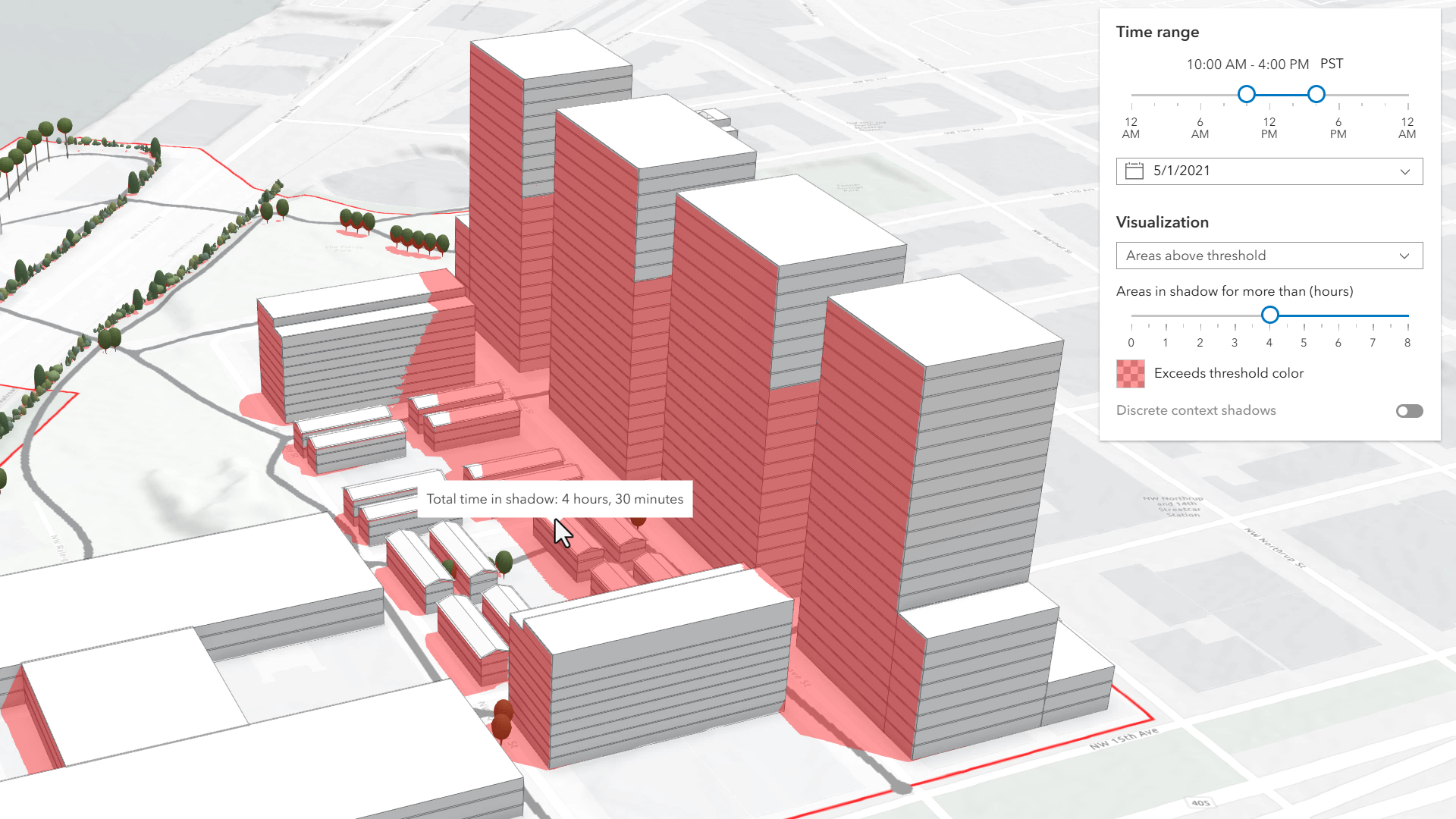
In the threshold mode, only the areas that receive shadows for more than a certain amount of time are displayed. In the image below, on May 1, 2021 the red areas receive shadow for more than 4 hours within the time interval of 10AM to 4PM.
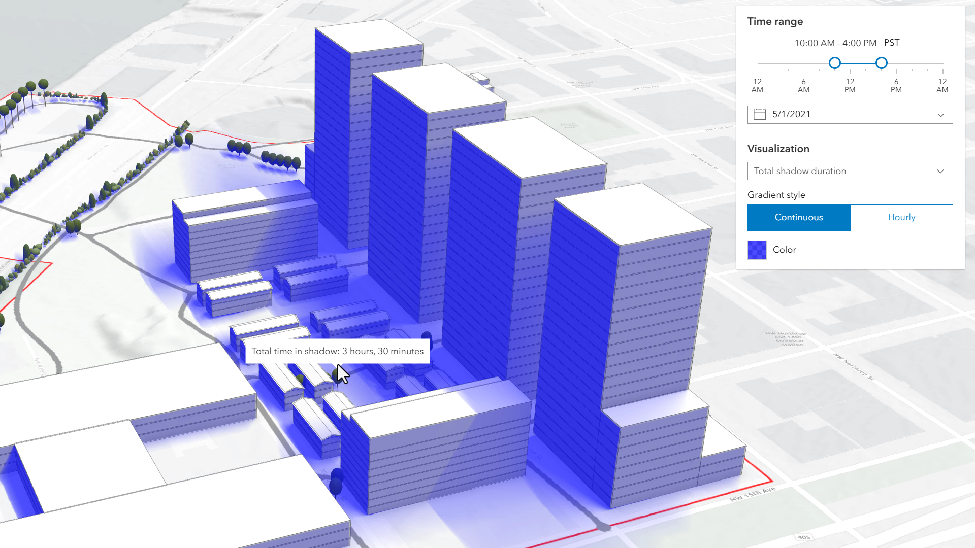
Total shadow duration mode displays the duration of the cumulative shadow using opacity: areas that don't receive any shadow are fully transparent and areas that receive a maximum amount of shadow have a default opacity of 0.7. The values in between are interpolated. Hovering over the view will display a tooltip showing the amount of time that location is in shadow, rounded to 15 minute intervals. In this mode, the visualization can display shadow cast in a continuous way or in 1 hour intervals.
Discrete shadows is a third visualization mode which displays individual shadows at a given time interval. For example, setting the time range to 10AM-11AM and the visualization time interval to 30 minutes will display shadows for 10AM, 10
and 11.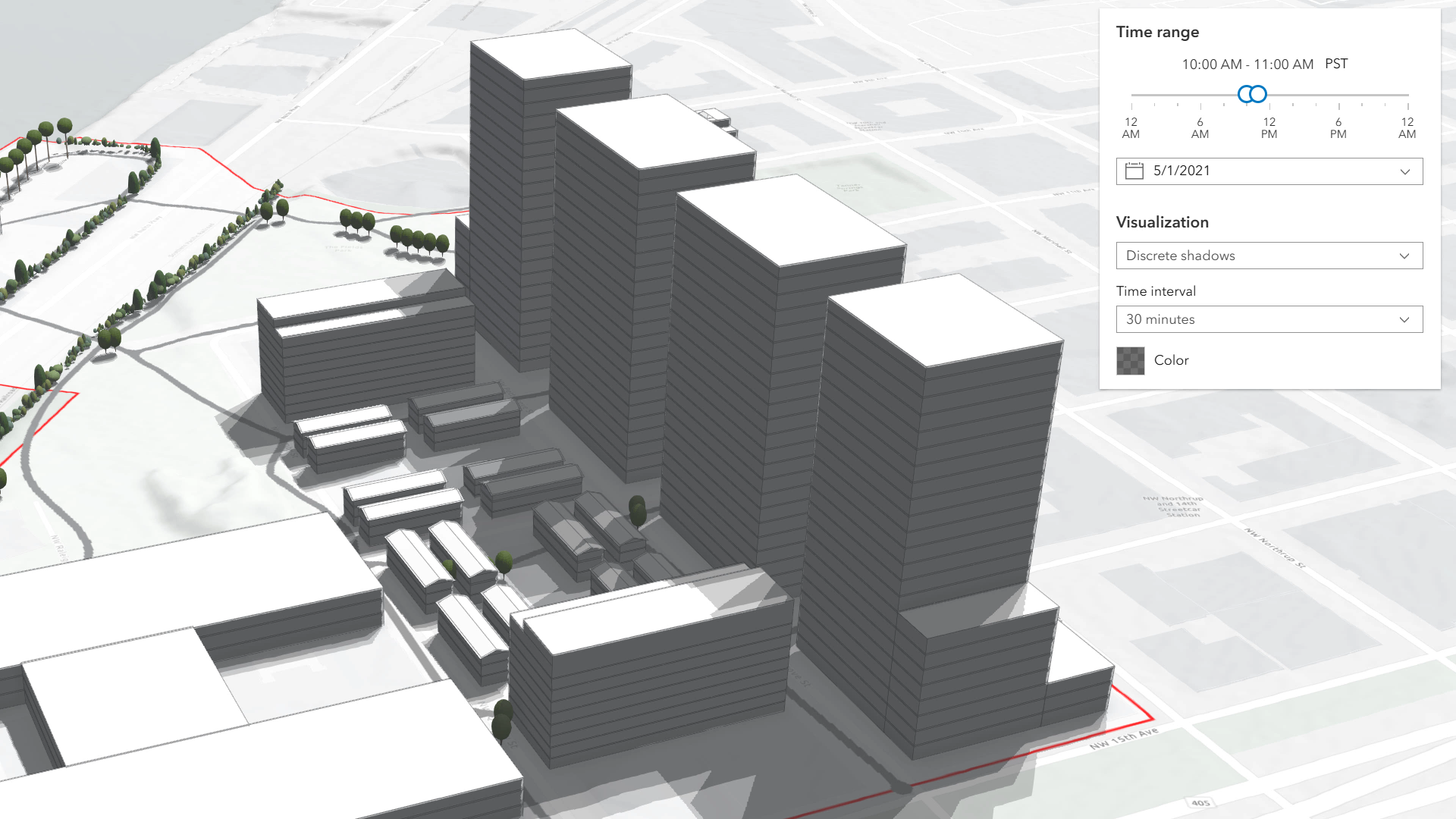
The defaults for the time range and visualization settings can be changed using the ShadowCastViewModel.
Known Limitations
Terrain does not cast shadows and it is therefore not taken into account in this analysis.
The widget does not take into account the daylight savings. Use the timezone dropdown to adjust the offset from the Coordinated Universal Time (UTC) and account for the daylight saving time.
The timezone is automatically detected by the widget based on the camera location. In some situations this might not be accurate. In case of an inaccurate timezone, users can set it manually using the timezone dropdown.
You can use the view's DefaultUI to add widgets to the view's user interface via the
ui property on the view. See the example below.
- See also
ShadowCastViewModel - Deprecated since 5.0. Use the ShadowCastAnalysis or Shadow Cast component instead.
Example
const shadowCast = new ShadowCast({ view: view});// Adds the shadow cast widget in// the top right corner of the viewview.ui.add(shadowCast, "top-right");Constructors
Constructor
Parameters
| Parameter | Type | Description | Required |
|---|---|---|---|
| properties | | |
Properties
| Property | Type | Class |
|---|---|---|
container inherited | HTMLElement | null | undefined | |
declaredClass readonly inherited | ||
destroyed readonly inherited | ||
| | ||
Icon["icon"] | | |
id inherited | ||
| | ||
| | ||
| | ||
visible inherited | ||
| |
container
- Type
- HTMLElement | null | undefined
The ID or node representing the DOM element containing the widget. This property can only be set once. The following examples are all valid use case when working with widgets.
Examples
// Create the HTML div element programmatically at runtime and set to the widget's containerconst basemapGallery = new BasemapGallery({  view: view,  container: document.createElement("div")});
// Add the widget to the top-right corner of the viewview.ui.add(basemapGallery, {  position: "top-right"});
// Specify an already-defined HTML div element in the widget's container
const basemapGallery = new BasemapGallery({ view: view, container: basemapGalleryDiv});
// Add the widget to the top-right corner of the viewview.ui.add(basemapGallery, { position: "top-right"});
// HTML markup<body> <div id="viewDiv"></div> <div id="basemapGalleryDiv"></div></body>// Specify the widget while adding to the view's UIconst basemapGallery = new BasemapGallery({ view: view});
// Add the widget to the top-right corner of the viewview.ui.add(basemapGallery, { position: "top-right"}); headingLevel
- Type
- HeadingLevel
Indicates the heading level to use for the titles "Time range" and "Visualization". By default, this message is rendered
as level 4 headings (e.g. <h4>Time range</h4>). Depending on the widget's placement
in your app, you may need to adjust this heading for proper semantics. This is
important for meeting accessibility standards.
- See also
- Default value
- 4
Example
shadowCast.headingLevel = 3; icon
- Type
- Icon["icon"]
- Since
- ArcGIS Maps SDK for JavaScript 4.27
Icon which represents the widget. It is typically used when the widget is controlled by another one (e.g. in the Expand widget).
- Default value
- "measure-building-height-shadow"
viewModel
- Type
- ShadowCastViewModel
The view model for this widget. This is a class that contains all the logic (properties and methods) that controls this widget's behavior. See the ShadowCastViewModel class to access all properties and methods on the widget.
visible
- Type
- boolean
Indicates whether the widget is visible.
If false, the widget will no longer be rendered in the web document. This may affect the layout of other elements or widgets in the document. For example, if this widget is
the first of three widgets associated to the upper right hand corner of the DefaultUI, then the other widgets will reposition when this widget is made invisible.
For more information, refer to the css display value of "none".
- Default value
- true
Example
// Hides the widget in the viewwidget.visible = false; visibleElements
This property provides the ability to display or hide the individual elements of the widget.
Example
shadowCast.visibleElements = { timeRangeSlider: true, timezone: true, datePicker: true, visualizationOptions: true, colorPicker: true, tooltip: true}Methods
| Method | Signature | Class |
|---|---|---|
classes inherited | classes(...classNames: ((string | null | undefined) | ((string[] | Record<string, boolean>) | null | undefined) | false | null | undefined)[]): string | |
destroy inherited | destroy(): void | |
emit inherited | emit<Type extends EventNames<this>>(type: Type, event?: this["@eventTypes"][Type]): boolean | |
hasEventListener inherited | hasEventListener<Type extends EventNames<this>>(type: Type): boolean | |
isFulfilled inherited | isFulfilled(): boolean | |
isRejected inherited | isRejected(): boolean | |
isResolved inherited | isResolved(): boolean | |
on inherited | on<Type extends EventNames<this>>(type: Type, listener: EventedCallback<this["@eventTypes"][Type]>): ResourceHandle | |
postInitialize inherited | postInitialize(): void | |
render inherited | render(): any | null | |
renderNow inherited | renderNow(): void | |
scheduleRender inherited | scheduleRender(): void | |
when inherited | when<TResult1 = this, TResult2 = never>(onFulfilled?: OnFulfilledCallback<this, TResult1> | null | undefined, onRejected?: OnRejectedCallback<TResult2> | null | undefined): Promise<TResult1 | TResult2> |
classes
- Signature
-
classes (...classNames: ((string | null | undefined) | ((string[] | Record<string, boolean>) | null | undefined) | false | null | undefined)[]): string
A utility method used for building the value for a widget's class property.
This aids in simplifying css class setup.
Parameters
- Returns
- string
The computed class name.
Example
// .tsx syntax showing how to set css classes while rendering the widget
render() {  const dynamicClasses = {    [css.flip]: this.flip,    [css.primary]: this.primary  };
return ( <div class={classes(css.root, css.mixin, dynamicClasses)} /> );} emit
- Signature
-
emit <Type extends EventNames<this>>(type: Type, event?: this["@eventTypes"][Type]): boolean
- Type parameters
- <Type extends EventNames<this>>
Emits an event on the instance. This method should only be used when creating subclasses of this class.
hasEventListener
- Signature
-
hasEventListener <Type extends EventNames<this>>(type: Type): boolean
- Type parameters
- <Type extends EventNames<this>>
Indicates whether there is an event listener on the instance that matches the provided event name.
Parameters
| Parameter | Type | Description | Required |
|---|---|---|---|
| type | Type | The name of the event. | |
- Returns
- boolean
Returns true if the class supports the input event.
isFulfilled
- Signature
-
isFulfilled (): boolean
isFulfilled() may be used to verify if creating an instance of the class is fulfilled (either resolved or rejected).
If it is fulfilled, true will be returned.
- Returns
- boolean
Indicates whether creating an instance of the class has been fulfilled (either resolved or rejected).
isRejected
- Signature
-
isRejected (): boolean
isRejected() may be used to verify if creating an instance of the class is rejected.
If it is rejected, true will be returned.
- Returns
- boolean
Indicates whether creating an instance of the class has been rejected.
isResolved
- Signature
-
isResolved (): boolean
isResolved() may be used to verify if creating an instance of the class is resolved.
If it is resolved, true will be returned.
- Returns
- boolean
Indicates whether creating an instance of the class has been resolved.
on
- Signature
-
on <Type extends EventNames<this>>(type: Type, listener: EventedCallback<this["@eventTypes"][Type]>): ResourceHandle
- Type parameters
- <Type extends EventNames<this>>
Registers an event handler on the instance. Call this method to hook an event with a listener.
Parameters
| Parameter | Type | Description | Required |
|---|---|---|---|
| type | Type | An event or an array of events to listen for. | |
| listener | EventedCallback<this["@eventTypes"][Type]> | The function to call when the event fires. | |
- Returns
- ResourceHandle
Returns an event handler with a
remove()method that should be called to stop listening for the event(s).Property Type Description remove Function When called, removes the listener from the event.
Example
view.on("click", function(event){ // event is the event handle returned after the event fires. console.log(event.mapPoint);}); when
- Signature
-
when <TResult1 = this, TResult2 = never>(onFulfilled?: OnFulfilledCallback<this, TResult1> | null | undefined, onRejected?: OnRejectedCallback<TResult2> | null | undefined): Promise<TResult1 | TResult2>
when() may be leveraged once an instance of the class is created. This method takes two input parameters: an onFulfilled function and an onRejected function.
The onFulfilled executes when the instance of the class loads. The
onRejected executes if the instance of the class fails to load.
Parameters
| Parameter | Type | Description | Required |
|---|---|---|---|
| onFulfilled | OnFulfilledCallback<this, TResult1> | null | undefined | The function to call when the promise resolves. | |
| onRejected | The function to execute when the promise fails. | |
- Returns
- Promise<TResult1 | TResult2>
Returns a new promise for the result of
onFulfilledthat may be used to chain additional functions.
Example
// Although this example uses MapView, any class instance that is a promise may use when() in the same waylet view = new MapView();view.when(function(){ // This function will execute once the promise is resolved}, function(error){ // This function will execute if the promise is rejected due to an error});