import SnappingControls from "@arcgis/core/widgets/support/SnappingControls.js";const SnappingControls = await $arcgis.import("@arcgis/core/widgets/support/SnappingControls.js");- Inheritance:
- SnappingControls→
Widget<SnappingControlsProperties>→ Accessor
- Since
- ArcGIS Maps SDK for JavaScript 4.21
Overview
The SnappingControls widget provides a user interface to use alongside the SnappingOptions class. SnappingOptions is a property in Sketch.snappingOptions, SketchViewModel.snappingOptions, Editor.snappingOptions, and EditorViewModel.snappingOptions.
This widget has been integrated as part of the Sketch and Editor widgets. Therefore, it will be automatically included when loading either of these widgets and no additional work is needed on the end of the developer.
Take a look at the SnappingControls in the Sketch widget with the sketch-geometries sample.
Using the widget
The SnappingControls widget can be used with the MapView or the SceneView like any other widget. However, this widget is dependent on the SnappingOptions class. Currently, this is only available as a property in the Sketch.snappingOptions and Editor.snappingOptions widgets, in addition to their respective view models. This means that the SnappingControls widget cannot be utilized as a standalone widget, unless it is being used in conjunction with these supported classes.
To use this widget with the Editor, EditorViewModel or SketchViewModel, it must be instantiated and its snappingOptions property must be set to either the Editor's, EditorViewModel's, or SketchViewModel's snappingOptions property.
The following code snippet demonstrates how to use SnappingControls within the Editor widget.
const [Editor, SnappingControls] = await $arcgis.import([ "@arcgis/core/widgets/Editor.js", "@arcgis/core/widgets/support/SnappingControls.js"]);const editor = new Editor({ view: view});
// create a new instance of the SnappingControls widgetconst snappingControls = new SnappingControls({ view: view, snappingOptions: editor.snappingOptions // set the Editor's snappingOptions property});
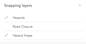
view.ui.add(editor, "top-right"); // adds the Editor widget to the viewview.ui.add(snappingControls, "top-left"); // adds the SnappingControls widget to the viewThis widget will automatically detect any layers on the Map that support snapping and the layerlist populates with these FeatureSnappingLayerSources. By default, these layers will be disabled for feature snapping. The layers will be enabled for snapping when a user clicks on the layer title in the layerlist. If there is a desire for these layers to be enabled automatically, set FeatureSnappingLayerSource.enabled as true.
Known Limitations
Layer types currently supported for snapping include: FeatureLayer, GraphicsLayer (except Mesh geometries), GeoJSONLayer, WFSLayer, CSVLayer, MapNotesLayer (2D only), 3D Object SceneLayer (3D only), and BuildingSceneLayer (3D only).
Example
// Create a new instance of SketchViewModelconst sketchViewModel = new SketchViewModel({  view: view,  layer: graphicsLayer});
// Create a new instance of the SnappingControls widgetconst snappingControls = new SnappingControls({  view: view,  snappingOptions: sketchViewModel.snappingOptions});
Constructors
Constructor
Parameters
| Parameter | Type | Description | Required |
|---|---|---|---|
| properties | | |
Properties
| Property | Type | Class |
|---|---|---|
container inherited | HTMLElement | null | undefined | |
declaredClass readonly inherited | ||
destroyed readonly inherited | ||
Icon["icon"] | | |
id inherited | ||
| | ||
| | ||
| | ||
| | ||
visible inherited | ||
| |
container
- Type
- HTMLElement | null | undefined
The ID or node representing the DOM element containing the widget. This property can only be set once. The following examples are all valid use case when working with widgets.
Examples
// Create the HTML div element programmatically at runtime and set to the widget's containerconst basemapGallery = new BasemapGallery({  view: view,  container: document.createElement("div")});
// Add the widget to the top-right corner of the viewview.ui.add(basemapGallery, {  position: "top-right"});
// Specify an already-defined HTML div element in the widget's container
const basemapGallery = new BasemapGallery({ view: view, container: basemapGalleryDiv});
// Add the widget to the top-right corner of the viewview.ui.add(basemapGallery, { position: "top-right"});
// HTML markup<body> <div id="viewDiv"></div> <div id="basemapGalleryDiv"></div></body>// Specify the widget while adding to the view's UIconst basemapGallery = new BasemapGallery({ view: view});
// Add the widget to the top-right corner of the viewview.ui.add(basemapGallery, { position: "top-right"}); icon
- Type
- Icon["icon"]
- Since
- ArcGIS Maps SDK for JavaScript 4.27
Icon which represents the widget. It is typically used when the widget is controlled by another one (e.g. in the Expand widget).
- Default value
- "snap-to-point"
snappingOptions
- Type
- SnappingOptions
The SnappingOptions for sketching. It supports self and feature snapping.
view
- Type
- MapViewOrSceneView | null | undefined
The view from which the widget will operate.
viewModel
The view model for the SnappingControls widget. This class contains all the logic, (ie. properties and methods) that control the widget's behavior. See the SnappingControlsViewModel class to access all of the properties and methods on the SnappingControls widget.
visible
- Type
- boolean
Indicates whether the widget is visible.
If false, the widget will no longer be rendered in the web document. This may affect the layout of other elements or widgets in the document. For example, if this widget is
the first of three widgets associated to the upper right hand corner of the DefaultUI, then the other widgets will reposition when this widget is made invisible.
For more information, refer to the css display value of "none".
- Default value
- true
Example
// Hides the widget in the viewwidget.visible = false; visibleElements
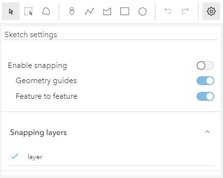
The visible elements that are displayed within the widget. This property provides the ability to turn individual elements of the widget's display on/off.
The image below displays the default SnappingControls widget with all visible elements visible.
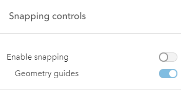
In comparison, the following image displays the widget with the feature enabled snapping toggle and the feature snapping layer source layerList turned off.
Example
// This removes the feature enabled snapping toggle and the layerlist.snappingControls.visibleElements = { featureEnabledToggle: false, layerList: false}Methods
| Method | Signature | Class |
|---|---|---|
classes inherited | classes(...classNames: ((string | null | undefined) | ((string[] | Record<string, boolean>) | null | undefined) | false | null | undefined)[]): string | |
destroy inherited | destroy(): void | |
emit inherited | emit<Type extends EventNames<this>>(type: Type, event?: this["@eventTypes"][Type]): boolean | |
hasEventListener inherited | hasEventListener<Type extends EventNames<this>>(type: Type): boolean | |
isFulfilled inherited | isFulfilled(): boolean | |
isRejected inherited | isRejected(): boolean | |
isResolved inherited | isResolved(): boolean | |
on inherited | on<Type extends EventNames<this>>(type: Type, listener: EventedCallback<this["@eventTypes"][Type]>): ResourceHandle | |
postInitialize inherited | postInitialize(): void | |
render inherited | render(): any | null | |
renderNow inherited | renderNow(): void | |
scheduleRender inherited | scheduleRender(): void | |
when inherited | when<TResult1 = this, TResult2 = never>(onFulfilled?: OnFulfilledCallback<this, TResult1> | null | undefined, onRejected?: OnRejectedCallback<TResult2> | null | undefined): Promise<TResult1 | TResult2> |
classes
- Signature
-
classes (...classNames: ((string | null | undefined) | ((string[] | Record<string, boolean>) | null | undefined) | false | null | undefined)[]): string
A utility method used for building the value for a widget's class property.
This aids in simplifying css class setup.
Parameters
- Returns
- string
The computed class name.
Example
// .tsx syntax showing how to set css classes while rendering the widget
render() {  const dynamicClasses = {    [css.flip]: this.flip,    [css.primary]: this.primary  };
return ( <div class={classes(css.root, css.mixin, dynamicClasses)} /> );} emit
- Signature
-
emit <Type extends EventNames<this>>(type: Type, event?: this["@eventTypes"][Type]): boolean
- Type parameters
- <Type extends EventNames<this>>
Emits an event on the instance. This method should only be used when creating subclasses of this class.
hasEventListener
- Signature
-
hasEventListener <Type extends EventNames<this>>(type: Type): boolean
- Type parameters
- <Type extends EventNames<this>>
Indicates whether there is an event listener on the instance that matches the provided event name.
Parameters
| Parameter | Type | Description | Required |
|---|---|---|---|
| type | Type | The name of the event. | |
- Returns
- boolean
Returns true if the class supports the input event.
isFulfilled
- Signature
-
isFulfilled (): boolean
isFulfilled() may be used to verify if creating an instance of the class is fulfilled (either resolved or rejected).
If it is fulfilled, true will be returned.
- Returns
- boolean
Indicates whether creating an instance of the class has been fulfilled (either resolved or rejected).
isRejected
- Signature
-
isRejected (): boolean
isRejected() may be used to verify if creating an instance of the class is rejected.
If it is rejected, true will be returned.
- Returns
- boolean
Indicates whether creating an instance of the class has been rejected.
isResolved
- Signature
-
isResolved (): boolean
isResolved() may be used to verify if creating an instance of the class is resolved.
If it is resolved, true will be returned.
- Returns
- boolean
Indicates whether creating an instance of the class has been resolved.
on
- Signature
-
on <Type extends EventNames<this>>(type: Type, listener: EventedCallback<this["@eventTypes"][Type]>): ResourceHandle
- Type parameters
- <Type extends EventNames<this>>
Registers an event handler on the instance. Call this method to hook an event with a listener.
Parameters
| Parameter | Type | Description | Required |
|---|---|---|---|
| type | Type | An event or an array of events to listen for. | |
| listener | EventedCallback<this["@eventTypes"][Type]> | The function to call when the event fires. | |
- Returns
- ResourceHandle
Returns an event handler with a
remove()method that should be called to stop listening for the event(s).Property Type Description remove Function When called, removes the listener from the event.
Example
view.on("click", function(event){ // event is the event handle returned after the event fires. console.log(event.mapPoint);}); when
- Signature
-
when <TResult1 = this, TResult2 = never>(onFulfilled?: OnFulfilledCallback<this, TResult1> | null | undefined, onRejected?: OnRejectedCallback<TResult2> | null | undefined): Promise<TResult1 | TResult2>
when() may be leveraged once an instance of the class is created. This method takes two input parameters: an onFulfilled function and an onRejected function.
The onFulfilled executes when the instance of the class loads. The
onRejected executes if the instance of the class fails to load.
Parameters
| Parameter | Type | Description | Required |
|---|---|---|---|
| onFulfilled | OnFulfilledCallback<this, TResult1> | null | undefined | The function to call when the promise resolves. | |
| onRejected | The function to execute when the promise fails. | |
- Returns
- Promise<TResult1 | TResult2>
Returns a new promise for the result of
onFulfilledthat may be used to chain additional functions.
Example
// Although this example uses MapView, any class instance that is a promise may use when() in the same waylet view = new MapView();view.when(function(){ // This function will execute once the promise is resolved}, function(error){ // This function will execute if the promise is rejected due to an error});