What is Dashboards?
ArcGIS Dashboards is an app builder product that creates configurable dashboards to visualize data, communicate information, and analyze real-time data in a single screen. It integrates with ArcGIS and allows you to create dashboards using visual elements to gain insights and communicate information effectively. Dashboards can easily be shared and accessed, making it a powerful tool for collaboration and decision making.
Dashboards offer a collection of visual elements that help you design and present your data in a meaningful way. Here are some common dashboard elements in ArcGIS Dashboards:
-
Map: Allows you to display data and visualize it in your web application. This element is generally connected to a web map that contains layers and customized symbology.
-
Serial chart: Enables you to create various types of charts such as bar or line charts. It helps you represent numerical data in a visual form.
-
Indicator: Displays values or a key performance indicator (KPI). Use this element to show metrics like counts, sums, averages, percentages, and other statistical values.
Why use dashboards?
The key features include the following:
-
Interactive interfaces: The builder interfaces are designed to be user-friendly and accessible for all levels of developers. They provide a drag-and-drop interface that simplifies the process of creating custom applications.
-
Pre-built components: All of the builders provide pre-built components and templates that you can start from instead of writing code from scratch.
-
Configurable: Each builder provides a range of configurable options, allowing you to create an application that meets your specific requirements. You can customize everything from the interface to the functionality.
-
Integration with ArcGIS: The builders integrate seamlessly with ArcGIS products and technologies, allowing you to take advantage of a range of pre-existing tools, content, and data.
-
Web hosting: All web applications created by the builders are hosted and managed in ArcGIS.
-
Security and sharing: All web applications created by the builders support security and can be shared with a group, shared publicly, or not shared.
Some of the additional benefits are:
-
Data visualization: Create visualizations of data that can easily be understood by your users. This makes it easy to communicate data and insights to your stakeholders and customers.
-
Real-time data: Display and monitor real-time data which allows you to monitor and react to changing conditions quickly.
How it works
ArcGIS Dashboards gives you the ability to create and share interactive data visualizations for real-time insights and analysis. You can use various data sources to create maps, charts, and other visualizations in your dashboard. Dashboards also display data in a user-friendly web interface, providing a comprehensive view for your stakeholders.
Dashboards use cases
The following section provides some examples of using ArcGIS Dashboards.
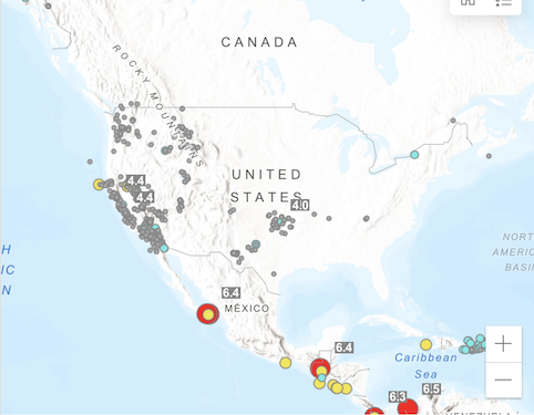
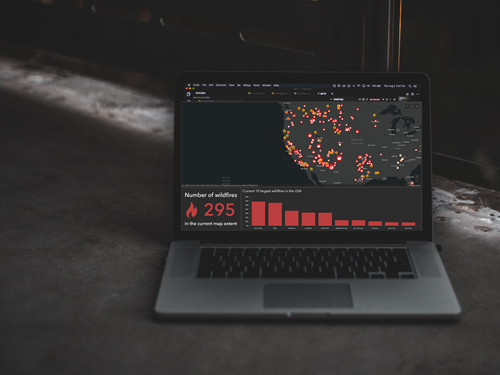
Live data monitoring
ArcGIS Dashboards provides the capability to monitor your data in real-time. You can configure your dashboard to automatically refresh as frequently as needed to keep up with your data as it changes over time.
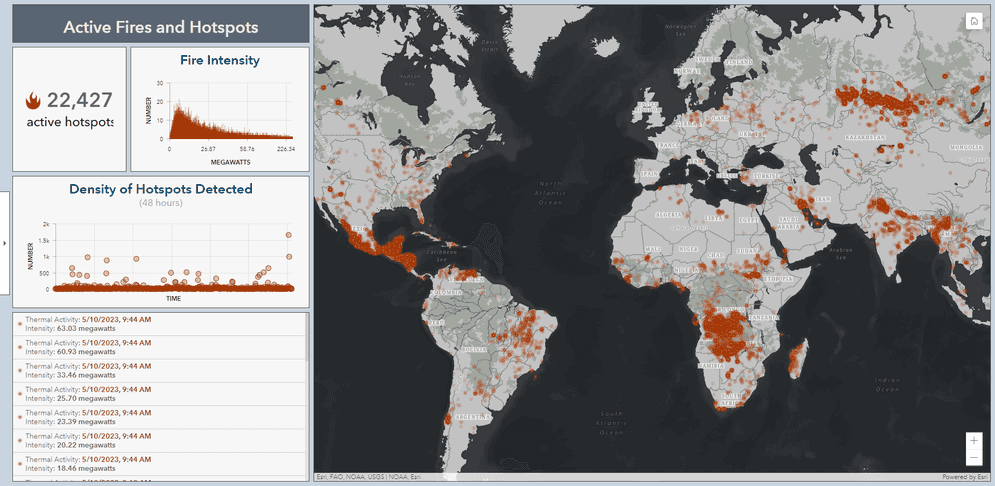
Live data monitoring of active fires and hotspots dashboard.
Environmental monitoring
ArcGIS Dashboards can display real-time environmental data, such as air quality, water quality, weather conditions, and other environmental indicators. This can help environmental managers and scientists track environmental conditions in real-time and respond quickly to any changes or anomalies.
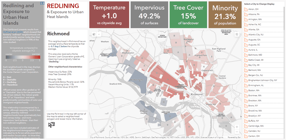
Environmental monitoring of redlining and exposure to urban heat dashboard.
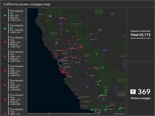
Utilities
ArcGIS Dashboards can provide the utilities industry with real-time information on outages, including the number of affected customers and the estimated time of restoration. This can help utilities prioritize repairs and communicate with customers.
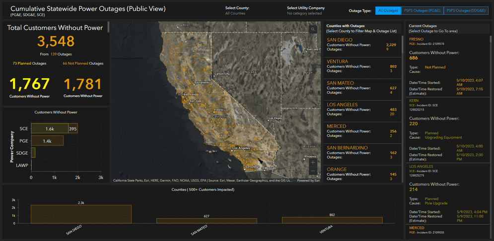
Real-time information on outages and affected customers dashboard.
Tutorials
Learn more on creating and enhancing dashboards.
Create a dashboard
Create your first dashboard using ArcGIS Dashboards.
ArcGIS Online
Make a dashboard to monitor wildfires
Create a dashboard showing a map of active wildfires and key indicators.
ArcGIS Online

Format data in your dashboard
Use Arcade in ArcGIS Dashboards to apply simple formatting to enhance data visualization.
ArcGIS Online
Advanced formatting in ArcGIS Dashboards
Use Arcade and HTML to derive new information and display alerts in a dashboard.
ArcGIS Online
Use tools to create different types of content and build low-code/no-code applications.
Import data as a feature layer
Use data management tools to import and create hosted feature layers.
ArcGIS Online Location Platform dashboard
Create a web map
Use Map Viewer to create a web map for your application.
ArcGIS Online Map Viewer
Style layers in a web map
Use Map Viewer to style layers in a web map.
ArcGIS Online Map Viewer
Tools
Use tools to access the ArcGIS organization and create and manage content for your no-code applications.