import "@arcgis/map-components/components/arcgis-feature-templates-legacy";- Inheritance:
- ArcgisFeatureTemplatesLegacy→
PublicLitElement
- Since
- ArcGIS Maps SDK for JavaScript 5.0
This is a legacy component. It relies on an underlying widget as part of our migration to native web components.
A fully native replacement for this component is in development. Once it reaches feature parity, the legacy component will be deprecated and no longer maintained. At that point, development should use the native component.
The FeatureTemplates component is part of an editing workflow. Its main purpose is to display FeatureLayer templates from one or more feature layers.
Properties
| Property | Attribute | Type |
|---|---|---|
auto-destroy-disabled | ||
| ||
enable-list-scroll | ||
| ||
filter-text | ||
group-by | GroupByType | null | undefined | |
heading-level | ||
hide-filter | ||
icon | Icon["icon"] | |
items readonly | | |
label | ||
| ||
reference-element | ||
selectedItem readonly | | |
selection-mode | ||
state readonly | | |
|
autoDestroyDisabled
- Type
- boolean
If true, the component will not be destroyed automatically when it is disconnected from the document. This is useful when you want to move the component to a different place on the page, or temporarily hide it. If this is set, make sure to call the destroy() method when you are done to prevent memory leaks.
- Attribute
- auto-destroy-disabled
- Default value
- false
disabledItemFunction
- Type
- DisabledItemFunction
A function that can be defined to disable specific
template items
within the component. The function takes an object containing a
layer
and template. If the function returns true, the item is disabled.
enableListScroll
- Type
- boolean
Indicates whether the list of available feature template items should scroll within its containing element.
- Attribute
- enable-list-scroll
- Default value
- false
filterFunction
A defined function used to help filter template items within the component. A custom function can be used to aid when searching for templates. It takes a function which passes in an object containing a name property of the template item.

Example
// Filter and display templates only if their labels contain the word `Street`function myFilterFunction(filter) {  let containsName = filter.label.includes("Street");  return containsName;}
// Create the FeatureTemplates widgettemplates = new FeatureTemplates({ container: "templatesDiv", visibleElements: { filter: false, // disable the default filter UI }, layers: [featureLayer], // in this example, one layer is used filterFunction: myFilterFunction}); groupBy
- Type
- GroupByType | null | undefined
It is possible to group template items. This can aid in managing various template items and how they display within the component. The values are discussed below.
| Type | Description | Example |
|---|---|---|
| layer | This is the default grouping. Groups template items by layers. | 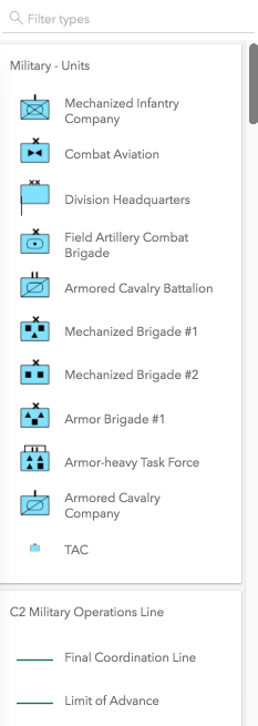 |
| geometry | Groups template items by geometry type. | 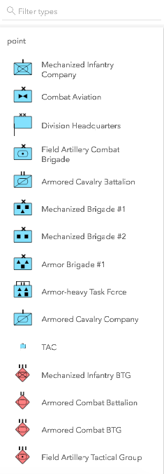 |
| none | The component displays everything in one list with no grouping. | 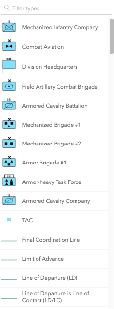 |
| GroupByFunction | Custom function that takes an object containing a FeatureTemplate and FeatureLayer. | 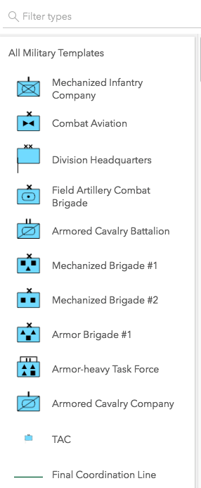 |
- Attribute
- group-by
- Default value
- "layer"
Example
// This example shows using a function to check if// the layer title contains the word 'military'. If so,// return a group of items called "All Military Templates"function customGroup(grouping) {  // Consolidate all military layers  if (grouping.layer.title.toLowerCase().indexOf("military") > -1) {    return "All Military Templates"  }// Otherwise, group by layer title  return grouping.layer.title;}
// Create the FeatureTemplates widgettemplates = new FeatureTemplates({  container: "templatesDiv",  layers: layers,  groupBy: customGroup});
headingLevel
- Type
- HeadingLevel
- Since
- ArcGIS Maps SDK for JavaScript 4.20
Indicates the heading level to use for the labels of grouped feature templates.
By default, the group label is rendered
as a level 4 heading (e.g. <h4>Group label</h4>). Depending on the component's placement
in your app, you may need to adjust this heading for proper semantics. This is
important for meeting accessibility standards.
- See also
- Attribute
- heading-level
- Default value
- 4
Example
// Group label will render as an <h3>featureTemplates.headingLevel = 3; hideFilter
- Type
- boolean
Indicates whether the templates filter displays.
- Attribute
- hide-filter
- Default value
- false
icon
- Type
- Icon["icon"]
Icon which represents the component. Typically used when the component is controlled by another component (e.g. by the Expand component).
- See also
- Attribute
- icon
- Default value
- "list-rectangle"
layers
An array of FeatureLayers to display within the component. The order in which these layers are set in the array dictates how they display within the component.
The component is designed to only display layers that are enabled for editing. It will not display layers that are enabled to only edit attributes.
Example
// The layers to display within the widgetlet militaryUnits = new FeatureLayer({  url: "http://sampleserver6.arcgisonline.com/arcgis/rest/services/Military/FeatureServer/2"});
let militaryHostile = new FeatureLayer({  url: "http://sampleserver6.arcgisonline.com/arcgis/rest/services/Military/FeatureServer/6"});
let layers = [militaryUnits, militaryHostile];
// Create FeatureTemplates widgettemplates = new FeatureTemplates({  container: "templatesDiv",  layers: layers});
referenceElement
- Type
- ArcgisReferenceElement | string | undefined
By assigning the id attribute of the Map or Scene component to this property, you can position a child component anywhere in the DOM while still maintaining a connection to the Map or Scene.
- Attribute
- reference-element
Methods
| Method | Signature |
|---|---|
componentOnReady inherited | componentOnReady(): Promise<this> |
destroy(): Promise<void> | |
select(item: null | undefined | TemplateItem): void |
componentOnReady
- Signature
-
componentOnReady (): Promise<this>
Creates a promise that resolves once the component is fully loaded.
- Returns
- Promise<this>
Example
const arcgisFeatureTemplatesLegacy = document.querySelector("arcgis-feature-templates-legacy");document.body.append(arcgisFeatureTemplatesLegacy);await arcgisFeatureTemplatesLegacy.componentOnReady();console.log("arcgis-feature-templates-legacy is ready to go!"); select
- Signature
-
select (item: null | undefined | TemplateItem): void
Selects the template item to use.
Parameters
| Parameter | Type | Description | Required |
|---|---|---|---|
| item | The template item to select. | |
- Returns
- void
Events
| Name | Type |
|---|---|
| CustomEvent<{ name: "state"; }> | |
arcgisPropertyChange
arcgisPropertyChange: CustomEvent<{ name: "state"; }> Emitted when the value of a property is changed. Use this to listen to changes to properties.
arcgisReady
arcgisReady: CustomEvent<void> Emitted when the component associated with a map or scene view is ready to be interacted with.
Type definitions
DisabledItemFunction
Parameters
| Parameter | Type | Description | Required |
|---|---|---|---|
| params | Pick<TemplateItem, "layer" | "template"> | | |
- Returns
- boolean