import "@arcgis/map-components/components/arcgis-layer-list";- Inheritance:
- ArcgisLayerList→
PublicLitElement
- Since
- ArcGIS Maps SDK for JavaScript 4.28
The Layer List provides a way to display a list of layers and switch on/off their visibility. The listItemCreatedFunction and the ListItem API provides access to each layer's properties, allows the developer to configure actions related to the layer, and allows the developer to add content to the item related to the layer.
Notes
- The Layer List does not emit an event when the visibility of a layer changes. To respond to layer visibility changes, watch the visible property of layers in the allLayers property with reactiveUtils.
- To hide layers in the map from the Layer List, you must set the listMode property on the desired layers to
hide.- When a KnowledgeGraphLayer is present in the map, the Layer List will display the tables as a tableList ListItem.
- When a CatalogLayer is present in the map, the Layer List will display the dynamicGroupLayer in a catalogLayerList ListItem.
Keyboard Navigation
- The Layer List supports keyboard navigation using the Treegrid Pattern for improved accessibility. Refer to the Calcite List component documentation for detailed keyboard interaction guidelines: Calcite List Keyboard Navigation.
Demo
Properties
| Property | Attribute | Type |
|---|---|---|
auto-destroy-disabled | ||
catalogLayerList readonly | | |
| ||
closed | ||
collapsed reflected | collapsed | |
drag-enabled | ||
filter-placeholder | ||
| ||
filter-text | ||
heading-level | ||
hide-catalog-layer-list | ||
hide-status-indicators | ||
icon | Icon["icon"] | |
| ||
label | ||
| ||
min-drag-enabled-items | ||
min-filter-items | ||
openedLayers readonly | | |
operationalItems readonly | | |
reference-element | ||
| ||
selection-mode | "multiple" | "single" | "none" | "single-persist" | |
show-close-button | ||
show-collapse-button | ||
show-errors | ||
show-filter | ||
show-heading | ||
show-temporary-layer-indicators | ||
state readonly | | |
tableList readonly | | |
| ||
visibility-appearance |
autoDestroyDisabled
- Type
- boolean
If true, the component will not be destroyed automatically when it is disconnected from the document. This is useful when you want to move the component to a different place on the page, or temporarily hide it. If this is set, make sure to call the destroy() method when you are done to prevent memory leaks.
- Attribute
- auto-destroy-disabled
- Default value
- false
catalogLayerList
- Type
- CatalogLayerList | null | undefined
The CatalogLayerList that displays a catalog layer's dynamic group layer.
catalogOptions
- Type
- CatalogLayerListProperties | null | undefined
- Since
- ArcGIS Maps SDK for JavaScript 4.30
CatalogLayer specific properties. Catalog layers will display their CatalogLayer#dynamicGroupLayer as an expandable catalogLayerList in the LayerList component. This list item will only be displayed when catalog layers with dynamic group layers are loaded in the map. These are the properties that are used to configure the catalogLayerList.
- See also
Example
layerListElement.catalogOptions = { listItemCreatedFunction: (event) => { const { item } = event; item.actionsSections = [ [ { title: "Add layer to map", icon: "add-layer", id: "add-layer" } ] ]; }, selectionMode: "single", visibleElements: { filter: true } }; closed
- Type
- boolean
- Since
- ArcGIS Maps SDK for JavaScript 4.33
Indicates whether a component is closed. When true, the component will be hidden.
- Attribute
- closed
- Default value
- false
collapsed
- Type
- boolean
- Since
- ArcGIS Maps SDK for JavaScript 4.29
Indicates whether the component is collapsed. When collapsed, only the collapse button and heading are displayed.
- See also
- Attribute
- collapsed
- Default value
- false
Example
layerListElement.collapsed = true; dragEnabled
- Type
- boolean
- Since
- ArcGIS Maps SDK for JavaScript 4.29
Indicates whether list items may be reordered within the list by dragging and dropping. MapImageLayer MapImageLayer#sublayers can be reordered only within their parent MapImageLayer and can not be dragged out as a separate layer. Drag won't be enabled until the number of list items is equal to or greater than than the value set set in minDragEnabledItems.
- See also
- Attribute
- drag-enabled
- Default value
- false
Example
layerListElement.dragEnabled = true; filterPlaceholder
- Type
- string
- Since
- ArcGIS Maps SDK for JavaScript 4.29
Placeholder text used in the filter input if visibleElements.filter is true.
- See also
- Attribute
- filter-placeholder
- Default value
- ""
Example
layerListElement.filterPlaceholder = "Filter layers"; filterPredicate
- Type
- FilterPredicate | null | undefined
- Since
- ArcGIS Maps SDK for JavaScript 4.32
Specifies a function to handle filtering list items.
Example
layerListElement.filterPredicate = (item) => item.title.toLowerCase().includes("streets"); filterText
- Type
- string
- Since
- ArcGIS Maps SDK for JavaScript 4.29
The value of the filter input if visibleElements.filter is true.
- See also
- Attribute
- filter-text
- Default value
- ""
Example
reactiveUtils.watch( () => layerListElement.filterText, (filterText) => console.log(filterText)); headingLevel
- Type
- HeadingLevel
- Since
- ArcGIS Maps SDK for JavaScript 4.29
Indicates the heading level to use for the heading of the component.
By default, the heading is rendered as a level 2 heading (e.g., <h2>Layer List</h2>).
Depending on the component's placement in your app, you may need to adjust this heading for proper semantics.
This is important for meeting accessibility standards.
- See also
- Attribute
- heading-level
- Default value
- 2
Example
layerListElement.headingLevel = 3; hideCatalogLayerList
- Type
- boolean
- Since
- ArcGIS Maps SDK for JavaScript 5.0
Indicates whether to display the LayerList#catalogLayerList.
- Attribute
- hide-catalog-layer-list
- Default value
- false
hideStatusIndicators
- Type
- boolean
- Since
- ArcGIS Maps SDK for JavaScript 5.0
Indicates whether the status indicators will be displayed.
- Attribute
- hide-status-indicators
- Default value
- false
icon
- Type
- Icon["icon"]
Icon which represents the component. Typically used when the component is controlled by another component (e.g. by the Expand component).
- See also
- Attribute
- icon
- Default value
- "layers"
knowledgeGraphOptions
- Type
- TableListProperties | null | undefined
- Since
- ArcGIS Maps SDK for JavaScript 4.30
KnowledgeGraphLayer specific properties. Knowledge graph layers will display KnowledgeGraphLayer#tables as an expandable tableList in the LayerList component. This tables list item will only be displayed when knowledge graph layers with tables are loaded in the map. These are the properties that are used to configure the tableList.
- See also
Example
layerListElement.knowledgeGraphOptions = { filterPlaceholder: "Filter tables", listItemCreatedFunction: (event) => { const { item } = event; item.actionsSections = [ [ { icon: "table", id: "open-table", title: "Show table" }, { icon: "information", id: "information", title: "Show information" } ] ]; }, minFilterItems: 1, visibleElements: { errors: true, filter: true, statusIndicators: true }} listItemCreatedFunction
- Type
- ListItemModifier | null | undefined
A function that executes each time a ListItem is created. Use this function to add actions and panels to list items, and to override the default settings of a list item. Actions can be added to list items using the ListItem#actionsSections property of the ListItem.
Example
layerListElement.listItemCreatedFunction = async function (event) {
    // The event object contains properties of the    // layer in the LayerList component.
    let item = event.item;
    // Wait for the layer to load and the item title to become available    await item.layer.when();
    if (item.title === "US Demographics") {      // open the list item in the LayerList component      item.open = true;      // change the title to something more descriptive      item.title = "Population by county";      // set an action for zooming to the full extent of the layer      item.actionsSections = [[{        title: "Go to full extent",        className: "esri-icon-zoom-out-fixed",        id: "full-extent"      }]];    }  };
minDragEnabledItems
- Type
- number
- Since
- ArcGIS Maps SDK for JavaScript 4.29
The minimum number of list items required to enable drag and drop reordering with dragEnabled.
- See also
- Attribute
- min-drag-enabled-items
- Default value
- 2
Example
layerListElement.dragEnabled = true;layerListElement.minDragEnabledItems = 5; minFilterItems
- Type
- number
- Since
- ArcGIS Maps SDK for JavaScript 4.29
The minimum number of list items required to display the visibleElements.filter input box.
- See also
- Attribute
- min-filter-items
- Default value
- 10
Example
layerListElement.showFilter = true;layerListElement.minFilterItems = 5; openedLayers
- Type
- Collection<FlowLayer>
- Since
- ArcGIS Maps SDK for JavaScript 4.31
A collection of Layers that are opened in a catalogLayerList or tableList flow item. This property is useful for backing out of the catalog layer list or table list programmatically to the parent layer list.
- See also
- Default value
- []
Example
// back out of the catalog layer list to the main layer listlayerListElement.openedLayers.pop(); operationalItems
- Type
- Collection<ListItem>
A collection of ListItems representing operational layers.
referenceElement
- Type
- ArcgisReferenceElement | string | undefined
By assigning the id attribute of the Map or Scene component to this property, you can position a child component anywhere in the DOM while still maintaining a connection to the Map or Scene.
- Attribute
- reference-element
selectedItems
- Type
- Collection<ListItem>
A collection of selected ListItems representing operational layers selected by the user.
- See also
selectionMode
- Type
- "multiple" | "single" | "none" | "single-persist"
- Since
- ArcGIS Maps SDK for JavaScript 4.29
Specifies the selection mode. Selected items are available in the selectedItems property.
| Value | Description |
|---|---|
| multiple | Allows any number of items to be selected at once. This is useful when you want to apply an operation to multiple items at the same time. |
| none | Disables selection. Use this when you want to prevent selecting items. |
| single | Allows only one item to be selected at a time. If another item is selected, the previous selection is cleared. This is useful when you want to ensure that a maximum of one item is selected at a time. |
| single-persist | Allows only one item to be selected at a time and prevents de-selection. Once an item is selected, it remains selected until another item is selected. This is useful when you want to ensure that there is always exactly one selected item. |
- See also
- Attribute
- selection-mode
- Default value
- "none"
Example
layerListElement.selectionMode = "multiple"; showCloseButton
- Type
- boolean
- Since
- ArcGIS Maps SDK for JavaScript 5.0
Indicates whether to display a close button in the header.
- Attribute
- show-close-button
- Default value
- false
showCollapseButton
- Type
- boolean
- Since
- ArcGIS Maps SDK for JavaScript 5.0
Indicates whether to display a collapse button in the header.
- Attribute
- show-collapse-button
- Default value
- false
showErrors
- Type
- boolean
- Since
- ArcGIS Maps SDK for JavaScript 5.0
Indicates whether to display layers with load errors.
- Attribute
- show-errors
- Default value
- false
showFilter
- Type
- boolean
- Since
- ArcGIS Maps SDK for JavaScript 5.0
Indicates whether to display a filter input box when then number of list items is equal to or greater than the value set in LayerList#minFilterItems, allowing users to filter layers by their title.
- Attribute
- show-filter
- Default value
- false
showHeading
- Type
- boolean
- Since
- ArcGIS Maps SDK for JavaScript 5.0
Indicates whether to display the layer list heading. The heading text is "Layer List". The heading level can be set with the LayerList#headingLevel.
- Attribute
- show-heading
- Default value
- false
showTemporaryLayerIndicators
- Type
- boolean
- Since
- ArcGIS Maps SDK for JavaScript 5.0
Indicates whether temporary layer indicators will be displayed for layers with Layer#persistenceEnabled set to false. A temporary icon will be displayed on the near side of the layer title.
- Attribute
- show-temporary-layer-indicators
- Default value
- false
view
- Type
- MapViewOrSceneView | null | undefined
The view associated with the component.
Note: The recommended approach is to fully migrate applications to use map and scene components and avoid using MapView and SceneView directly. However, if you are migrating a large application from widgets to components, you might prefer a more gradual transition. To support this use case, the SDK includes this
viewproperty which connects a component to a MapView or SceneView. Ultimately, once migration is complete, the arcgis-layer-list component will be associated with a map or scene component rather than using theviewproperty.
visibilityAppearance
- Type
- VisibilityAppearance
- Since
- ArcGIS Maps SDK for JavaScript 4.29
Determines the icons used to indicate visibility.
| Value | Description | Example |
|---|---|---|
| default | Displays view icons on the far side. Icons are hidden except on hover or if they have keyboard focus. See view-visible and view-hide calcite icons. | 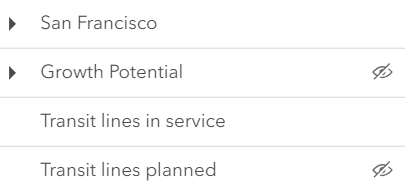 |
| checkbox | Displays checkbox icons on the near side. See check-square-f and square calcite icons. | 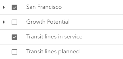 |
- Attribute
- visibility-appearance
- Default value
- "default"
Example
layerListElement.visibilityAppearance = "checkbox";Methods
| Method | Signature |
|---|---|
componentOnReady inherited | componentOnReady(): Promise<this> |
destroy(): Promise<void> | |
triggerAction(action: ActionButton | ActionToggle, item: ListItem): Promise<void> |
componentOnReady
- Signature
-
componentOnReady (): Promise<this>
Creates a promise that resolves once the component is fully loaded.
- Returns
- Promise<this>
Example
const arcgisLayerList = document.querySelector("arcgis-layer-list");document.body.append(arcgisLayerList);await arcgisLayerList.componentOnReady();console.log("arcgis-layer-list is ready to go!");Events
| Name | Type |
|---|---|
| CustomEvent<{ name: "state"; }> | |
arcgisClose
arcgisClose: CustomEvent<void> - Since
- ArcGIS Maps SDK for JavaScript 4.33
Emitted when the component's close button is clicked.
arcgisPropertyChange
arcgisPropertyChange: CustomEvent<{ name: "state"; }> Emitted when the value of a property is changed. Use this to listen to changes to properties.
arcgisReady
arcgisReady: CustomEvent<void> Emitted when the component associated with a map or scene view is ready to be interacted with.
arcgisTriggerAction
arcgisTriggerAction: CustomEvent<LayerListViewModelTriggerActionEvent> Emitted when an action is triggered on the component.