import "@arcgis/map-components/components/arcgis-value-picker-legacy";- Inheritance:
- ArcgisValuePickerLegacy→
PublicLitElement
- Since
- ArcGIS Maps SDK for JavaScript 5.0
This is a legacy component. It relies on an underlying widget as part of our migration to native web components.
A fully native replacement for this component is in development. Once it reaches feature parity, the legacy component will be deprecated and no longer maintained. At that point, development should use the native component.
Value Picker is a component that allows users to step or play through a list of values. Value Picker component can be configured with an optional collection, label, combobox or slider control to help users navigate values.
Similar to a media player, values can be interactively stepped through using the next and previous buttons.
Value Picker can also be set to automatically progress (play) through an ordered
list of items at a playRate.
Configuring Value Picker
Value Picker can be configured in variety of ways, depending on your use case. The following are the five possible configurations of the Value Picker component.
1. Configuring Value Picker without data
It is important to note that the Value Picker component is not associated with a View nor does it necessarily require data.
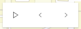
<arcgis-map itemId="462c629e8e604c15baf45627c4f337d6"> <arcgis-value-picker-legacy slot="top-right"></arcgis-value-picker-legacy></arcgis-map>Since the component is not associated with any data, it is necessary to listen and respond to component events generated by the component. This could be useful when data is not static like positional changes for bus features currently in service, for example.
valuePicker.addEventListener("arcgisPlay", () => { console.log("user clicks play"); });valuePicker.addEventListener("arcgisPause", () => { console.log("user clicks pause"); });valuePicker.addEventListener("arcgisPrevious", () => { console.log("user clicks previous"); });valuePicker.addEventListener("arcgisNext", () => { console.log("user clicks next"); });
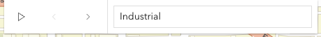
2. Using the label component to present items
Consider using the label component to step through a fixed list of predefined values like land use zones. In the following snippet a Value Picker component is created containing three coded land use zones.
const ValuePickerLabel = (await import("@arcgis/core/widgets/ValuePicker/ValuePickerLabel.js")).default;
const valuePicker = document.querySelector("arcgis-value-picker-legacy");
const labelItems = [  { value: "ind", label: "Industrial" },  { value: "res", label: "Residential" },  { value: "com", label: "Commercial" }];
valuePicker.component = new ValuePickerLabel({  items: labelItems,});
valuePicker.values = ["ind"];
The user's interaction can be handled by monitoring the values property.
valuePicker.addEventListener("arcgisPropertyChange", () => { console.log("The current land use zone is: ", valuePicker.values[0]); layer.rasterFunction = { functionName: valuePicker.values[0], };});
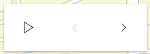
3. Using an arbitrary collection component to present predefined list
It may be required to step through a fixed collection of items like extents,
bookmarks, or
basemaps. If only the play,
next and previous buttons are required then the collection component may be used. The collection component
consists of the same user interface as option 1 above with the distinction that the current item is accessible and
tracked.
In the following example, a Value Picker component is created with a collection of three items. Value Picker is initialized with starting value of "topo-vector". Since "topo-vector" is the first item in the collection, only the next button will be enabled.
const Collection = (await import("@arcgis/core/core/Collection.js")).default;const ValuePickerCollection = (await import("@arcgis/core/widgets/ValuePicker/ValuePickerCollection.js")).default;
const valuePicker = document.querySelector("arcgis-value-picker-legacy");
const basemapCollection = new Collection(["topo-vector", "streets", "osm"]);
valuePicker.component = new ValuePickerCollection({  collection: basemapCollection,});
valuePicker.values = ["topo-vector"];
As the user clicks the next, previous, and play buttons, the values property updates. Handle this by listening for the @arcgisPropertyChange event when the component’s values property changes, as shown below.
valuePicker.addEventListener("arcgisPropertyChange", () => { console.log("The current basemap is: ", valuePicker.values[0]); mapElement.basemap = valuePicker.values[0];});
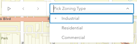
4. Using the combobox component to present selectable items
Consider using the combobox component when a searchable dropdown list is required. In the following snippet the Value Picker component is created containing three coded land use zones.
const ValuePickerCombobox = (await import("@arcgis/core/widgets/ValuePicker/ValuePickerCombobox.js")).default;
const valuePicker = document.querySelector("arcgis-value-picker-legacy");
const comboboxItems = [  { value: "ind", label: "Industrial" },  { value: "res", label: "Residential" },  { value: "com", label: "Commercial" }];
valuePicker.component = new ValuePickerCombobox({  placeholder: "Pick Zoning Type",  items: comboboxItems,});
valuePicker.values = ["res"];
The user's interaction can be handled by monitoring the values property.
valuePicker.addEventListener("arcgisPropertyChange", () => { console.log("The current land use zone is: ", valuePicker.values[0]); layer.rasterFunction = { functionName: valuePicker.values[0], };});
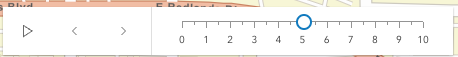
5. Using the slider component to navigate numeric values
The slider component, as the name suggests, appends a slider to end of the Value Picker component. The slider is ideal for users that need to select a value within a fixed numeric range. For example, the snippet below presents a Value Picker with a slider for picking a layer's opacity. The starting value is 50%.
const ValuePickerSlider = (await import("@arcgis/core/widgets/ValuePicker/ValuePickerSlider.js")).default;
const valuePicker = document.querySelector("arcgis-value-picker-legacy");
valuePicker.component = new ValuePickerSlider({  min: 0,  max: 10,  steps: [0, 1, 2, 3, 4, 5, 6, 7, 8, 9, 10],  minorTicks: [.5, 1.5, 2.5, 3.5, 4.5, 5.5, 6.5, 7.5, 8.5, 9.5],  majorTicks: [0, 1, 2, 3, 4, 5, 6, 7, 8, 9, 10],  labels: [0, 1, 2, 3, 4, 5, 6, 7, 8, 9, 10],});
valuePicker.values = [5];
Note that steps (positions the slider thumb snaps to), minorTicks, majorTicks and labels are independent of each other and optional.
The following code will watch for changes and apply the user's modification to a feature layer.
valuePicker.addEventListener("arcgisPropertyChange", () => { console.log("The current opacity is: ", valuePicker.values[0]); layer.opacity = valuePicker.values[0] / 100;});
Value Picker Orientation
By default Value Picker is oriented horizontally. Value Picker (with the exception of combobox and label components) can be oriented vertically. The following snippet demonstrates how to orient a collection based Value Picker vertically.
const Collection = (await import("@arcgis/core/core/Collection.js")).default;const ValuePickerCollection = (await import("@arcgis/core/widgets/ValuePicker/ValuePickerCollection.js")).default;
const valuePicker = document.querySelector("arcgis-value-picker-legacy");
const basemapCollection = new Collection(["topo-vector", "streets", "osm"]);
valuePicker.component = new ValuePickerCollection({  layout: "vertical", // default is "horizontal"  collection: basemapCollection,});
valuePickerBasemap.values = ["topo-vector"];Demo
Properties
| Property | Attribute | Type |
|---|---|---|
auto-destroy-disabled | ||
canNext readonly | | |
canPlay readonly | | |
canPrevious readonly | | |
caption | ||
| ||
hide-next-button | ||
hide-play-button | ||
hide-previous-button | ||
icon | Icon["icon"] | |
label | ||
layout | ||
loop | ||
play-rate | ||
reference-element | ||
|
autoDestroyDisabled
- Type
- boolean
If true, the component will not be destroyed automatically when it is disconnected from the document. This is useful when you want to move the component to a different place on the page, or temporarily hide it. If this is set, make sure to call the destroy() method when you are done to prevent memory leaks.
- Attribute
- auto-destroy-disabled
- Default value
- false
canNext
- Type
- boolean
Returns true if the Value Picker can be advanced to the next position.
- Default value
- false
Example
// check if canNext is true before advancing.const basemapCollection = new Collection(["topo-vector", "streets", "osm"]);
valuePicker.component = new ValuePickerCollection({  collection: basemapCollection,});
valuePicker.values = ["topo-vector"];
if (valuePicker.canNext) {  valuePicker.next();} else {  console.log("Already at the end of the collection. Please press the 'previous' button instead.");}
canPlay
- Type
- boolean
Returns true if the Value Picker can be played.
- Default value
- false
Example
// Create a new Value Picker and then check canPlay before playing.const basemapCollection = new Collection(["topo-vector", "streets", "osm"]);
valuePicker.component = new ValuePickerCollection({  collection: basemapCollection,});
valuePicker.values = ["topo-vector"];
if (valuePicker.canPlay) {  valuePicker.play();} else {  console.log("Cannot play this collection.");}
canPrevious
- Type
- boolean
Returns true if the Value Picker can moved to the previous item.
- Default value
- false
Example
// Create a new Value Picker and then test if canPrevious is true before selecting the preceding item.const basemapCollection = new Collection(["topo-vector", "streets", "osm"]);
valuePicker.component = new ValuePickerCollection({  collection: basemapCollection,});
valuePicker.values = ["topo-vector"];
if (valuePicker.canPrevious) {  valuePicker.previous();} else {  console.log("Already at the beginning of the collection. Please press the 'next' button instead.");}
caption
An optional caption that appears on the Value Picker component to give context for the user. This is particularly useful when an application is using more than one Value Picker component.
- Attribute
- caption
Example
const valuePicker = document.querySelector("arcgis-value-picker-legacy");
valuePicker.component = new ValuePickerCombobox({  items: [    { value: "Newton", label: "Newton" },    { value: "Einstein", label: "Einstein" }  ],});
valuePicker.caption = "Scientist";
component
- Type
- ValuePickerComponent | null | undefined
An optional component for presenting and managing data. This property can be assigned one of the following: ValuePickerCollection ValuePickerCombobox, ValuePickerLabel, or ValuePickerSlider.
If this property is not set then the play, next and previous buttons will always be enabled. In this case, listen to the component events, for example, @arcgisPrevious and @arcgisNext, when the user interacts with the component.
Example
// Add a Value Picker with a slider ranging from 0 to 10.const steps = [0, 1, 2, 3, 4, 5, 6, 7, 8, 9, 10];
const valuePicker = document.querySelector("arcgis-value-picker-legacy");
valuePicker.component = new ValuePickerSlider({  min: 0,  max: 10,  steps,  labels: steps,  labelFormatFunction: (value) => value + " km",});
valuePicker.values = [0];
hideNextButton
- Type
- boolean
When set to false, the next button (or up button when vertical) is not displayed.
- Attribute
- hide-next-button
- Default value
- false
hidePlayButton
- Type
- boolean
When set to false, the play/pause button is not displayed.
- Attribute
- hide-play-button
- Default value
- false
hidePreviousButton
- Type
- boolean
When set to false, the previous button (or down button when vertical) is not displayed.
- Attribute
- hide-previous-button
- Default value
- false
icon
- Type
- Icon["icon"]
Icon which represents the component. Typically used when the component is controlled by another component (e.g. by the Expand component).
- See also
- Attribute
- icon
- Default value
- "list-rectangle"
layout
- Type
- Layout
Indicates if the component should be orientated horizontally (default) or vertically.
Please note that ValuePickerCombobox and ValuePickerLabel do not support vertical layout.
- Attribute
- layout
- Default value
- "horizontal"
Example
// Display a Value Picker vertically with a slider component.const valuePicker = document.querySelector("arcgis-value-picker-legacy");
valuePicker.component = new ValuePickerSlider({  min: 0,  max: 10,});
valuePicker.values = [0];valuePicker.layout = "vertical";
loop
- Type
- boolean
If true, playback will restart when it reaches the end.
- Attribute
- loop
- Default value
- false
Example
// Add a ValuePicker with looping enabled and start playing.const valuePicker = document.querySelector("arcgis-value-picker-legacy");
valuePicker.component = new ValuePickerSlider({  min: 0,  max: 10,});
valuePicker.values = [0];valuePicker.loop = true;
valuePicker.play();
playRate
- Type
- number
The pause, in milliseconds between playback advancement.
- Attribute
- play-rate
- Default value
- 1000
Example
// Add a playing Value Picker that only passes 100 milliseconds at each step.// The slider's thumb will start at 0 and move to 10 in exactly one second.const steps = [0, 1, 2, 3, 4, 5, 6, 7, 8, 9, 10];
const valuePicker = document.querySelector("arcgis-value-picker-legacy");
valuePicker.component = new ValuePickerSlider({  min: 0,  max: 10,  steps,});
valuePicker.values = [0];valuePicker.playRate = 100;
valuePicker.play();
referenceElement
- Type
- ArcgisReferenceElement | string | undefined
By assigning the id attribute of the Map or Scene component to this property, you can position a child component anywhere in the DOM while still maintaining a connection to the Map or Scene.
- Attribute
- reference-element
values
The current values of the Value Picker component. The type for this property depends on which component is being used. For example, a slider component will return an array of numbers.
If the component is not set then this property will return null. Similarly this property can be null
if the component is created without an initial value.
Once a component and an initial value has been assigned this property will return an array
containing a value.
Example
const basemapCollection = new Collection(["topo-vector", "streets", "osm"]);
valuePickerBasemap.component = new ValuePickerCollection({  collection: basemapCollection,});
valuePickerBasemap.values = ["topo-vector"];
valuePickerLandCover.addEventListener("arcgisPropertyChange", () => {  if (valuePickerLandCover.values?.[0]) {    layer.rasterFunction = {      functionName: valuePickerLandCover.values[0],    };  }});
Methods
componentOnReady
- Signature
-
componentOnReady (): Promise<this>
Creates a promise that resolves once the component is fully loaded.
- Returns
- Promise<this>
Example
const arcgisValuePickerLegacy = document.querySelector("arcgis-value-picker-legacy");document.body.append(arcgisValuePickerLegacy);await arcgisValuePickerLegacy.componentOnReady();console.log("arcgis-value-picker-legacy is ready to go!"); next
- Signature
-
next (): Promise<void>
Select the next value or advance to next.
Example
// Create a Value Picker with a slider component.const valuePicker = document.querySelector("arcgis-value-picker-legacy");
valuePicker.component = new ValuePickerSlider({  min: 0,  max: 3,  steps: [0, 1, 2, 3],  labels: [0, 1, 2, 3]});
valuePicker.values = [0];console.log("Current value:", valuePicker.values[0]); // "Current value: 0"
valuePicker.next();console.log("Current value:", valuePicker.values[0]); // "Current value: 1" play
- Signature
-
play (): Promise<void>
Start playing. Value Picker will advance at the rate specified by playRate.
Example
// Add a playing Value Picker widget that is continuously looping.const valuePicker = document.querySelector("arcgis-value-picker-legacy");
valuePicker.component = new ValuePickerSlider({  min: 0,  max: 3,  steps: [0, 1, 2, 3],  labels: [0, 1, 2, 3]});
valuePicker.loop = true;valuePicker.values = [0];
valuePicker.addEventListener("arcgisPropertyChange", () => {  console.log("Current value:", valuePicker.values[0]);});
valuePicker.play();// output: 1, 2, 3, 0, 1, 2, 3, 0...
previous
- Signature
-
previous (): Promise<void>
Select the previous value.
Example
// Create a Value Picker with a slider component.const valuePicker = document.querySelector("arcgis-value-picker-legacy");
valuePicker.component = new ValuePickerSlider({  min: 0,  max: 3,  steps: [0, 1, 2, 3],  labels: [0, 1, 2, 3]});
valuePicker.values = [3];console.log("Current value:", valuePicker.values[0]); // "Current value: 3"
valuePicker.previous();console.log("Current value:", valuePicker.values[0]); // "Current value: 2"
Events
| Name | Type |
|---|---|
| CustomEvent<ValuePickerEvents["next"]> | |
| CustomEvent<ValuePickerEvents["pause"]> | |
| CustomEvent<ValuePickerEvents["play"]> | |
| CustomEvent<ValuePickerEvents["previous"]> | |
| CustomEvent<{ name: "values"; }> | |
arcgisAnimate
arcgisAnimate: CustomEvent<AnimateEvent> Fires when the Value Picker is playing at a rate defined by playRate.
arcgisNext
arcgisNext: CustomEvent<ValuePickerEvents["next"]> Fires when the Value Picker's next button is clicked.
arcgisPause
arcgisPause: CustomEvent<ValuePickerEvents["pause"]> Fires when the Value Picker's pause button is clicked.
arcgisPlay
arcgisPlay: CustomEvent<ValuePickerEvents["play"]> Fires when the Value Picker's play button is clicked.
arcgisPrevious
arcgisPrevious: CustomEvent<ValuePickerEvents["previous"]> Fires when the Value Picker's previous button is clicked.
arcgisPropertyChange
arcgisPropertyChange: CustomEvent<{ name: "values"; }> Emitted when the value of a property is changed. Use this to listen to changes to properties.
Example
// Listen for changes to the values property.// Update ImageryLayer's raster function accordingly.valuePicker.addEventListener("arcgisPropertyChange", (event) =>{ layer.rasterFunction = { functionName: rasterFunctionPicker.values[0], };}); arcgisReady
arcgisReady: CustomEvent<void> Emitted when the component associated with a map or scene view is ready to be interacted with.