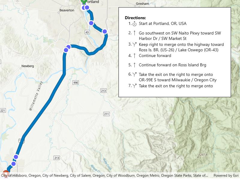
Display a route layer and its directions using a feature collection.
Use case
Routes can be stored as feature collection layers. These layers can store useful information such as directions, estimated trip time, and more.
You can create a route layer in ArcGIS Pro and store a route layer as a portal item, making it easy to access, share, or display.
How to use the sample
Pan and zoom to view the route displayed by the feature collection layer. Toggle to view or hide the turn-by-turn directions.
How it works
- Create a with the default portal and item ID.
- Create and load a with the item.
- After loading, get the containing turn-by-turn directions.
- Set the of the collection displaying directions to the .
- Create a with the feature collection and set it to the map’s .
Relevant API
- AGSFeatureCollection
- AGSFeatureCollectionLayer
- AGSFeatureCollectionTable
Tags
directions, feature collection, route layer
Sample Code
<UserControl x:Class="ArcGIS.WinUI.Samples.DisplayRouteLayer.DisplayRouteLayer"             xmlns="http://schemas.microsoft.com/winfx/2006/xaml/presentation"             xmlns:x="http://schemas.microsoft.com/winfx/2006/xaml"             xmlns:converters="using:ArcGIS.WinUI.Viewer.Converters"             xmlns:esriUI="using:Esri.ArcGISRuntime.UI.Controls">
    <UserControl.Resources>        <converters:DirectionPointTypeToIconConverter x:Key="Converter" />    </UserControl.Resources>    <Grid>        <esriUI:MapView x:Name="MyMapView" />        <Border Height="300" Style="{StaticResource BorderStyle}">            <ScrollViewer Height="250" VerticalScrollBarVisibility="Auto">                <StackPanel>                    <TextBlock FontWeight="Bold" Text="Directions:" />                    <ItemsControl x:Name="DirectionsList">                        <ItemsControl.ItemTemplate>                            <DataTemplate>                                <Grid>                                    <Grid.ColumnDefinitions>                                        <ColumnDefinition Width="20" />                                        <ColumnDefinition Width="2" />                                        <ColumnDefinition Width="25" />                                        <ColumnDefinition Width="*" />                                    </Grid.ColumnDefinitions>                                    <TextBlock HorizontalAlignment="Right" Text="{Binding Attributes[Sequence]}" />                                    <TextBlock Grid.Column="1" Text="." />                                    <TextBlock Grid.Column="2"                                               Margin="0,0,0,10"                                               FontFamily="{StaticResource CalciteUIIconsMediumFontFamily}"                                               FontSize="24"                                               Text="{Binding Attributes[DirectionPointType], Converter={StaticResource Converter}}" />                                    <TextBlock Grid.Column="3"                                               Text="{Binding Attributes[DisplayText]}"                                               TextWrapping="Wrap" />                                </Grid>                            </DataTemplate>                        </ItemsControl.ItemTemplate>                    </ItemsControl>                </StackPanel>            </ScrollViewer>        </Border>    </Grid></UserControl>
// Copyright 2023 Esri.//// Licensed under the Apache License, Version 2.0 (the "License"); you may not use this file except in compliance with the License.// You may obtain a copy of the License at: http://www.apache.org/licenses/LICENSE-2.0//// Unless required by applicable law or agreed to in writing, software distributed under the License is distributed on an// "AS IS" BASIS, WITHOUT WARRANTIES OR CONDITIONS OF ANY KIND, either express or implied. See the License for the specific// language governing permissions and limitations under the License.
using Esri.ArcGISRuntime;using Esri.ArcGISRuntime.Data;using Esri.ArcGISRuntime.Mapping;using Esri.ArcGISRuntime.Portal;using System;using System.Collections.Generic;using System.Linq;using System.Threading.Tasks;
namespace ArcGIS.WinUI.Samples.DisplayRouteLayer{ [ArcGIS.Samples.Shared.Attributes.Sample( name: "Display route layer", category: "Layers", description: "Display a route layer and its directions using a feature collection.", instructions: "Pan and zoom to view the route displayed by the feature collection layer. Toggle to view or hide the turn-by-turn directions.", tags: new[] { "directions", "feature collection", "route layer" })] [ArcGIS.Samples.Shared.Attributes.OfflineData()] [ArcGIS.Samples.Shared.Attributes.ClassFile("Converters\\DirectionPointTypeToIconConverter.cs")] public partial class DisplayRouteLayer { private readonly string _itemId = "0e3c8e86b4544274b45ecb61c9f41336";
public DisplayRouteLayer() { InitializeComponent(); _ = Initialize(); }
private async Task Initialize() { // Create a new map with the topographic basemap style. MyMapView.Map = new Map(BasemapStyle.ArcGISTopographic);
try { // Create a portal instance. ArcGISPortal portal = await ArcGISPortal.CreateAsync();
// Get the portal item containing route data. PortalItem item = await PortalItem.CreateAsync(portal, _itemId);
// Create a collection of feature layers, then load. var featureCollection = new FeatureCollection(item); await featureCollection.LoadAsync();
if (featureCollection.LoadStatus == LoadStatus.Loaded) { // Select all tables. IList<FeatureCollectionTable> tables = featureCollection.Tables;
// List the turn-by-turn directions. FeatureCollectionTable directionPoints = tables.Where(t => t.TableName == "DirectionPoints").FirstOrDefault(); DirectionsList.ItemsSource = directionPoints;
// Create a FeatureCollectionLayer and add it to the map. FeatureCollectionLayer featureCollectionLayer = new FeatureCollectionLayer(featureCollection); MyMapView.Map.OperationalLayers.Add(featureCollectionLayer);
// Set the viewpoint to the full extent of the FeatureCollectionLayer in Oregon, US. await MyMapView.SetViewpointAsync(new Viewpoint(featureCollectionLayer.FullExtent)); } } catch (Exception e) { await new MessageDialog2(e.ToString(), "Error").ShowAsync(); } } }}