rt.plot() is a lightweight plotting method included with GeoAnalytics Engine
that allows you to quickly view raster data stored in a PySpark DataFrame. This tutorial will show you how to use rt.plot along with various parameters
to plot raster data, symbolize with a color map, add a basemap and use a specified extent and spatial reference.
The full list of supported parameters is documented in the API reference for rt.plot.
Prerequisites
To complete the following steps, you will need:
- A running Spark session configured with ArcGIS GeoAnalytics Engine 2.0.0 or later.
- A notebook connected to your Spark session (e.g. Jupyter, JupyterLab, Databricks, EMR, etc.).
Steps
Import
-
In your notebook, import
geoanalyticsand authorize the module using a username and password, an API key, or a license file. Also, import the modules required to run the plotting examples below.PythonUse dark colors for code blocks Copy import geoanalytics geoanalytics.auth(username="user1", password="p@ssword") import geoanalytics.sql.functions as ST import pyspark.sql.functions as F from geoanalytics.raster import functions as RT from geoanalytics.tools.raster import *
Create a PySpark DataFrame with a raster column
-
Load a polygon feature service of earthquakes since 1970 into a DataFrame.
PythonUse dark colors for code blocks Copy # Path to the earthquakes data data_path = r"https://sampleserver6.arcgisonline.com/arcgis/rest/services/Earthquakes_Since1970/FeatureServer/0" earthquakes_df = spark.read.format("feature-service").load(data_path) # Create a DataFrame for earthquakes in Greece using ST_EnvIntersects greece_earthquakes_df = earthquakes_df.where(ST.bbox_intersects("shape", xmin=19.28, xmax=26.65, ymin=35.13, ymax=40.17)) -
Create square bins for each earthquake and group the bins by count.
PythonUse dark colors for code blocks Copy # Create the bins bins = greece_earthquakes_df\ .withColumn("bin", ST.square_bin("shape", 1))\ .groupBy("bin").count()\ .withColumn("count", F.col("count").cast("int")) -
Run the
Binstool to create a raster from these bins.To Raster PythonUse dark colors for code blocks Copy # Use the BinsToRaster tool to convert bins to raster raster = BinsToRaster()\ .setBinColumn("bin")\ .setBandValueColumns("count")\ .setTileSize(10, 10)\ .run(bins)
Plot the raster data
In this example the figsize parameter is used. This parameter adjusts the size of the result plot.
raster.rt.plot(figsize=(6, 6))
Plot with a basemap and extent
In this example the following parameters are introduced:
basemap—Adds a basemap to the plot. Choose from "light" (Light Gray Canvas), "dark" (Dark Gray Canvas), "streets" (Esri Streets Basemap) or "osm" (OpenStreetMap Vector Basemap).sr—The spatial reference used to plot the data.extent—Limits the extent of the plot. The desired plot extent is defined using a tuple in the format(min._x, min _y, max _x, max _y)
margin=2
raster.rt.plot(figsize=(6, 6), basemap="streets", sr=4326, extent=(19.28 - margin, 35.13 - margin, 26.65 + margin, 41.17 + margin))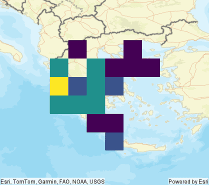
Plot with a color map
In this example the cmap parameter is introduced. This is used to represent your data in 3D colorspace. To learn more about colormaps, see the see the matplotlib's documentation for colormaps
margin=2
raster.rt.plot(figsize=(6, 6), cmap='afmhot', sr=4326, basemap="streets", extent=(19.28 - margin, 35.13 - margin, 26.65 + margin, 41.17 + margin))
Plot with an alpha
As you can see in the previous example, the raster layer is hiding the basemap. In this example the alpha parameter will be used to control the transparency of the plotted elements.
margin=2
raster.rt.plot(figsize=(6, 6), cmap='afmhot', sr=4326, basemap="streets", extent=(19.28 - margin, 35.13 - margin, 26.65 + margin, 41.17 + margin), alpha=0.6)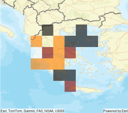
What's next?
Because rt.plot extends matplotlib, you can leverage the rich plotting capabilities in matplotlib for plotting
your raster data. The examples shown here are a basic introduction to what's possible with
rt.plot and matplotlib. For more ideas see the matplotlib's documentation.