import "@arcgis/map-components/components/arcgis-feature-table";- Inheritance:
- ArcgisFeatureTable→
PublicLitElement
- Since
- ArcGIS Maps SDK for JavaScript 4.31
The Feature Table component provides an interactive tabular view of each feature's attributes in a feature layer.
Demo
Properties
| Property | Attribute | Type |
|---|---|---|
actionColumn readonly | | |
| ||
activeFilters readonly | | |
activeSortOrders readonly | | |
allColumns readonly | | |
allRelatedTablesVisible readonly | | |
allVisibleColumns readonly | | |
attachmentsColumns readonly | | |
attachments-enabled | ||
| ||
| ||
auto-destroy-disabled | ||
auto-refresh-disabled | ||
auto-save-disabled | ||
canAddRelatedFeature readonly | | |
column-performance-mode-disabled | ||
column-reordering-disabled | ||
columns readonly | | |
definition-expression | ||
description | ||
disabled reflected | disabled | |
editing-enabled | ||
effectiveSize readonly | | |
fieldColumns readonly | | |
filter-by-selection-enabled | ||
| ||
groupColumns readonly | | |
hasContingentValues readonly | | |
hasInvalidPendingEdits readonly | | |
hasPendingEdits readonly | | |
| ||
hide-column-descriptions | ||
hide-column-menu-items-sort-ascending | ||
hide-column-menu-items-sort-descending | ||
hide-column-menus | ||
hide-header | ||
hide-layer-dropdown-icons | ||
hide-menu | ||
hide-menu-items-clear-selection | ||
hide-menu-items-delete-selection | ||
hide-menu-items-export-selection-to-csv | ||
hide-menu-items-refresh-data | ||
hide-menu-items-selected-records-show-all-toggle | ||
hide-menu-items-selected-records-show-selected-toggle | ||
hide-menu-items-toggle-columns | ||
hide-menu-items-zoom-to-selection | ||
hide-progress | ||
hide-selection-column | ||
hide-tooltips | ||
highlight-disabled | ||
| ||
icon | Icon["icon"] | |
initial-size | ||
isQueryingOrSyncing readonly | | |
isSyncingAttachments readonly | | |
label | ||
| ||
layer-item-id | ||
| ||
layer-url | ||
layerView readonly | | |
max-size | ||
| ||
multiple-selection-disabled | ||
multiple-sort-enabled | ||
multiple-sort-priority | ||
navigation-scale | "s" | "m" | "l" | |
no-data-message | ||
| ||
| ||
pageCount readonly | | |
page-index | ||
page-size | ||
pagination-enabled | ||
reference-element | ||
related-records-enabled | ||
relatedTable readonly | | |
| ||
relationship readonly | | |
relationshipColumns readonly | | |
return-geometry-enabled | ||
return-m-enabled | ||
return-z-enabled | ||
| ||
| ||
show-layer-dropdown | ||
size readonly | | |
state readonly | | |
supportsAddAttachments readonly | | |
supportsAttachments readonly | | |
supportsDeleteAttachments readonly | | |
supportsResizeAttachments readonly | | |
supportsUpdateAttachments readonly | | |
sync-template-on-changes-disabled | ||
sync-view-selection | ||
tableController readonly | | |
tableDisabled deprecated | table-disabled | |
tableParent readonly | | |
| ||
table-title | ||
| TimeExtent | null | undefined | |
time-zone | ||
| ||
visibleColumns readonly | |
actionColumn
- Type
- ActionColumn | null | undefined
- Since
- ArcGIS Maps SDK for JavaScript 4.33
Reference to the current action column. This column is only generated if a configuration has been provided.
- See also
actionColumnConfig
- Type
- ActionColumnConfig | null | undefined
Configuration for the ActionColumn. This property allows for customizing the action column's appearance and behavior. The action column is a column that contains interactive buttons for each row. These buttons can be used to perform actions such as editing, deleting, or viewing additional information about a feature. This column is displayed as the last column in the table and is only displayed if this property is set.
Example
// The following snippet demonstrates how to configure an action column that adds a button// to each row which allows an end-user to zoom to the associated row's feature within the view.featureTable.actionColumnConfig = { label: "Go to feature", icon: "zoom-to-object", callback: (params) => { view.goTo(params.feature); }} activeSortOrders
- Type
- Array<ColumnSortOrder>
Use this read-only property if needing to query features while retaining a column's sort order.
- Default value
- []
allColumns
- Since
- ArcGIS Maps SDK for JavaScript 4.33
A flattened array of all columns within the table, including nested columns. Take note that group columns are separate entries. This property is useful when applying updates to all columns, including nested columns, as it provides ease of use when iterating through all columns in the table.
allRelatedTablesVisible
- Type
- boolean
Indicates the table is displaying all related tables in "show all" mode.
- Default value
- false
allVisibleColumns
- Since
- ArcGIS Maps SDK for JavaScript 4.33
A flattened array of all visible columns within the table, including nested columns. Group columns are separate entries.
attachmentsColumns
- Type
- Array<AttachmentsColumn>
- Since
- ArcGIS Maps SDK for JavaScript 4.33
A flattened array of all attachment columns within the table, including nested columns.
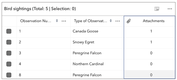
attachmentsEnabled
- Type
- boolean
Indicates whether to display the Attachments field in the table. It displays the count of attachments per feature and is only applicable if the feature layer supports attachments.
- Attribute
- attachments-enabled
- Default value
- false
attributeTableTemplate
- Type
- AttributeTableTemplate | null | undefined
Use this property to configure how columns display within the table in regard to visibility, column order, and sorting.
This property differs from the tableTemplate property. The tableTemplate property provides more fine-grained control over how the table is rendered within the application by offering more advanced configurations such as custom cell rendering, column formatting, and more. It is useful for application-level development that remains within an application. Use the attributeTableTemplate property to access the table's settings across different applications. By using this property, the settings can be saved within a webmap or layer. Please refer to the AttributeTableTemplate and TableTemplate documentation for more information.
- See also
autoDestroyDisabled
- Type
- boolean
If true, the component will not be destroyed automatically when it is disconnected from the document. This is useful when you want to move the component to a different place on the page, or temporarily hide it. If this is set, make sure to call the destroy() method when you are done to prevent memory leaks.
- Attribute
- auto-destroy-disabled
- Default value
- false
autoRefreshDisabled
- Type
- boolean
Indicates whether the table should automatically refresh when the underlying data changes.
- Attribute
- auto-refresh-disabled
- Default value
- false
autoSaveDisabled
- Type
- boolean
- Since
- ArcGIS Maps SDK for JavaScript 5.0
Indicates whether the table should automatically save when the underlying data changes.
- Attribute
- auto-save-disabled
- Default value
- false
canAddRelatedFeature
- Type
- boolean
- Since
- ArcGIS Maps SDK for JavaScript 5.0
Indicates whether the table supports adding a related record based on the current relationship configuration. This accounts for whether table is currently configured to show related features. If the table is not displaying related features, then the value of this property is always false.
- Default value
- false
columnPerformanceModeDisabled
- Type
- boolean
Indicates whether to enable the table's column performance mode. This mode is designed to improve the performance of the table when working with a large number of columns.
- Attribute
- column-performance-mode-disabled
- Default value
- false
columnReorderingDisabled
- Type
- boolean
Indicates whether the table should allow reordering of columns.
- Attribute
- column-reordering-disabled
- Default value
- false
columns
- Type
- Collection<Column>
A read-only collection of column, field, group, action, attachment, and relationship columns that are displayed within the table.
definitionExpression
- Since
- ArcGIS Maps SDK for JavaScript 4.33
The SQL where clause used to filter features visible in the table. Only the features that satisfy the definition expression are displayed in the table. This value takes priority over any definition expression set on the associated layer.
- Attribute
- definition-expression
description
- Type
- string | FeatureTableDescriptionFunction | null | undefined
Text displayed in the table header, under the title. This can be a basic string or custom function that returns a string. This is useful in situations where additional context is needed for the table.
- Attribute
- description
disabled
- Type
- boolean
- Since
- ArcGIS Maps SDK for JavaScript 5.0
When true, the component is visually withdrawn and cannot receive user interaction.
- Attribute
- disabled
- Default value
- false
editingEnabled
- Type
- boolean
Indicates whether editing is enabled on the data within the feature table. Double-clicking in a cell will enable editing for that value. In order to edit a feature, the layer must be editable and the user must have the appropriate permissions. In addition, the layer must contain an object ID field.
- Attribute
- editing-enabled
- Default value
- false
effectiveSize
- Type
- number
Total number of records displayed in the table's current view.
fieldColumns
- Type
- Array<FieldColumn>
- Since
- ArcGIS Maps SDK for JavaScript 4.33
A flattened array of all field columns within the table, including nested columns.
filterBySelectionEnabled
- Type
- boolean
Indicates whether the table only displays rows that are considered selected. Row selection can be modified by adding or removing associated object IDs from highlightIds. This will cause the store to fetch fresh features to ensure the expected sort order is honored.
- Attribute
- filter-by-selection-enabled
- Default value
- false
filterGeometry
- Type
- GeometryUnion | null | undefined
Set this property to filter the features displayed in the table. It accepts a Geometry, e.g. Extent, and uses it as a spatial filter. When modifying this property, the FeatureTable will completely refresh and re-query for all features.
Example
// Listen for when the view is stationary.// If true, check the view's extent and set// the table to display only the attributes// for the features falling within this extent.
reactiveUtils.when( () => view.stationary === true,() => {  // Get the new extent of view/map whenever map is updated.  if (view.extent) {    // Filter out and show only the visible features in the feature table.    featureTable.filterGeometry = view.extent;  }}, { initial: true });
groupColumns
- Type
- Array<GroupColumn>
- Since
- ArcGIS Maps SDK for JavaScript 4.33
A flattened array of all group columns within the table.
hasContingentValues
- Type
- boolean
- Since
- ArcGIS Maps SDK for JavaScript 5.0
Convenience property indicating the data set contains contingent values. This includes contingent values in a related table.
- Default value
- false
hasInvalidPendingEdits
- Type
- boolean
- Since
- ArcGIS Maps SDK for JavaScript 5.0
Indicates there are unsaved edits and that they are invalid. This includes invalid pending edits in a related table.
- Default value
- false
hasPendingEdits
- Type
- boolean
- Since
- ArcGIS Maps SDK for JavaScript 5.0
Indicates there are unsaved edits. This includes edits in a related table. This does not account for whether the edits are valid or not.
- Default value
- false
hiddenFields
- Type
- Collection<string>
TODO
- See also
Examples
const featureTable = new FeatureTable({ layer: featureLayer, view: view, hiddenFields: ["Primary_Type", "incident_date"], // will not show these two fields within the table container: document.getElementById("tableDiv")});// Set this syntax if needing to display a default hidden field, e.g. 'CreationDate`const featureTable = new FeatureTable({ layer: featureLayer, view: view, tableTemplate: { // autocastable to TableTemplate columnTemplates: [ // takes an array of FieldColumnTemplate and GroupColumnTemplate { //autocastable to FieldColumnTemplate type: "field", fieldName: "date_created", label: "Date created", visible: true }] } container: document.getElementById("tableDiv")}); hideColumnDescriptions
- Type
- boolean
Indicates whether to display descriptions in the header cells of individual columns.
- Attribute
- hide-column-descriptions
- Default value
- false
hideColumnMenuItemsSortAscending
- Type
- boolean
- Since
- ArcGIS Maps SDK for JavaScript 5.0
Indicates whether to display the Sort Ascending menu item.
- Attribute
- hide-column-menu-items-sort-ascending
- Default value
- false
hideColumnMenuItemsSortDescending
- Type
- boolean
- Since
- ArcGIS Maps SDK for JavaScript 5.0
Indicates whether to display the Sort Descending menu item.
- Attribute
- hide-column-menu-items-sort-descending
- Default value
- false
hideColumnMenus
- Type
- boolean
Indicates whether to display the menu items within the individual columns
- Attribute
- hide-column-menus
- Default value
- false
hideHeader
- Type
- boolean
- Since
- ArcGIS Maps SDK for JavaScript 5.0
Indicates whether to display the feature table's header information.
- Attribute
- hide-header
- Default value
- false
hideLayerDropdownIcons
- Type
- boolean
Indicates whether to display layer-specific icons in the layer drop down menu.
- Attribute
- hide-layer-dropdown-icons
- Default value
- false
hideMenu
- Type
- boolean
- Since
- ArcGIS Maps SDK for JavaScript 5.0
Indicates whether to display the feature table's menu.
- Attribute
- hide-menu
- Default value
- false
hideMenuItemsClearSelection
- Type
- boolean
- Since
- ArcGIS Maps SDK for JavaScript 5.0
Indicates whether to display the Clear selection menu item.
- Attribute
- hide-menu-items-clear-selection
- Default value
- false
hideMenuItemsDeleteSelection
- Type
- boolean
- Since
- ArcGIS Maps SDK for JavaScript 5.0
Indicates whether to display the Delete Selection menu item.
- Attribute
- hide-menu-items-delete-selection
- Default value
- false
hideMenuItemsExportSelectionToCsv
- Type
- boolean
- Since
- ArcGIS Maps SDK for JavaScript 5.0
Indicates whether to display the Export selection to CSV menu item.
- Attribute
- hide-menu-items-export-selection-to-csv
- Default value
- false
hideMenuItemsRefreshData
- Type
- boolean
- Since
- ArcGIS Maps SDK for JavaScript 5.0
Indicates whether to display the Refresh data menu item.
- Attribute
- hide-menu-items-refresh-data
- Default value
- false
hideMenuItemsSelectedRecordsShowAllToggle
- Type
- boolean
- Since
- ArcGIS Maps SDK for JavaScript 5.0
Indicates whether to toggle between showing only selected records in the table to showing all of the records.
- Attribute
- hide-menu-items-selected-records-show-all-toggle
- Default value
- false
hideMenuItemsSelectedRecordsShowSelectedToggle
- Type
- boolean
- Since
- ArcGIS Maps SDK for JavaScript 5.0
Indicates whether to display the Show selected records menu item.
- Attribute
- hide-menu-items-selected-records-show-selected-toggle
- Default value
- false
hideMenuItemsToggleColumns
- Type
- boolean
- Since
- ArcGIS Maps SDK for JavaScript 5.0
Indicates whether to enable toggling column visibility within the menu.
- Attribute
- hide-menu-items-toggle-columns
- Default value
- false
hideMenuItemsZoomToSelection
- Type
- boolean
- Since
- ArcGIS Maps SDK for JavaScript 5.0
Indicates whether to display the Zoom to selected menu item.
- Attribute
- hide-menu-items-zoom-to-selection
- Default value
- false
hideProgress
- Type
- boolean
Indicates whether to display the progress indicator when the table is querying or syncing data.
- Attribute
- hide-progress
- Default value
- false
hideSelectionColumn
- Type
- boolean
- Since
- ArcGIS Maps SDK for JavaScript 5.0
Indicates whether to display the selection column in the table. Each row has a checkbox that selects its corresponding feature.
- Attribute
- hide-selection-column
- Default value
- false
hideTooltips
- Type
- boolean
Indicates whether to display the tooltip for the Show/hide columns button.
- Attribute
- hide-tooltips
- Default value
- false
highlightIds
- Type
- Collection<ObjectId>
This property accepts and returns a collection of feature object IDs. Use this to access and control which features are currently selected in the table and subsequently highlighted within the map. Once an application sets a collection of object IDs, the table will select the corresponding row and highlight its feature within the map.
Example
// This example instantiates the table with highlighted featuresconst featureTable = new FeatureTable({  view: view,  layer: featureLayer,  container: "tableDiv",  highlightIds});
// Push the object IDs into a collection and selectfeatureTable.highlightIds.push(2, 3, 4);
// Listen for changes in the collection of highlighted featuresfeatureTable.highlightIds.on("change", (event) => {  console.log("features selected", event.added);  console.log("features deselected", event.removed);});
icon
- Type
- Icon["icon"]
Icon which represents the component. Typically used when the component is controlled by another component (e.g. by the Expand component).
- Attribute
- icon
- Default value
- "table"
initialSize
The user-provided number of total features accessed from the data source. This is used for initial load of the data store as opposed to querying a specified layer. Additionally, the table will query data counts to verify the data's integrity, or when requested via refresh().
- Attribute
- initial-size
isQueryingOrSyncing
- Type
- boolean
A read-only property which indicates if the table is querying or syncing data.
- Default value
- false
isSyncingAttachments
- Type
- boolean
- Since
- ArcGIS Maps SDK for JavaScript 5.0
Indicates the table is syncing attachment edits.
- Default value
- false
layer
- Type
- FeatureTableSupportedLayer | null | undefined
The associated CatalogFootprintLayer, CSVLayer, FeatureLayer, GeoJSONLayer, ImageryLayer, KnowledgeGraphSublayer, ParquetLayer SceneLayer, WFSLayer, OrientedImageryLayer or Sublayer containing the fields and attributes to display within the component.
The table's pagination defaults to 50 records at a time. If the layer contains less than 50 records, it will use whatever count it has. Note that 0 records do not apply.
Support for CatalogFootprintLayer was added at version 4.30.
Support for ParquetLayer was added at version 4.34. Column sorting is not supported for ParquetLayer.
Support for GeoJSONLayer, CSVLayer, ImageryLayer, and WFSLayer was added at version 4.21.
For an ImageryLayer to work with FeatureTable, it must have a mosaic dataset.
- See also
layers
- Type
- Array<FeatureTableSupportedLayer> | null | undefined
Group of layers displayed in the dropdown component in the table's header, which allows changing what layer is currently displayed in the table.
maxSize
This property is applicable when working with layers that contain a large number of features, as it provides the ability to limit the displayed total feature count. If paginationEnabled is true, and maxSize is greater than the current value of pageSize, multiple pages usually display. If maxSize is less than pageSize, a single page shows the total number of features limited to maxSize.
- Attribute
- max-size
menuConfig
- Type
- TableMenuConfig | null | undefined
Set this object to customize the feature table's menu content.
multipleSelectionDisabled
- Type
- boolean
Controls whether the table allows multiple selected rows.
- Attribute
- multiple-selection-disabled
- Default value
- false
multipleSortEnabled
- Type
- boolean
Indicates whether sorting multiple columns is supported within the table.
- Attribute
- multiple-sort-enabled
- Default value
- false
Example
const featureTableVM = new FeatureTable({ layer: featureLayer, multiSortEnabled: true, tableTemplate: { // autocastable to TableTemplate columnTemplates: [ // takes an array of FieldColumnTemplate and GroupColumnTemplate { // autocastable to FieldColumnTemplate type: "field", fieldName: "ObjectId", direction: "asc", // In order to use initialSortPriority, make sure direction is set initialSortPriority: 1, // This field's sort order takes second-highest priority. }, { type: "field", fieldName: "Name", direction: "asc", // In order to use initialSortPriority, make sure direction is set initialSortPriority: 0, // This field's sort order takes the highest priority. }, { type: "field", fieldName: "Status", direction: "asc", // In order to use initialSortPriority, make sure direction is set initialSortPriority: 2 // This field's sort order is prioritized after Name and ObjectId, respectively. }] }, container: "tableDiv"}); objectIds
- Type
- Collection<ObjectId>
This property accepts and returns a collection of feature object IDs. Use this to access and control which features are currently visible in the table.
When the collection is empty, all potential rows are displayed. Modifying object IDs is not supported while filterBySelectionEnabled is true as these properties are mutually exclusive.
This filter can also be combined with filterGeometry to display features that satisfy both conditions.
outFields
An array of field names from the table's data source to include when the table requests data. By default, all fields are requested. This property is useful when working with many fields and only a subset of them is needed for the table. Take note that doing so can improve the table's load time.
pageCount
- Type
- number
Number of pages of features to be displayed in the table, based on the total number of features and configured pageSize.
pageIndex
- Type
- number
Represents the index of the page of the feature currently being displayed. The number of features per page can be adjusted by modifying the pageSize. Pagination must be enabled or the value of this property may not be not reliable due to virtualization of visible pages.
- Attribute
- page-index
pageSize
- Type
- number
The default page size used when displaying features within the table. By default, the page loads the first 50 features returned by the service. It can be used with paginationEnabled to display a subset of features.
It is not possible to overwrite the maximum page size on the server, ie. maxRecordCount, as this property only applies to set values less than the maximum page size, i.e. maxRecordCount, set on the service.
- Attribute
- page-size
- Default value
- 50
paginationEnabled
- Type
- boolean
Controls whether the table should only display a single page of features at any time. Current page can be determined via the pageIndex property. The current page can be modified by calling the goToPage() method and passing in the desired page index.
- Attribute
- pagination-enabled
- Default value
- false
referenceElement
- Type
- ArcgisReferenceElement | string | undefined
By assigning the id attribute of the Map or Scene component to this property, you can position a child component anywhere in the DOM while still maintaining a connection to the Map or Scene.
- Attribute
- reference-element
relatedTable
- Type
- FeatureTable | null | undefined
Reference to a nested table instance representing a relationship with another table.
relatedTables
- Type
- Collection<FeatureTable>
A collection of nested table instances. This is typically used to represent relationships between each other. These are configured and managed by a single table component instance. Only applies if this particular table instance is responsible for managing all nested tables. Nested tables reference the main table controller via the tableController property.
relationship
- Type
- Relationship | null | undefined
- Since
- ArcGIS Maps SDK for JavaScript 5.0
Reference to the relationship represented by the table.
relationshipColumns
- Type
- Array<RelationshipColumn>
- Since
- ArcGIS Maps SDK for JavaScript 4.33
A flattened array of all relationship columns within the table, including nested columns.
returnGeometryEnabled
- Type
- boolean
Indicates whether to fetch geometries for the corresponding features displayed in the table.
Setting this to true can potentially impact the component's performance.
- Attribute
- return-geometry-enabled
- Default value
- false
returnMEnabled
- Type
- boolean
Indicates whether geometries fetched for the corresponding features contain M values, if supported. The returnGeometryEnabled property must also be true.
Setting this to true can potentially impact the component's performance.
- Attribute
- return-m-enabled
- Default value
- false
returnZEnabled
- Type
- boolean
Indicates whether the fetched features' geometries contain Z values. This is only applicable if Z-values are supported. The returnGeometryEnabled property must also be true.
Setting this to true can potentially impact the component's performance.
- Attribute
- return-z-enabled
- Default value
- false
rowHighlightIds
- Type
- Collection<ObjectId>
This property accepts and returns a collection of feature object IDs. It is used to access and control which rows display a darker background, i.e., highlighted. Take note that highlighted rows are not considered selected as this property is independent of the table's selection state. Use the highlightIds property to choose rows. Setting rowHighlightIds applies an alternative highlight style to an entire row or rows.
Use this property to highlight rows based on an event or action from another component (e.g. the view). For example, purposefully highlighting rows when hovering over a feature on the map or applying a "filter" via another component to call out specific rows in the table. Generally, this property is not modified based on table events but rather an event or action from a different component.
Example
// This snippet adds an event listener which highlights (not selects) a row in the table// when a mouse pointer hovers over its corresponding row.featureTable.on("cell-pointerover", (event) => {// Add the event's feature to the rowHighlightIds collection if it's not already included if (!featureTable.rowHighlightIds.includes(event.objectId)) { featureTable.rowHighlightIds.push(event.objectId); }});// This snippet adds an event listener which removes the highlight from a row in the table// when a mouse pointer moves out of its corresponding row.featureTable.on("cell-pointerout", (event) => { // Remove the event's feature from the rowHighlightIds collection if it's included const index = featureTable.rowHighlightIds.indexOf(event.objectId); if (index > -1) { featureTable.rowHighlightIds.splice(index, 1); }}); selectionManager
- Type
- SelectionManager | null | undefined
- Since
- ArcGIS Maps SDK for JavaScript 5.0
Use this property to supply a custom SelectionManager that overrides the default selection manager.
This is useful when applications want to share selection sets between components, without relying on the view's selection manager. This property is ignored if syncViewSelection is true.
showLayerDropdown
- Type
- boolean
Indicates whether to display the feature table's layer switch drop down menu.
- Attribute
- show-layer-dropdown
- Default value
- false
size
- Type
- number
Total number of records currently displayed in the table.
- Default value
- 0
state
- Type
- FeatureTableState
The current state of the component.
- Default value
- "disabled"
supportsAddAttachments
- Type
- boolean
- Since
- ArcGIS Maps SDK for JavaScript 4.33
Indicates whether the table and associated layer support adding attachments with the current configuration.
- Default value
- false
supportsAttachments
- Type
- boolean
- Since
- ArcGIS Maps SDK for JavaScript 4.33
Indicates whether the table and associated layer support viewing attachments with the current configuration.
- Default value
- false
supportsDeleteAttachments
- Type
- boolean
- Since
- ArcGIS Maps SDK for JavaScript 4.33
Indicates whether the table and associated layer support deleting attachments with the current configuration.
- Default value
- false
supportsResizeAttachments
- Type
- boolean
- Since
- ArcGIS Maps SDK for JavaScript 4.33
Defines whether or not the feature supports resizing
attachments. This depends on whether the
feature layer's capabilities.attachment.supportsResize is set to true.
- Default value
- false
supportsUpdateAttachments
- Type
- boolean
- Since
- ArcGIS Maps SDK for JavaScript 4.33
Indicates whether the table and associated layer support updating attachments with the current configuration.
- Default value
- false
syncTemplateOnChangesDisabled
- Type
- boolean
Indicates whether the table should synchronize the current attributeTableTemplate being used based on changes made to the table's UI.
- Attribute
- sync-template-on-changes-disabled
- Default value
- false
syncViewSelection
- Type
- boolean
- Since
- ArcGIS Maps SDK for JavaScript 5.0
Controls whether the table should sync with the view's selection manager. This does not include selection sources, which must be configured independently on the view's selection manager.
- Attribute
- sync-view-selection
- Default value
- false
tableController
- Type
- FeatureTable | null | undefined
Reference to top-level controller table, if this table is a related table, nested within and controlled by another table.
tableParent
- Type
- FeatureTable | null | undefined
Reference to a table instance that this table is directly related to.
tableTemplate
- Type
- TableTemplate | null | undefined
The associated template used for the feature table.
The TableTemplate is where you configure how the feature table should display and set any associated properties for the table and its columns.
The TableTemplate provides more fine-grained control over how the table is rendered within the application by offering more advanced configurations such as custom cell rendering, column formatting, and more. TableTemplate is useful for application-level development that remains within an application. This property differs from the attributeTableTemplate property as that property should be used to access the table's settings across different applications. By using attributeTableTemplate, the settings can be saved within a webmap or layer. Please refer to the AttributeTableTemplate and TableTemplate documentation for more information.
Take note that it is required to set the type property when creating column templates.
Example
const tableTemplate = new TableTemplate({ columnTemplates: [ // takes an array of FieldColumnTemplate and GroupColumnTemplate { // autocasts to FieldColumnTemplate type: "field", // This must be set when creating field column templates fieldName: "ObjectId", direction: "asc", // In order to use initialSortPriority, make sure direction is set initialSortPriority: 1 // This field's sort order takes the second-highest priority. }, { type: "field", fieldName: "NAME", label: "Name", direction: "asc", // In order to use initialSortPriority, make sure direction is set initialSortPriority: 0 // This field's sort order takes the highest priority }, { type: "field", fieldName: "STATUS", label: "Status", direction: "asc", // In order to use initialSortPriority, make sure direction is set initialSortPriority: 2 // This field's sort order is prioritized after Name and ObjectId, respectively. }]}); tableTitle
- Type
- string | FeatureTableTitleFunction | null | undefined
- Since
- ArcGIS Maps SDK for JavaScript 5.0
Replacement title for the table. This can be a basic string or custom function that returns a string. This is useful in situations where it may be necessary to dynamically update titles based on the current state of the table.
- Attribute
- table-title
timeExtent
- Type
- TimeExtent | null | undefined
The TimeExtent in which to filter and display data within the FeatureTable component. Setting this property directly on the component or its viewModel takes precedence over the layer's FeatureLayer#timeExtent. If this property is set directly on the component, the table will not refresh when the layer's TimeExtent changes.
- See also
Example
// Filters the table to display only features that fit within the time extentreactiveUtils.watch( () => timeSlider.timeExtent, (extent) => { featureTable.timeExtent = extent; }); timeZone
Dates and times displayed in the component will be in terms of this time zone. If not supplied, the view's time zone is used (if available). Depending on the field type, individual columns may have their own unique time zone behavior when the time zone itself is unknown.
The following considerations apply when working with date, time, and big integer field types:
By default, the FeatureTable displays timezones for date and timestamp-offset field types reflecting the MapView's timezone. This timezone can be overridden by setting the table's timeZone property.
If the table's view isn't set, and the table's Feature#timeZone isn't set, the table defaults to system time. The only time that this is not the case is when there is a FeatureLayer#preferredTimeZone set on the table's layer. If the latter is true, the preferred time zone is used as opposed to system.
- Attribute
- time-zone
view
- Type
- LinkChartView | MapViewOrSceneView | null | undefined
The view associated with the component.
Note: The recommended approach is to fully migrate applications to use map and scene components and avoid using MapView and SceneView directly. However, if you are migrating a large application from widgets to components, you might prefer a more gradual transition. To support this use case, the SDK includes this
viewproperty which connects a component to a MapView or SceneView. Ultimately, once migration is complete, the arcgis-feature-table component will be associated with a map or scene component rather than using theviewproperty.
Methods
| Method | Signature |
|---|---|
addPendingEdits(edits: FeatureStoreEdits[]): void | |
componentOnReady inherited | componentOnReady(): Promise<this> |
deleteSelection(showWarningPrompt?: boolean): Promise<void> | |
destroy(): Promise<void> | |
discardPendingEdits(edits?: DiscardPendingEditsParameters[] | null, showWarningPrompt?: boolean): Promise<boolean> | |
exportSelectionToCSV(includeGeometry?: boolean): Promise<void> | |
findColumn(fieldName: string): Promise<ActionColumn | AttachmentsColumn | Column | GroupColumn | RelationshipColumn | null | undefined> | |
getFeatureStoreItemByObjectId(objectId: number | string): Promise<FeatureStoreItem | null | undefined> | |
goToPage(index: number): Promise<void> | |
hideColumn(fieldName: string): Promise<void> | |
nextPage(): Promise<void> | |
previousPage(): Promise<void> | |
refresh(): Promise<void> | |
refreshCellContent(): Promise<void> | |
savePendingEdits(): Promise<void> | |
scrollToBottom(): Promise<void> | |
scrollToIndex(index: number): Promise<void> | |
scrollToLeft(): Promise<void> | |
scrollToRow(objectId: number | string): Promise<void> | |
scrollToTop(): Promise<void> | |
showAllColumns(): Promise<void> | |
showColumn(fieldName: string): Promise<void> | |
sortColumn(path: string, direction: "asc" | "desc"): Promise<void> | |
toggleColumnVisibility(fieldName: string): Promise<void> | |
zoomToSelection(): Promise<void> |
addPendingEdits
- Signature
-
addPendingEdits (edits: FeatureStoreEdits[]): void
- Since
- ArcGIS Maps SDK for JavaScript 5.0
Creates a pending edit with the specified parameters. A pending edit is not immediately saved to the layer.
Parameters
| Parameter | Type | Description | Required |
|---|---|---|---|
| edits | Pending edits to be cached. Edits must include a valid objectId and field name. | |
- Returns
- void
Example
// Add pending edits for two cells in a single rowtable.addPendingEdits( [ { objectId: 1, updates: [ { fieldName: "Hotel_Name", value: "My Hotel" }, { fieldName: "Address", value: "123 Hotel Street" }, ] } ]); componentOnReady
- Signature
-
componentOnReady (): Promise<this>
Creates a promise that resolves once the component is fully loaded.
- Returns
- Promise<this>
Example
const arcgisFeatureTable = document.querySelector("arcgis-feature-table");document.body.append(arcgisFeatureTable);await arcgisFeatureTable.componentOnReady();console.log("arcgis-feature-table is ready to go!"); discardPendingEdits
- Signature
-
discardPendingEdits (edits?: DiscardPendingEditsParameters[] | null, showWarningPrompt?: boolean): Promise<boolean>
- Since
- ArcGIS Maps SDK for JavaScript 5.0
Cancels any pending edits. This might be edits for a specific field or column, or all pending edits for a specific feature. If no parameters are supplied, all pending edits for all features are discarded. Additionally, if showWarningPrompt is 'true', the value returned from this method will reflect whether or not the user chose to discard the pending edits.
Parameters
| Parameter | Type | Description | Required |
|---|---|---|---|
| edits | Information about which pending edits should be canceled. If nothing is provided, all pending edits are discarded. | | |
| showWarningPrompt | Indicates the table should display a warning prompt, which allows users to confirm if pending edits should be discarded. | |
Example
// Discard pending edits for single cell in a given rowtable.discardPendingEdits([{ objectId: 1, fieldName: "Address" }]);
// Discard pending edits for all cells in a given rowtable.discardPendingEdits([{ objectId: 1 }]);
// Discard all pending editstable.discardPendingEdits();
// Displays a confirmation prompt before discarding all pending edits// Returns 'true' if edits were discardedconst editsWereDiscarded = await table.discardPendingEdits(undefined, true); findColumn
- Signature
-
findColumn (fieldName: string): Promise<ActionColumn | AttachmentsColumn | Column | GroupColumn | RelationshipColumn | null | undefined>
Parameters
| Parameter | Type | Description | Required |
|---|---|---|---|
| fieldName | | |
- Returns
- Promise<ActionColumn | AttachmentsColumn | Column | GroupColumn | RelationshipColumn | null | undefined>
Events
| Name | Type |
|---|---|
| CustomEvent<{ name: "effectiveSize" | "isQueryingOrSyncing" | "layerView" | "size" | "state"; }> | |
arcgisCellClick
arcgisCellClick: CustomEvent<TableInteractionCellClickEvent> arcgisCellKeydown
arcgisCellKeydown: CustomEvent<TableInteractionCellKeydownEvent> arcgisCellPointerout
arcgisCellPointerout: CustomEvent<TableInteractionCellPointeroutEvent> arcgisCellPointerover
arcgisCellPointerover: CustomEvent<TableInteractionCellPointeroverEvent> arcgisColumnReorder
arcgisColumnReorder: CustomEvent<TableInteractionColumnReorderEvent> arcgisPropertyChange
arcgisPropertyChange: CustomEvent<{ name: "effectiveSize" | "isQueryingOrSyncing" | "layerView" | "size" | "state"; }> Emitted when the value of a property is changed. Use this to listen to changes to properties.
arcgisReady
arcgisReady: CustomEvent<void> Emitted when the component associated with a map or scene view is ready to be interacted with.
arcgisSelectionChange
arcgisSelectionChange: CustomEvent<CollectionChangeEvent<number | string>>