import "@arcgis/map-components/components/arcgis-popup";- Inheritance:
- ArcgisPopup→
PublicLitElement
- Since
- ArcGIS Maps SDK for JavaScript 4.34
Overview
The Popup component allows users to view content from feature attributes. Popups enhance web applications by providing users with a simple way to interact with and view attributes in a layer. They play an important role in relaying information to the user, which improves the storytelling capabilities of the application.
The popup component can be added to the arcgis-map, arcgis-scene, or arcgis-link-chart using the popup slot.
When added to a view component, the popup is automatically populated with content from the selected feature in the view and displays when clicking on features in the view.
The content of the popup is determined based on the PopupTemplate assigned to the selected feature.
<arcgis-map id="06ca49d0ddb447e7817cfc343ca30df9"> <arcgis-popup slot="popup"></arcgis-popup></arcgis-map>The Popup component can also be opened manually at a specific location using the open property.
To prevent the popup from opening automatically when clicking on features within view components, set the popup-disabled attribute to true and add the Popup component to the arcgis-map, arcgis-scene, or arcgis-link-chart using the popup slot.
Before setting the open property to true, you must set the location property to specify where the popup should open or call the fetchFeatures() method to open the popup template for features at a specific screen location.
Example of opening the popup at a clicked location with custom content:
<!-- Set popup-disabled and popup-component-enabled attributes --><arcgis-map id="06ca49d0ddb447e7817cfc343ca30df9" popup-disabled> <!-- Add the popup component to the popup slot. --> <arcgis-popup slot="popup"></arcgis-popup></arcgis-map><script>const viewElement = document.querySelector("arcgis-map");const popupComponent = document.querySelector("arcgis-popup");// Listen for clicks on the view and open the popup at the clicked location with custom content.viewElement.addEventListener("arcgisViewClick", (event) => { const { mapPoint } = event.detail; popupComponent.clear(); popupComponent.location = mapPoint; popupComponent.heading = "You clicked here"; popupComponent.content = "Latitude: " + mapPoint.latitude.toFixed(3) + ", Longitude: " + mapPoint.longitude.toFixed(3); popupComponent.open = true;});</script>Alternatively, you can call the fetchFeatures() method within the view element's click event listener to open the popup with features at the clicked location.
<!-- Set popup-disabled and popup-component-enabled attributes --><arcgis-map id="06ca49d0ddb447e7817cfc343ca30df9" popup-disabled> <!-- Add the popup component to the popup slot. --> <arcgis-popup slot="popup"></arcgis-popup></arcgis-map><script>const viewElement = document.querySelector("arcgis-map");const popupComponent = document.querySelector("arcgis-popup");// Listen for clicks on the view and populate the popup with features at that location.viewElement.addEventListener("arcgisViewClick", async (event) => { await popupComponent.fetchFeatures(event.detail);});// Open the popup when the features property changes.reactiveUtils.watch(() => popupComponent.features,() => { popupComponent.open = popupComponent.features ? true : false;});</script>The popup component can be used with the view components by default. Set the popup-component-enabled attribute to true using arcgis-map.popupComponentEnabled, arcgis-scene.popupComponentEnabled, or arcgis-link-chart.popupComponentEnabled to open the popup component automatically when clicking on features.
<arcgis-map id="06ca49d0ddb447e7817cfc343ca30df9" popup-component-enabled></arcgis-map>At version 6.0, the Popup component will be used by default and setting the
popup-component-enabledattribute will no longer be necessary.
Popup UI
The arcgis-map, arcgis-scene, or arcgis-link-chart components contain a default popup. This popup can display generic content, which is set in its heading and content properties. When content is set directly on the Popup instance it is not tied to a specific feature or layer.
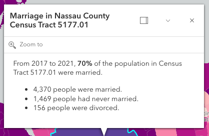
In the image above, the text "Marriage in Nassau County Census Tract 5177.01" is the popup's heading. The remaining text is the popup's content. A dock button is displayed in the top right corner of the popup allowing the user to dock the popup to one of the sides or corners of the view. The options for docking may be set in the dockOptions property. The popup may also be collapsed by clicking the collapse button (the down arrow icon) in the top right corner of the popup. When collapsed, only the heading of the popup displays. The popup may be closed by clicking the close button (the "x" icon) in the top right corner of the popup.
Popups can also contain actions which execute a function defined by the developer when clicked. By default, every popup has a "Zoom to" action (as shown in the image above with the magnifying glass) that allows users to zoom to the selected feature. See the actions property for information about adding custom actions to a popup.
The Popup component is tied to an arcgis-map, arcgis-scene, or arcgis-link-chart component, whether it's docked or anchored to the selected feature. If wanting to utilize the Popup functionality outside of arcgis-map, arcgis-scene, or arcgis-link-chart, the arcgis-features component can be used to display the same content in its own container.
Popup and PopupTemplate
PopupTemplates are closely related to Popup, but are more specific to layers and graphics. Popup templates allow you to define custom titles and content templates based on the source of the selectedFeature. When a layer or a graphic has a defined popup template, the popup will display the content defined in the popup template when the feature is clicked. The content may contain field values from the attributes of the selectedFeature.
Custom PopupTemplates may also be assigned directly to a popup by setting graphics on the features property.
- See also
Demos
Properties
| Property | Attribute | Type |
|---|---|---|
| ||
active readonly | | |
alignment | ||
auto-close-enabled | ||
auto-destroy-disabled | ||
collapsed | ||
content | ||
currentDockPosition readonly | | |
default-popup-template-enabled | ||
dock-enabled | ||
| ||
featureCount readonly | | |
feature-menu-open | ||
feature-menu-title | ||
| ||
| ||
heading | ||
heading-level | ||
hide-action-bar | ||
hide-close-button | ||
hide-collapse-button | ||
hide-feature-list-layer-title | ||
hide-feature-menu-heading | ||
hide-feature-navigation | ||
hide-heading | ||
hide-spinner | ||
highlight-disabled | ||
include-default-actions-disabled | ||
initial-display-mode | ||
label | ||
| ||
| ||
open | ||
| ||
reference-element | ||
selectedDrillInFeature readonly | | |
selectedFeature readonly | | |
selectedFeatureComponent readonly | | |
selected-feature-index | ||
state readonly | | |
top-layer-disabled | ||
update-location-enabled | ||
|
actions
- Type
- Collection<PopupAction>
A collection of action button or action toggle objects. Each action may be executed by clicking the icon or image symbolizing them.
There is a default Zoom To action styled with a magnifying glass icon to zoom in four LODs and center the map on the selected feature. This default action can be removed by setting includeDefaultActionsDisabled to true, or by setting the overwriteActions property to true in a PopupTemplate.
The order of each action is the order in which they appear in the actions Collection. The @arcgisTriggerAction event fires each time an action is clicked.
alignment
- Type
- Alignment
Position of the popup in relation to the selected feature. The default behavior
is to display above the feature and adjust if not enough room. If needing
to explicitly control where the popup displays in relation to the feature, choose
an option besides auto.
- Attribute
- alignment
- Default value
- "auto"
Example
// Popup will display on the bottom-right of the selected feature regardless of where that feature is locatedpopupComponent.alignment = "bottom-right"; autoDestroyDisabled
- Type
- boolean
If true, the component will not be destroyed automatically when it is disconnected from the document. This is useful when you want to move the component to a different place on the page, or temporarily hide it. If this is set, make sure to call the destroy() method when you are done to prevent memory leaks.
- Attribute
- auto-destroy-disabled
- Default value
- false
collapsed
- Type
- boolean
Indicates whether the popup displays its content. If true, only the header displays.
- Attribute
- collapsed
- Default value
- false
content
The content of the component. When set directly on the component, this content is static and cannot use fields to set content templates. To set a template for the content based on field or attribute names, see PopupTemplate.content.
- Attribute
- content
Example
// This sets generic instructions in the component that will always be displayed// unless it is overridden by a PopupTemplate.component.content = "Click a feature on the map to view its attributes"; currentDockPosition
- Type
- null | undefined | PopupPositionResult
Dock position in the arcgis-map, arcgis-scene, or arcgis-link-chart component.
defaultPopupTemplateEnabled
- Type
- boolean
Enables automatic creation of a popup template for layers that have popups enabled but no popupTemplate defined. Automatic popup templates are supported for layers that support the createPopupTemplate method.
Note: Starting with version 4.28, date fields are formatted using the short-date-short-time preset dateFormat rather than long-month-day-year in default popup created by setting the defaultPopupTemplateEnabled property to true.
For example, previously a date that may have appeared as "December 30, 1997" will now appear as "12/30/1997 6:00 PM".
- Attribute
- default-popup-template-enabled
- Default value
- false
dockEnabled
- Type
- boolean
Indicates whether the placement of the popup is docked to the side of the view.
Docking the popup allows for a better user experience, particularly when opening popups in apps on mobile devices. When a popup is "dockEnabled" it means the popup no longer points to the selectedFeature or the location assigned to it. Rather it is attached to a side, the top, or the bottom of the view.
See dockOptions to override default options related to docking the popup.
- Attribute
- dock-enabled
- Default value
- false
Examples
<!-- Setting this property in HTML --><arcgis-popup dock-enabled></arcgis-popup>// Setting this property using JS.// The popup will automatically be dockEnabled when made visiblepopupComponent.dockEnabled = true; dockOptions
- Type
- DockOptions
Docking the popup allows for a better user experience, particularly when opening popups in apps on mobile devices. When a popup is "dockEnabled" it means the popup no longer points to the selectedFeature or the location assigned to it. Rather it is placed in one of the corners of the view or to the top or bottom of it. This property allows the developer to set various options for docking the popup.
See the object specification table below to override default docking properties on the popup.
Example
popupComponent.dockOptions = { // Disable the dock button so users cannot undock the popup buttonEnabled: false, // Dock the popup when the size of the view is less than or equal to 600x1000 pixels breakpoint: { width: 600, height: 1000 }}; featureMenuOpen
- Type
- boolean
This property enables multiple features in the component to display in a list rather than displaying the first selected feature. Setting this to true allows the user to scroll through the list of features. This value will only be honored if initialDisplayMode is set to "feature".
- Attribute
- feature-menu-open
- Default value
- false
features
An array of features associated with the component. Each graphic in this array must have a valid PopupTemplate set. They may share the same PopupTemplate or have unique PopupTemplates depending on their attributes. The content and heading of the component is set based on the content and title properties of each graphic's respective PopupTemplate.
When more than one graphic exists in this array, the current content of the component is set based on the value of the selectedFeature).
This value is null if no features are associated with the component.
Example
// When setting the features property, the graphics pushed to this property// must have a PopupTemplate set.let g1 = new Graphic();g1.popupTemplate = new PopupTemplate({ title: "Results title", content: "Results: {ATTRIBUTE_NAME}"});// Set the graphics as an array to the popup instance. The content and title of// the component will be set depending on the PopupTemplate of the graphics.// Each graphic may share the same PopupTemplate or have a unique PopupTemplatelet graphics = [g1, g2, g3, g4, g5];component.features = graphics; goToOverride
- Type
- GoToOverride | null | undefined
This function provides the ability to override either the arcgis-map.goTo() or arcgis-scene.goTo() methods.
Example
component.goToOverride = function(view, goToParams) { goToParams.options = { duration: updatedDuration }; return view.goTo(goToParams.target, goToParams.options);}; heading
The title of the popup. This can be set generically on the popup no matter the features that are selected. If the selectedFeature has a PopupTemplate, then the title set in the corresponding template is used here.
- See also
- Attribute
- heading
Examples
<!-- This title will display in the popup unless a selected feature's PopupTemplate overrides it --><arcgis-popup heading="Population by zip codes in Southern California"></arcgis-popup>// This title will display in the popup unless a selected feature's// PopupTemplate overrides itpopupComponent.heading = "Population by zip codes in Southern California"; headingLevel
- Type
- HeadingLevel
Indicates the heading level to use for the heading of the popup.
By default, the heading is rendered
as a level 2 heading (e.g. <h2>Popup title</h2>). Depending on the component's placement
in your app, you may need to adjust this heading for proper semantics. This is
important for meeting accessibility standards.
- See also
- Attribute
- heading-level
- Default value
- 2
Example
<!-- Render the popup heading as a level 3 heading --><arcgis-popup heading="Popup title" heading-level="3"></arcgis-popup> hideCloseButton
- Type
- boolean
Indicates whether to hide the close button in the component.
- Attribute
- hide-close-button
- Default value
- false
hideCollapseButton
- Type
- boolean
Indicates whether to hide the collapse button in the component.
- Attribute
- hide-collapse-button
- Default value
- false
hideFeatureListLayerTitle
- Type
- boolean
Indicates whether to hide the group heading for a list of multiple features.
- Attribute
- hide-feature-list-layer-title
- Default value
- false
hideFeatureMenuHeading
- Type
- boolean
Indicates whether to hide the feature menu heading and description in the component's feature menu list.
- Attribute
- hide-feature-menu-heading
- Default value
- false
hideHeading
- Type
- boolean
Indicates whether to hide the heading in the component.
- Attribute
- hide-heading
- Default value
- false
hideSpinner
- Type
- boolean
Indicates whether to hide the spinner in the component.
- Attribute
- hide-spinner
- Default value
- false
highlightDisabled
- Type
- boolean
Indicates if the selected feature will be highlighted. This is done using the arcgis-map.highlights or the arcgis-scene.highlights.
- Attribute
- highlight-disabled
- Default value
- false
includeDefaultActionsDisabled
- Type
- boolean
Indicates whether to include the default actions in the component.
In order to disable any default actions, it is necessary to set includeDefaultActionsDisabled to true.
- Attribute
- include-default-actions-disabled
- Default value
- false
location
Point used to position the popup. This is automatically set when viewing the popup by selecting a feature or when calling the fetchFeatures() method. If using the Popup to display content not related to features in the map, such as the results from a task, then you must set this property before open the popup.
- See also
Examples
// Sets the location of the popup to the center of the viewpopupComponent.location = viewElement.center;// Displays the popuppopupComponent.open = true;// Sets the location of the popup to a specific place (using autocast)// Note: using latitude/longitude only works if view is in Web Mercator or WGS84 spatial reference.popupComponent.location = {latitude: 34.0571, longitude: -117.1968};// Sets the location of the popup to the location of a click on the viewreactiveUtils.on(()=>viewElement, "arcgisViewClick", (event)=>{ popupComponent.location = event.detail.mapPoint; // Displays the popup popupComponent.open = true;}); open
- Type
- boolean
- Since
- ArcGIS Maps SDK for JavaScript 5.0
Indicates whether the component is visible. This property is true when the component is querying for results, even if it is not open. Use this property to check if the component is visible.
When setting the content and heading directly, it is recommended to call clear() before setting open to true to remove any existing promises, features, heading, location, and content from the component. Otherwise, the old content will display.
- See also
- Attribute
- open
- Default value
- false
Example
// Listen for clicks on the view and open the component at the clicked location with custom content.viewElement.addEventListener("arcgisViewClick", (event) => { const { mapPoint } = event.detail; component.clear(); component.location = mapPoint; component.heading = "You clicked here"; component.content = "Latitude: " + mapPoint.latitude.toFixed(3) + ", Longitude: " + mapPoint.longitude.toFixed(3); component.open = true;}); promises
An array of pending Promises that have not yet been fulfilled. If there are
no pending promises, the value is null. When the pending promises are
resolved they are removed from this array and the features they return
are pushed into the features array.
referenceElement
- Type
- ArcgisReferenceElement | string | undefined
By assigning the id attribute of the Map or Scene component to this property, you can position a child component anywhere in the DOM while still maintaining a connection to the Map or Scene.
- Attribute
- reference-element
selectedDrillInFeature
The feature that the component has drilled into. This feature is either associated with the selected feature in a relationship or utility network element.
selectedFeature
The selected feature accessed by the popup. The content of the Popup is determined based on the PopupTemplate assigned to this feature.
selectedFeatureComponent
- Type
- ArcgisFeature | null
Returns a reference to the current arcgis-feature that the Popup is using. This is useful if needing to get a reference to the component in order to make any changes to it.
selectedFeatureIndex
- Type
- number
Index of the feature that is selectedFeature. When features are set, the first index is automatically selected.
- Attribute
- selected-feature-index
topLayerDisabled
- Type
- boolean
- Since
- ArcGIS Maps SDK for JavaScript 5.0
When true, disables rendering in the top layer (above overlays and modals). This can be useful for controlling stacking context in complex UI layouts.
- Attribute
- top-layer-disabled
- Default value
- false
updateLocationEnabled
- Type
- boolean
- Since
- ArcGIS Maps SDK for JavaScript 5.0
Indicates whether to update the location when the selectedFeatureIndex changes.
- Attribute
- update-location-enabled
- Default value
- false
view
- Type
- MapViewOrSceneView | null | undefined
The view associated with the component.
Note: The recommended approach is to fully migrate applications to use map and scene components and avoid using MapView and SceneView directly. However, if you are migrating a large application from widgets to components, you might prefer a more gradual transition. To support this use case, the SDK includes this
viewproperty which connects a component to a MapView or SceneView. Ultimately, once migration is complete, the arcgis-popup component will be associated with a map or scene component rather than using theviewproperty.
Methods
| Method | Signature |
|---|---|
clear(): Promise<void> | |
componentOnReady inherited | componentOnReady(): Promise<this> |
destroy(): Promise<void> | |
fetchFeatures(screenPoint?: ScreenPoint, options?: FetchFeaturesOptions): Promise<void> | |
next(): Promise<FeaturesViewModel> | |
previous(): Promise<FeaturesViewModel> | |
setFocus(): Promise<void> | |
triggerAction(action: ActionButton | ActionToggle): Promise<void> |
componentOnReady
- Signature
-
componentOnReady (): Promise<this>
Creates a promise that resolves once the component is fully loaded.
- Returns
- Promise<this>
Example
const arcgisPopup = document.querySelector("arcgis-popup");document.body.append(arcgisPopup);await arcgisPopup.componentOnReady();console.log("arcgis-popup is ready to go!"); fetchFeatures
- Signature
-
fetchFeatures (screenPoint?: ScreenPoint, options?: FetchFeaturesOptions): Promise<void>
Use this method to return feature(s) at a given screen location. These features are fetched from all of the LayerViews in the view. In order to use this, a layer must already have an associated PopupTemplate and have its popupEnabled. This method allows a developer to control how the input location is handled. For example, you may want to fetch features on a click event or on a pointer-move event. This method automatically sets the location based on the input event's screen coordinates.
- See also
Parameters
| Parameter | Type | Description | Required |
|---|---|---|---|
| screenPoint | | | |
| options | | |
Example
const viewElement = document.querySelector("arcgis-map");// Get viewElement's click eventreactiveUtils.on(()=>viewElement, "arcgisViewClick", async (event)=>{ // Call fetchFeatures on the component and pass in the click event detail await component.fetchFeatures(event.detail);});// Watch for changes to the features property and open the component when features are available.reactiveUtils.watch( () => component.features, () => { component.open = component.features ? true : false; },); next
- Signature
-
next (): Promise<FeaturesViewModel>
Selects the feature at the next index in relation to the selected feature.
- See also
- Returns
- Promise<FeaturesViewModel>
previous
- Signature
-
previous (): Promise<FeaturesViewModel>
Selects the feature at the previous index in relation to the selected feature.
- See also
- Returns
- Promise<FeaturesViewModel>
triggerAction
- Signature
-
triggerAction (action: ActionButton | ActionToggle): Promise<void>
Triggers the @arcgisTriggerAction event and executes the actions at the specified index in the actions array.
Parameters
| Parameter | Type | Description | Required |
|---|---|---|---|
| action | | |
Events
| Name | Type |
|---|---|
| CustomEvent<{ name: "active" | "collapsed" | "currentAlignment" | "dockEnabled" | "featureCount" | "featureMenuOpen" | "features" | "promises" | "selectedDrillInFeature" | "selectedFeature" | "selectedFeatureComponent" | "selectedFeatureIndex" | "state" | "open"; }> | |
arcgisClose
arcgisClose: CustomEvent<void> Emitted when the component's close button is clicked.
arcgisPropertyChange
arcgisPropertyChange: CustomEvent<{ name: "active" | "collapsed" | "currentAlignment" | "dockEnabled" | "featureCount" | "featureMenuOpen" | "features" | "promises" | "selectedDrillInFeature" | "selectedFeature" | "selectedFeatureComponent" | "selectedFeatureIndex" | "state" | "open"; }> arcgisReady
arcgisReady: CustomEvent<void> Emitted when the component associated with a map or scene view is ready to be interacted with.
arcgisTriggerAction
arcgisTriggerAction: CustomEvent<ActionEvent> Fires after the user clicks on an action in the Popup component. This event may be used to define a custom function to execute when particular actions are clicked.
- See also
Example
// Fires each time an action is clickedreactiveUtils.on(()=> component, "arcgisTriggerAction", (event)=>{ // If the zoom-out action is clicked, execute the following code if(event.detail.action.id === "zoom-out"){ // Zoom out two levels (LODs) viewElement.goTo({ center: viewElement.center, zoom: viewElement.zoom - 2 }); }});