import "@arcgis/map-components/components/arcgis-time-slider";- Inheritance:
- ArcgisTimeSlider→
PublicLitElement
- Since
- ArcGIS Maps SDK for JavaScript 4.28
The Time Slider component simplifies visualization of temporal data in your application.
Demos
Properties
| Property | Attribute | Type |
|---|---|---|
| ||
auto-destroy-disabled | ||
disabled reflected | disabled | |
effectiveStops readonly | | |
| TimeExtent | null | undefined | |
icon | Icon["icon"] | |
label | ||
layout | ||
loop | ||
mode | ||
play-rate | ||
reference-element | ||
state readonly | | |
| ||
| Array<TickConfig> | null | undefined | |
| TimeExtent | null | undefined | |
time-visible | ||
time-zone | ||
|
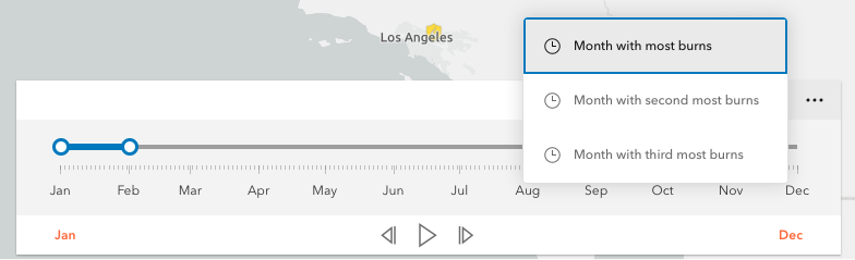
actions
- Type
- Collection<Action>
Defines actions that will appear in a menu when the user clicks the ellipsis button
 in the component. The
ellipsis button will not display if this property is
in the component. The
ellipsis button will not display if this property is null or if the collection is empty.
Each Action is defined with a unique id, a title,
and an icon.
The @trigger-action event fires each time an action in the menu is clicked. This event can be used to execute custom code such as setting the timeExtent to a specific date or copying the timeExtent to the browser's clipboard.
- See also
Example
// Create a TimeSlider with two actions to snap the thumb to// two specific time extents.const timeSlider = new TimeSlider({  container: "timeSliderDiv",  fullTimeExtent: {    start: new Date(2011, 0, 1),    end: new Date(2012, 0, 1)  },  mode: "instant",  actions: [    {      id: "quake",      icon: "exclamation-mark-triangle",      title: "Jump to Earthquake"    },    {      id: "quake-plus-one-month",      icon: "organization",      title: "One month later"    }  ]});
// listen to timeSlider's trigger-action event// check what action user clicked on and respond accordingly.timeSlider.on("trigger-action", (event) => {  const quake = new Date(Date.UTC(2011, 3, 11, 8, 16, 12));  const oneMonthLater = new Date(quake.getTime()).setMonth(quake.getMonth() + 1);  switch(event.action.id) {    case "quake":      timeSlider.timeExtent = {        start: quake,        end: quake      };      break;    case "quake-plus-one-month":      timeSlider.timeExtent = {        start: oneMonthLater,        end: oneMonthLater      };      break;  }});
autoDestroyDisabled
- Type
- boolean
If true, the component will not be destroyed automatically when it is disconnected from the document. This is useful when you want to move the component to a different place on the page, or temporarily hide it. If this is set, make sure to call the destroy() method when you are done to prevent memory leaks.
- Attribute
- auto-destroy-disabled
- Default value
- false
disabled
- Type
- boolean
When true, the component is visually withdrawn and cannot receive user interaction.
- Attribute
- disabled
- Default value
- false
Example
// Create a timeslider widget that is initially disabled.const timeSlider = new TimeSlider({ container: "timeSliderDiv", fullTimeExtent: { start: new Date(2000, 5, 1), end: new Date(2010, 0, 1) }, disabled: true}); fullTimeExtent
- Type
- TimeExtent | null | undefined
The temporal extent of the entire slider. It defines the entire time period within which you can visualize your time aware data using the time slider component.
Example
// Create a new TimeSlider with set datesconst timeSlider = new TimeSlider({  container: "timeSliderDiv",  view: view});
// wait for the time-aware layer to loadlayer.when(() => {  // set up time slider properties based on layer timeInfo  timeSlider.fullTimeExtent = layer.timeInfo.fullTimeExtent;  timeSlider.stops = {   interval: layer.timeInfo.interval  };});
icon
- Type
- Icon["icon"]
Icon which represents the component. Typically used when the component is controlled by another component (e.g. by the Expand component).
- See also
- Attribute
- icon
- Default value
- "clock"
layout
- Type
- TimeSliderLayout
Determines the layout used by the TimeSlider component.
Possible values are listed below:
| Value | Description |
|---|---|
| auto | Automatically uses the "compact" layout when the component width is less than 858 pixels. Otherwise the "wide" layout it used. |
| compact | Component elements are oriented vertically. This layout is better suited to narrower widths. |
| wide | Component elements are oriented laterally. This thinner design is better suited to wide applications. |
- Attribute
- layout
- Default value
- "auto"
Example
timeSlider.layout = "compact"; loop
- Type
- boolean
When true, the time slider will play its animation in a loop.
- Attribute
- loop
- Default value
- false
Example
// Start a time slider animation that advances every second// and restarts when it reaches the end.timeSlider.set({ loop: true, playRate: 1000});timeSlider.play(); mode
- Type
- TimeSliderMode
The time slider mode. This property is used for defining if the temporal data will be displayed cumulatively up to a point in time, a single instant in time, or within a time range. See the following table for possible values.
| Possible Values | Description | Example |
|---|---|---|
| instant | The slider will show temporal data that falls on a single instance in time. Set the timeExtent property's start and end dates to same date: {start: sameDate, end: sameDate} | 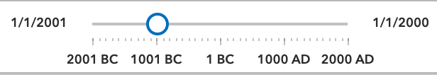 |
| time-window | The slider will show temporal data that falls within a given time range. This is the default. Set timeExtent property's start and date properties to desired dates. | 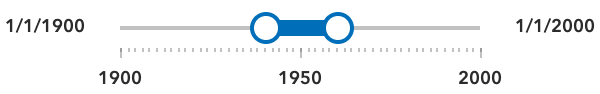 |
| cumulative-from-start | Similar to time-window with the start time is always pinned to the start of the slider. Set the timeExtent property's start date to null and set end date to a desired date: {start: null, end: date} | 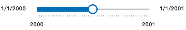 |
| cumulative-from-end | Also, similar to the time-window with the end time pinned to the end of the slider. Set the timeExtent property's start date to a desired date and set end date to null: {start: date, end: null} | 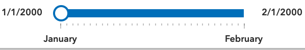 |
- See also
- Attribute
- mode
- Default value
- "time-window"
Example
// Create a single thumbed time slider that includes all historic content.const timeSlider = new TimeSlider({ container: "timeSliderDiv", view: view, mode: "cumulative-from-start", fullTimeExtent: { start: new Date(2000, 0, 1), end: new Date(2010, 0, 1) }, timeExtent: { start: null, end: new Date(2001, 0, 1) //end date }}); playRate
- Type
- number
The time (in milliseconds) between animation steps.
When a View is associated with a TimeSlider and the TimeSlider is playing, the playback will pause before advancing if the View is still updating.
For example, if the playRate is set to 1,000 (one second) and the View takes 1.5 seconds to render then the TimeSlider thumb(s) will advance every
1.5 seconds rather than every second.
- Attribute
- play-rate
- Default value
- 1000
Example
// Start a time slider animation that advances// ten times a second and stops when it reaches the end.timeSlider.set({ loop: false, playRate: 100});timeSlider.play(); referenceElement
- Type
- ArcgisReferenceElement | string | undefined
By assigning the id attribute of the Map or Scene component to this property, you can position a child component anywhere in the DOM while still maintaining a connection to the Map or Scene.
- Attribute
- reference-element
state
- Type
- TimeSliderState
The current state of the component.
- Default value
- "disabled"
Example
// Display the current state of the view model.switch (timeSlider.viewModel.state) { case "disabled": console.log("The view is not ready or some property are not set."); break; case "ready": console.log("The time slider is ready for use."); break; case "playing": console.log("The time slider is currently animating."); break;} stops
Defines specific locations on the time slider where thumbs will snap to when manipulated. If unspecified, ten evenly spaced stops will be added.
For continuous sliding, set stops to null:
timeSlider.stops = null;To define regularly spaced stops, parse an object with interval and timeExtent properties
with types TimeInterval and TimeExtent respectively.
The timeExtent property is optional and used to confine stops to a certain date range.
This property is useful to commence stops on a specific day of the week or month.
If a stop definition by interval results in excess of 10,000 stops, then the view model
will default to ten evenly spaced stops.
// Add yearly intervals starting from the beginning of the TimeSlider.timeSlider.stops = { interval: { value: 1, unit: "years" }};Rather than setting the stops as time intervals, the TimeSlider can be divided into evenly spaced
stops using the count property. Similar to the previous method, divisions can be confined to a specific date range
using the optional timeExtent property.
// Add stops at 15 evenly spaced intervals.timeSlider.stops = { count: 15};For irregularly spaced stops, simply assign an array of dates as demonstrated below.
// Add nine irregular stops.timeSlider.stops = { dates: [ new Date(2000, 0, 1), new Date(2001, 3, 8), new Date(2002, 0, 10), new Date(2003, 12, 8), new Date(2004, 2, 19), new Date(2005, 7, 5), new Date(2006, 9, 11), new Date(2007, 11, 21), new Date(2008, 1, 10) ]};Lastly, to constrain or offset division by count or interval use the optional timeExtent property.
// Add yearly stops from Christmas 2019 to Christmas 2029 onlytimeSlider.stops = {  interval: {    value: 1,    unit: "years"  },  timeExtent: {    start: new Date(2019, 11, 25),    end: new Date(2029, 11, 25)  }};
// Likewise, add stops that represent quarters of 2019 only.timeSlider.stops = { count: 4, timeExtent: { start: new Date(2019, 0, 1), end: new Date(2020, 0, 1) }};- Default value
- { count : 10 }
tickConfigs
- Type
- Array<TickConfig> | null | undefined
When set, overrides the default TimeSlider ticks labelling system. Please refer to TickConfig for detailed documentation on how to configure tick placement, style, and behavior.
Examples
// By default in "en-US" the TimeSlider will display ticks with "2010, 2011, 2012, etc".// Overwrite TimeSlider tick configuration so that labels display "'10, '12, '14, etc" in red.const timeSlider = new TimeSlider({ container: "timeSliderDiv", fullTimeExtent: { start: new Date(2010, 0, 1), end: new Date(2020, 0, 1) }, tickConfigs: [{ mode: "position", values: [ new Date(2010, 0, 1), new Date(2012, 0, 1), new Date(2014, 0, 1), new Date(2016, 0, 1), new Date(2018, 0, 1), new Date(2020, 0, 1) ].map((date) => date.getTime()), labelsVisible: true, labelFormatFunction: (value) => { const date = new Date(value); return `'${date.getUTCFullYear() - 2000}`; }, tickCreatedFunction: (value, tickElement, labelElement) => { tickElement.classList.add("custom-ticks"); labelElement.classList.add("custom-labels"); } }]};// this CSS goes with the snippet above.#timeSlider .custom-ticks { background-color: red; width: 1px; height: 8px;}#timeSlider .custom-labels { font-family: Georgia, 'Times New Roman', Times, serif; font-size: 15px; color: red;} timeExtent
- Type
- TimeExtent | null | undefined
The current time extent of the time slider. This property can be watched for
updates and used to update the time extent property in queries and/or the layer filters and effects.
The following table shows the timeExtent values returned for each mode.
| Mode | The timeExtent value |
|---|---|
time-window | {start: startDate, end: endDate} |
instant | {start: sameDate, end: sameDate} |
cumulative-from-start | {start: null, end: endDate} |
cumulative-from-end | {start: startDate, end: null} |
Example
// Display the time extent to the console whenever it changes.const timeSlider = new TimeSlider({  container: "timeSliderDiv",  mode: "time-window",  fullTimeExtent: {    start: new Date(2019, 2, 3),    end: new Date(2019, 2, 5)  },  timeExtent: {    start: new Date(2019, 2, 1),    end: new Date(2019, 2, 28)  }});
reactiveUtils.watch(  () => timeSlider.timeExtent,  (timeExtent) => {    console.log("Time extent now starts at", timeExtent.start, "and finishes at:", timeExtent.end);  });
timeVisible
- Type
- boolean
Shows/hides time in the display.
- Attribute
- time-visible
- Default value
- false
Example
// For time sliders with a small time extent it may be useful to display times as shown below.const timeSlider = new TimeSlider({ container: "timeSliderDiv", mode: "time-window", timeVisible: true, fullTimeExtent: { start: new Date(2019, 2, 3), end: new Date(2019, 2, 5) }, timeExtent: { start: new Date(2019, 2, 1), end: new Date(2019, 2, 28) }}); timeZone
- Type
- string
Dates and times displayed in the component will be displayed in this time zone. By default this time zone is
inherited from MapView#timeZone. When a MapView is not associated with the component
then the property will fallback to the system time zone.
Possible Values
| Value | Description |
|---|---|
| system | Dates and times will be displayed in the timezone of the device or browser. |
| unknown | Dates and time are not adjusted for any timezone. TimeSlider will be disabled. |
| Specified IANA timezone | Dates and times will be displayed in the specified IANA time zone. See wikipedia - List of tz database time zones. |
- Attribute
- time-zone
view
- Type
- MapViewOrSceneView | null | undefined
The view associated with the component.
Note: The recommended approach is to fully migrate applications to use map and scene components and avoid using MapView and SceneView directly. However, if you are migrating a large application from widgets to components, you might prefer a more gradual transition. To support this use case, the SDK includes this
viewproperty which connects a component to a MapView or SceneView. Ultimately, once migration is complete, the arcgis-time-slider component will be associated with a map or scene component rather than using theviewproperty.
Example
// Create and then add a TimeSlider component and then listen to changes in the View's time extent.const timeSlider = new TimeSlider({  container: "timeSliderDiv",  view: view,  mode: "instant",  fullTimeExtent: {    start: new Date(2000, 0, 1),    end: new Date(2010, 0, 1)  },  timeExtent: {    start: new Date(2000, 0, 1),    end: new Date(2000, 0, 1)  }});view.ui.add(timeSlider, "top-left");
reactiveUtils.watch(  () => view.timeExtent,  (timeExtent) => {    console.log("New view time is: ", timeExtent.start);  });
Methods
| Method | Signature |
|---|---|
applyTimeSliderSettings(settings: TimeSliderSettings): Promise<void> | |
componentOnReady inherited | componentOnReady(): Promise<this> |
destroy(): Promise<void> | |
next(): Promise<void> | |
play(): Promise<void> | |
previous(): Promise<void> | |
stop(): Promise<void> | |
updateWebDocument(webmap: WebMap): Promise<void> |
componentOnReady
- Signature
-
componentOnReady (): Promise<this>
Creates a promise that resolves once the component is fully loaded.
- Returns
- Promise<this>
Example
const arcgisTimeSlider = document.querySelector("arcgis-time-slider");document.body.append(arcgisTimeSlider);await arcgisTimeSlider.componentOnReady();console.log("arcgis-time-slider is ready to go!");Events
| Name | Type |
|---|---|
| CustomEvent<{ name: "effectiveStops" | "fullTimeExtent" | "timeExtent" | "state"; }> | |
arcgisPropertyChange
arcgisPropertyChange: CustomEvent<{ name: "effectiveStops" | "fullTimeExtent" | "timeExtent" | "state"; }> Emitted when the value of a property is changed. Use this to listen to changes to properties.
arcgisReady
arcgisReady: CustomEvent<void> Emitted when the component associated with a map or scene view is ready to be interacted with.
arcgisTriggerAction
arcgisTriggerAction: CustomEvent<TimeSliderViewModelTriggerActionEvent> Emitted when an action is triggered on the component.