Explore details of a building scene by using filters and sublayer visibility.
Use case
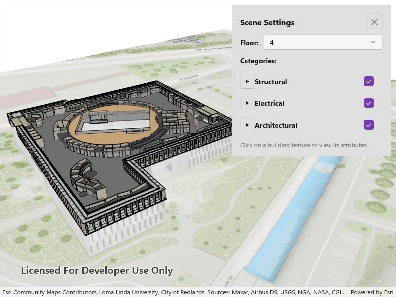
Buildings and their component parts (in this example, structural, electrical, or architectural) can be difficult to explain and visualize. An architectural firm might share a 3D building model visualization with clients and contractors to let them explore these components by floor and component type.
How to use the sample
Once the scene is loaded, tap the “Building Filter Settings” button to view the filtering options.
- Select a floor from the “Floor” menu to view the internal details of each floor or “All” to view the entire model. Selecting a floor applies a filter that hides all floors above the selected floor and gives the floors below a transparent, X-ray renderer.
- Expand the categories under the top-level disciplines to show or hide individual categories in the building model. The entire discipline may be shown or hidden as well.
- Tap on any features in the building to view the attributes of the feature.
How it works
- Create a
Scenewith the URL to a Building Scene Layer service. - Create a
LocalSceneViewand add the scene. - Retrieve the
BuildingSceneLayerfrom the scene’s operational layers. - When a floor is selected:
- A new
BuildingFilteris created with twoBuildingFilterBlockitems. - One block defines the solid renderer for features on the selected floor.
- The second block defines the X-ray filter for features on the floors below the selected floor.
- Features that exist on floors above the selected floor are not rendered.
- If “All” is selected, the
ActiveFilterproperty on the building scene layer is set tonullso all features are rendered according to their default settings.
- A new
- Architectural disciplines and categories are represented by
BuildingGroupSublayerandBuildingSublayerobjects containing features within a building scene layer. When checked or unchecked, the visibility of the group or sublayer is set to true (visible) or false (hidden). - When a building feature is tapped on:
- A call to
IdentifyLayerAsyncon theLocalSceneViewis initiated based on the screen offset of the click. - The
SublayerResultsproperty of the returnedIdentifyLayerResultwill contain the identified features. Note that the building scene layer features are NOT returned in theGeoElementsproperty of the results. - The details of the first identified feature are shown in a popup.
- A call to
Relevant API
- BuildingComponentSublayer
- BuildingFilter
- BuildingFilterBlock
- BuildingSceneLayer
- LocalSceneView
- Scene
About the data
This sample uses the Esri Building E Local Scene web scene, which contains a Building Scene Layer representing Building E on the Esri Campus in Redlands, CA. The Revit BIM model was brought into ArcGIS using the BIM capabilities in ArcGIS Pro and published to the web as a Building Scene Layer.
Additional information
Buildings in a Building Scene Layer can be very complex models composed of sublayers containing internal and external features of the structure. Sublayers may include structural components like columns, architectural components like floors and windows, and electrical components.
Applying filters to the Building Scene Layer can highlight features of interest in the model. Filters are made up of filter blocks, which contain several properties that allow control over the filter’s function. Setting the filter mode to X-Ray, for instance, will render features with a semi-transparent white color so other interior features can be seen. In addition, toggling the visibility of sublayers can show or hide all the features of a sublayer.
Tags
3D, building scene layer, layers
Sample code
// Copyright 2025 Esri.//// Licensed under the Apache License, Version 2.0 (the "License"); you may not use this file except in compliance with the License.// You may obtain a copy of the License at: http://www.apache.org/licenses/LICENSE-2.0//// Unless required by applicable law or agreed to in writing, software distributed under the License is distributed on an// "AS IS" BASIS, WITHOUT WARRANTIES OR CONDITIONS OF ANY KIND, either express or implied. See the License for the specific// language governing permissions and limitations under the License.
using Esri.ArcGISRuntime.Data;using Esri.ArcGISRuntime.Mapping;
namespace ArcGIS.Samples.FilterBuildingSceneLayer{    [ArcGIS.Samples.Shared.Attributes.Sample(        name: "Filter building scene layer",        category: "Layers",        description: "Explore details of a building scene by using filters and sublayer visibility.",        instructions: "In the filter controls, select floor and category options to filter what parts of the Building Scene Layer are displayed in the scene. Tap on any of the building features to identify them.",        tags: new[] { "3D", "building scene layer", "layers" })]    public partial class FilterBuildingSceneLayer : ContentPage    {        // Hold a reference to the building scene layer.        private BuildingSceneLayer _buildingSceneLayer;
        // Store the list of floors in the building.        private List<string> _floorList = new List<string>();
        // Track the currently selected feature's sublayer for clearing selection.        private BuildingComponentSublayer _selectedSublayer;
        public FilterBuildingSceneLayer()        {            InitializeComponent();            _ = Initialize();        }
        private async Task Initialize()        {            // Create a scene from a web scene portal item.            var sceneUri = new Uri("https://arcgisruntime.maps.arcgis.com/home/item.html?id=b7c387d599a84a50aafaece5ca139d44");            var scene = new Scene(sceneUri);
            // Load the scene.            await scene.LoadAsync();
            // Set the scene to the scene view.            MySceneView.Scene = scene;
            // Get the building scene layer from the scene's operational layers.            _buildingSceneLayer = scene.OperationalLayers                .OfType<BuildingSceneLayer>()                .FirstOrDefault();
            if (_buildingSceneLayer != null)            {                // Load the building scene layer to access sublayers and statistics.                await _buildingSceneLayer.LoadAsync();
                // Get the statistics to retrieve floor information.                var statistics = await _buildingSceneLayer.FetchStatisticsAsync();
                // Note: BldgLevel values are numeric in the dataset.                if (statistics.ContainsKey("BldgLevel"))                {                    // Get the floor values and sort them in descending order (top floor first).                    var floorStats = statistics["BldgLevel"];                    _floorList = floorStats.MostFrequentValues.ToList();                    _floorList.Sort((a, b) => int.Parse(b).CompareTo(int.Parse(a)));                }
                // Populate the UI controls.                PopulateFloorPicker();                PopulateCategoryControls();
                // Listen for taps on the scene view to identify features.                MySceneView.GeoViewTapped += MySceneView_GeoViewTapped;            }        }
        private void PopulateFloorPicker()        {            // Add "All" option followed by each floor.            FloorPicker.Items.Add("All");            foreach (var floor in _floorList)            {                FloorPicker.Items.Add(floor);            }
            FloorPicker.SelectedIndex = 0;        }
        private void FloorPicker_SelectedIndexChanged(object sender, EventArgs e)        {            if (FloorPicker.SelectedIndex < 0) return;
            ApplyFloorFilter(FloorPicker.Items[FloorPicker.SelectedIndex]);        }
        private void ApplyFloorFilter(string selectedFloor)        {            // If "All" is selected, remove any active filter.            if (string.IsNullOrEmpty(selectedFloor) || selectedFloor == "All")            {                _buildingSceneLayer.ActiveFilter = null;                return;            }
            // Create a building filter with two blocks:            // 1. Solid mode for the selected floor.            // 2. X-ray mode for floors below (semi-transparent).            var filter = new BuildingFilter(                "Floor filter",                "Show selected floor and x-ray filter for lower floors.",                new[]                {                    new BuildingFilterBlock(                        "solid block",                        $"BldgLevel = {selectedFloor}",                        new BuildingSolidFilterMode()                    ),                    new BuildingFilterBlock(                        "xray block",                        $"BldgLevel < {selectedFloor}",                        new BuildingXrayFilterMode()                    )                });
            _buildingSceneLayer.ActiveFilter = filter;        }
        private void PopulateCategoryControls()        {            CategoriesStackLayout.Children.Clear();
            if (_buildingSceneLayer == null) return;
            // Get the "Full Model" sublayer group which contains all categories.            var fullModelSublayer = _buildingSceneLayer.Sublayers                .OfType<BuildingGroupSublayer>()                .FirstOrDefault(s => s.Name == "Full Model");
            if (fullModelSublayer == null) return;
            // Create expandable UI for each category (e.g., Architectural, Structural, Electrical).            foreach (BuildingGroupSublayer categorySublayer in fullModelSublayer.Sublayers)            {                CategoriesStackLayout.Children.Add(CreateCategoryItem(categorySublayer));            }        }
        private View CreateCategoryItem(BuildingGroupSublayer categorySublayer)        {            var mainStack = new VerticalStackLayout { Spacing = 4, Margin = new Thickness(0, 4) };
            // Category header with expand button, name, and visibility checkbox.            var headerLayout = new HorizontalStackLayout { Spacing = 8 };
            var expandButton = new Button            {                Text = "▶",                FontSize = 12,                WidthRequest = 30,                HeightRequest = 30,                Padding = 0,                BackgroundColor = Colors.Transparent            };
            var categoryCheckBox = new CheckBox { IsChecked = categorySublayer.IsVisible };            categoryCheckBox.CheckedChanged += (s, e) => categorySublayer.IsVisible = e.Value;
            var nameLabel = new Label            {                Text = categorySublayer.Name,                FontAttributes = FontAttributes.Bold,                VerticalOptions = LayoutOptions.Center            };
            headerLayout.Add(expandButton);            headerLayout.Add(categoryCheckBox);            headerLayout.Add(nameLabel);
            mainStack.Children.Add(headerLayout);
            // Component sublayers (collapsed by default).            var componentsStack = new VerticalStackLayout            {                Margin = new Thickness(40, 4, 0, 0),                Spacing = 4,                IsVisible = false            };
            foreach (BuildingComponentSublayer componentSublayer in categorySublayer.Sublayers)            {                var componentLayout = new HorizontalStackLayout { Spacing = 8 };
                var componentCheckBox = new CheckBox { IsChecked = componentSublayer.IsVisible };                componentCheckBox.CheckedChanged += (s, e) => componentSublayer.IsVisible = e.Value;
                var componentLabel = new Label                {                    Text = componentSublayer.Name,                    VerticalOptions = LayoutOptions.Center                };
                componentLayout.Add(componentCheckBox);                componentLayout.Add(componentLabel);                componentsStack.Children.Add(componentLayout);            }
            mainStack.Children.Add(componentsStack);
            // Toggle expand/collapse when button is clicked.            expandButton.Clicked += (s, e) =>            {                componentsStack.IsVisible = !componentsStack.IsVisible;                expandButton.Text = componentsStack.IsVisible ? "▼" : "▶";            };
            return mainStack;        }
        private async void MySceneView_GeoViewTapped(object sender, Esri.ArcGISRuntime.Maui.GeoViewInputEventArgs e)        {            // Clear any previous selection.            if (_selectedSublayer != null)            {                _selectedSublayer.ClearSelection();                _selectedSublayer = null;            }
            // Reset panel visibility.            FeaturePanel.IsVisible = false;            SettingsPanel.IsVisible = true;
            if (_buildingSceneLayer == null) return;
            // Identify features at the tapped location.            var identifyResult = await MySceneView.IdentifyLayerAsync(                _buildingSceneLayer,                e.Position,                5,                false);
            // Process the first identified feature.            if (identifyResult.SublayerResults.Any())            {                var sublayerResult = identifyResult.SublayerResults.First();
                if (sublayerResult.GeoElements.Any())                {                    var identifiedFeature = sublayerResult.GeoElements.First() as Feature;                    var sublayer = sublayerResult.LayerContent as BuildingComponentSublayer;
                    if (identifiedFeature != null && sublayer != null)                    {                        // Select the feature and display its attributes.                        sublayer.SelectFeature(identifiedFeature);                        _selectedSublayer = sublayer;                        DisplayFeatureAttributes(identifiedFeature);                    }                }            }        }
        private void DisplayFeatureAttributes(Feature feature)        {            FeatureAttributesCollection.ItemsSource = feature.Attributes                .Select(a => new BuildingSceneFeatureAttribute(a.Key, a.Value?.ToString() ?? "N/A"))                .ToList();
            SettingsPanel.IsVisible = false;            FeaturePanel.IsVisible = true;        }
        private void CloseFeatureButton_Clicked(object sender, EventArgs e)        {            if (_selectedSublayer != null)            {                _selectedSublayer.ClearSelection();                _selectedSublayer = null;            }
            FeaturePanel.IsVisible = false;            FeatureAttributesCollection.ItemsSource = null;            SettingsPanel.IsVisible = true;        }    }
    /// <summary>    /// This class represents a key-value pair for displaying feature attributes. It is used instead of a    /// KeyValuePair generic to help data binding in the xaml file.    /// </summary>    public sealed class BuildingSceneFeatureAttribute    {        public string Key { get; set; }        public string Value { get; set; }
public BuildingSceneFeatureAttribute(string key, string value) { Key = key; Value = value; } }}<?xml version="1.0" encoding="utf-8" ?><ContentPage x:Class="ArcGIS.Samples.FilterBuildingSceneLayer.FilterBuildingSceneLayer" xmlns="http://schemas.microsoft.com/dotnet/2021/maui" xmlns:x="http://schemas.microsoft.com/winfx/2009/xaml" xmlns:local="clr-namespace:ArcGIS.Samples.FilterBuildingSceneLayer" xmlns:esriUI="clr-namespace:Esri.ArcGISRuntime.Maui;assembly=Esri.ArcGISRuntime.Maui"> <Grid Style="{DynamicResource EsriSampleContainer}"> <!-- LocalSceneView displays the 3D building scene. --> <esriUI:LocalSceneView x:Name="MySceneView" Style="{DynamicResource EsriSampleGeoView}" />
<!-- Control panel: toggles between settings and feature attributes. --> <Border Style="{DynamicResource EsriSampleControlPanel}"> <Grid> <!-- Settings panel for floor filtering and category visibility controls. --> <ScrollView x:Name="SettingsPanel"> <VerticalStackLayout Spacing="12"> <!-- Floor selection dropdown. --> <Grid ColumnDefinitions="Auto,*"> <Label Grid.Column="0" FontAttributes="Bold" FontSize="14" Text="Floor:" VerticalOptions="Center" /> <Picker x:Name="FloorPicker" Grid.Column="1" Margin="10,0,0,0" SelectedIndexChanged="FloorPicker_SelectedIndexChanged" /> </Grid>
<!-- Category controls for toggling sublayer visibility. --> <Label FontAttributes="Bold" FontSize="14" Text="Categories:" /> <VerticalStackLayout x:Name="CategoriesStackLayout" Spacing="4" />
<!-- Instruction text. --> <BoxView HeightRequest="1" Color="Gray" /> <Label FontSize="12" Text="Tap on a building feature to view its attributes." TextColor="Gray" /> </VerticalStackLayout> </ScrollView>
<!-- Feature attributes panel, shown when a feature is selected. --> <Grid x:Name="FeaturePanel" IsVisible="False" RowDefinitions="Auto,*" RowSpacing="8"> <!-- Header with close button. --> <Grid Grid.Row="0"> <Label FontAttributes="Bold" FontSize="14" HorizontalOptions="Start" Text="Feature Attributes" VerticalOptions="Center" /> <Button BackgroundColor="Gray" Clicked="CloseFeatureButton_Clicked" FontSize="16" HorizontalOptions="End" Text="✖" TextColor="{AppThemeBinding Light=Black, Dark=White}" /> </Grid>
<!-- Scrollable list of feature attributes. --> <CollectionView x:Name="FeatureAttributesCollection" Grid.Row="1" ItemsLayout="VerticalList" MaximumHeightRequest="400"> <CollectionView.ItemTemplate> <DataTemplate x:DataType="local:BuildingSceneFeatureAttribute"> <VerticalStackLayout Margin="0,4" Spacing="2"> <Label FontAttributes="Bold" FontSize="12"> <Label.FormattedText> <FormattedString> <Span FontAttributes="Bold" Text="{Binding Key}" /> <Span Text=":" /> </FormattedString> </Label.FormattedText> </Label> <Label Margin="10,0,0,0" FontSize="12" Text="{Binding Value}" TextColor="Gray" /> </VerticalStackLayout> </DataTemplate> </CollectionView.ItemTemplate> </CollectionView> </Grid> </Grid> </Border> </Grid></ContentPage>